Google Labs Embedded in Gmail

I think a lot about how organizations and their products evolve quickly rather than remain static, and Google Labs are a prime example of that. By developing many alpha products, releasing several public betas, and getting live feedback they use the market to tell them what works. For many companies the notion of releasing your proprietary ideas is very scary, and yet the effect is the opposite: risk management.

A colleague just gave me a heads up to the Labs section of Gmail (accessible from Settings). It’s interesting for a few reasons:

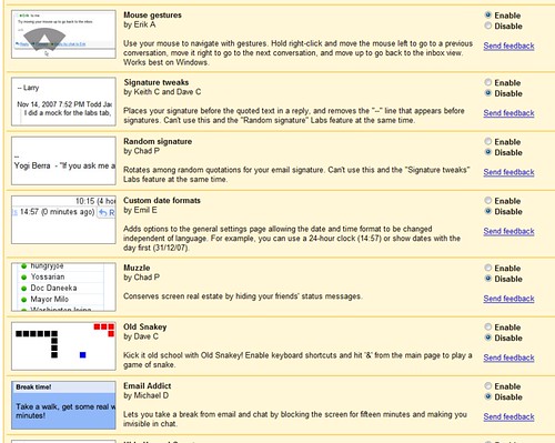
  1. They’ve turned the labs upside down, embedding experimental ideas as preferences in an application rather than silo’d sites.
  2. Each feature is attributed to the employee(s) who invented it, acknowledging that great experiments often originate with one person, even if it takes a company to implement it.
  3. Some of the features — like “mouse gestures” which lets you navigate conversations by moving the mouse — innovate at the user interface level.

Gmail Labs

Surowiecki on Toyota

Toyota gets Surowiecki’d (a straightforward, insightful summary)…

…if Toyota doesn’t look like an innovative company it’s only because our definition of innovation—cool new products and technological breakthroughs, by Steve Jobs-like visionaries—is far too narrow. Toyota’s innovations, by contrast, have focussed on process rather than on product, on the factory floor rather than on the showroom. That has made those innovations hard to see. But it hasn’t made them any less powerful.

…Toyota’s approach: defining innovation as an incremental process, in which the goal is not to make huge, sudden leaps but, rather, to make things better on a daily basis.

…Toyota’s innovative methods may seem mundane, but their sheer relentlessness defeats many companies. That’s why Toyota can afford to hide in plain sight: it knows the system is easy to understand but hard to follow.

Not a new sentiment, but one that needs to be repeated and accepted more widely.

The Ten Distinguishing Properties of Wicked Problems

You may have heard of Rittel and Webber’s wicked problems (problems that are messy, circular, and aggressive). I was interested to see their original paper (pdf) includes ten distinguishing properties “that planners had better be alert to” because “policy problems cannot be definitively described.

  1. There is no definitive formulation of a wicked problem
  2. Wicked problems have no stopping rule
  3. Solutions to wicked problems are not true-or-false, but good-or-bad
  4. There is no immediate and no ultimate test of a solution to a wicked problem
  5. Every solution to a wicked problem is a “one-shot operation”; because there is no opportunity to learn by trial-and-error, every attempt counts significantly
  6. Wicked problems do not have an enumerable (or an exhaustively describable) set of potential solutions, nor is there a well-described set of permissible operations that may be incorporated into the plan
  7. Every wicked problem is essentially unique
  8. Every wicked problem can be considered to be a symptom of another problem
  9. The existence of a discrepancy representing a wicked problem can be explained in numerous ways. The choice of explanation determines the nature of the problem’s resolution
  10. The planner has no right to be wrong

It makes me wonder if any politicians have tried to campaign on a process for solving wicked problems instead of prescriptive solutions.

In Tillie’s, Fort Greene, Brooklyn

“Hey Man”
“Hey, how’s it going?”
“Good good. You know, I’m sorry to bother you, but I’ve been watching what you’re doing and it looks wild. What is that?”
“Oh, I’m sort of drawing a piece of software.”
“Drawing it? Is that how you do it?”
“Well ya, I draw what it’ll look like, and someone else makes it work.”
“How much of it do you have to draw?”
“Well, it depends. In this case, I’m drawing every screen.”
“Every screen?! Man, that is crazy, that is so far out. I didn’t know people did that. Draw every screen. Man, that’s something. Why do you do it that way?”
“You know, I’m not sure.”
“It’s kinda like an architect. Like you’re drawing a building. But I thought, you know, people just programmed and whatnot and that’s all you had to do.”
“Yeah. Yeah, that would be cool.”

Published
Categorized as Process

Looking for Examples of Digital Design Concept Processes

I’m storyboarding away and working on a section about design concepts: examples and processes for making them. This write-up of the Chamr concept process is a good overview, and I’m looking for more in case you know of any.

In a nutshell, the Adaptive Path team started with research, then expressed important principles and major user activities to design for. Then they brainstormed hundreds of ideas and filtered them. Then one team member offers a new idea that nails it. I’m guessing the team so thoroughly internalized the research and constraints by this point in the project that they could evaluate a new idea quickly, in addition to recognizing the sexiness of it.

Charmr

Later… There isn’t much online, perhaps because the most mature examples are from non-digital design fields such as industrial design, architecture, and digital art. I have some hypotheses about why there’s little conceptual design in the software world, but they’re still half-baked.

Published
Categorized as Process

When Design Innovation Comes Down to Execution

Matt, formerly of Nokia, counters the notion that Apple alone has the best touch user interface ideas, but also that it’s not the idea that won that race, but execution…

In recent months we’ve seen Nokia and Sony Ericsson show demos of their touch UIs. To which the response on many tech blogs has been “It’s a copy of the iPhone”. In fact, even a Nokia executive responded that they had ‘copied with pride’.

That last remark made me spit with anger – and I almost posted something very intemperate as a result. The work that all the teams within Nokia had put into developing touch UI got discounted, just like that, with a half-thought-through response in a press conference. I wish that huge software engineering outfits like S60 could move fast enough to ‘copy with pride’.

Sheesh.

Fact-of-the-matter is if you have roughly the same component pipeline, and you’re designing an interface used on-the-go by (human) fingers, you’re going to end up with a lot of the same UI principles.

But Apple executed first, and beautifully, and they win. They own it, culturally.

Agile with a capital/lowercase A

It looks like agile software development is having the same growing pains, expressed through semantics, as the design field (or the Design field). It’s the perceived misapplication of language that catches my eye…

Jason Gorman argued that the meaning of Agile was ambiguous and was being inappropriately applied to a very wide range of approaches like Six Sigma and CMMi. He also argued that “Agile”, “evolutionary”, and “lean” (as in Lean software development) did not mean the same thing in practice, even though they are all lumped under the banner of “Agile” – possibly for marketing purposes. Gorman argued that process-oriented methods, especially methods that incrementally reduce waste and process variation like Six Sigma, have a tendency to limit an organisation’s adaptive capacity (their “slack”), making them less able to respond to discontinuous change – i.e., less agile. He also argues in later posts that “agile”, “lean” and “evolutionary” are strategies that need to be properly understood and appropriately applied to any specific context. That is, there is a time to be “agile”, a time to be “lean” and a time to be “evolutionary”.

Fascinating, but a nuance that will be completely lost on business clients who are focused on other matters. But just as IDEO shows what they do instead of only talking about it, I think making it all tangible will be a way around the semantic mess. I’d like to see the Agile Alliance produce a “shopping-cart“-like video of an agile project.

Interview on the State of Information Architecture

I’m on my way to the IA Konferenz in Stuttgart this week where I plan to talk about the future of the web design profession by learning from other technology-related professions and projecting out the current trends.

To preface that, Jan Jursa invited me to answer five questions on his blog, for example this one on collaboration…

Information Architects can’t simultaneously become experts in their field and in finance and accounting. The reverse is also true: people trained in business can’t also become experts in design. We need to collaborate. And to collaborate we have to know enough to understand each other, and build respect for each other. Therefore, we should become better at explaining what we do to business people — now I think we spend too much time just talking to ourselves.

Published
Categorized as Process

Online Design Pattern Languages, 2nd Generation

It’s great to see design pattern libraries like Yahoo!’s getting a lot of attention these days. I’ve been working on planning one for a client recently and thinking a lot about what makes them successful. In short, I think the newer, popular ones are immediately useful, meaning you can directly insert the pattern into your work during the design process. This hasn’t always been the case.

Roughly ten years ago, interaction designers started to see how patterns were used by programmers and began writing their own patterns, just as Christopher Alexander knew people could. I was part of this wave, for example with this short paper introducing the topic to my colleagues.

But many of the patterns at the time were a little too clever. And the books that came out (and that are still coming out) are a little too abstract to be useful. Instead of giving one concrete observation of a design artifact with an example we can immediately use, they go one level of abstraction higher, in the hope that more generalized descriptions will last longer and be more widely applicable. But this just requires too much work from the typical reader; people have enough constraints to deal with, they want the answers.

Pattern languages so far haven’t been good design tools. Christopher Alexander himself realized that pattern languages didn’t do a good job of helping to generate coherent designs or objects. The ones that seem to be most useful like Yahoo!’s and Welie’s (and templates and stencils and the recent wave of AJAX frameworks) are fairly concrete — you can look at a pattern and copy it (sometimes downloading examples and code). They offer patterns that help people execute a design rather than do design.

And while Alexander et al’s original book is thoughtful and philosophic, it also focuses on concrete examples.

Bad News Should Travel Fast

Another reason I like agile management is because when something bad happens, you should know as soon as you can. If you only check project status every week or longer, that can be way too late. It’s like what Robert Duvall says in The Godfather: “I have to go to the airport. The Godfather is a man who likes to hear bad news immediately.’

A Tiny, Giant Shift to Design Thinking

If someone were to ask me to sum up in a tiny nutshell what I thought would be the single most useful change to make to start using design thinking, I’d recommend reducing the frequency of the times we ask, “Can we do this?” and increasing the frequency of the times we ask, “How can we do this?” It seems a small change, but in practice it involves changing how people communicate and make decisions, and therefore into culture. And cultures don’t change easily.

But — except for a few dozen very passionate people — no one is asking this question, which is perhaps another challenge.

Published
Categorized as Process

Seeing the Real Difference Between Art and Design

The Sartorialist blog has been a big hit, with each post getting dozens of comments. Why? On the surface it’s the usual blogger story: an individual with insight on a particular topic publishes quickly and honestly sans organizational overhead.

To me, the Sartorialist does something else important. He delineates the difference between art and design. Many publications aimed at the fashion consumer, whether it be men’s magazines or even the New York Times, present clothes as art. I imagine the editors are fashionistas, and publish for (the taste and budgets of) other fashionistas. The Sartorialist on the other hand covers what people actually wear and so has something of agile in it, quickly revealing what people are and do. It’s field research with a point of view.

No-Knead Product Design

Lou dropped off a loaf of this amazing no-knead bread that’s all the rage among home cooks these days (recipe). It was and continues to be delicious, and as I munched through the crunchy exterior into the large crumb I pondered Lou’s search for a no-knead information architecture. My brain loves reducing complex processes to heuristics to make life simpler, so I’ve been looking for the equivalent for my job: no-knead product design. After chatting with some Overlappers tonight, here’s my first pass:

Free MIT Sloan Article: Clay Christensen on Product Dev

For a limited time only you can download the full text of Finding the Right Job for Your Product by Clayton M. Christensen et al. The article itself isn’t revolutionary — they essentially mirror the transition that marketing research has undergone in moving from demographic to affinity customer segmentation. Christensen and his colleagues describe that transition in terms of product development. It starts to get a little muddled as they come up with their own interpretation/strawman of user-centered design and then critique it, but the intentions seem noble.