Which methods and resources should we deploy when users are suffering?

In the field of user experience design, we research users and often talk about the user pain points we’ve observed. When I use pain here I don’t mean inconveniences, as when I can’t find just the right streaming music playlist to match my mood. I mean tasks that emotionally hurt, such as knowing you need to file a timesheet by a deadline but you can’t figure out how do that with the enterprise timesheet software you’re forced to use, to the point you are cursing the software.

The phrase “pain points” implies discrete things or points in time. But in some cases users are interacting with a system on an ongoing basis and that pain is continuous. Usually when someone is in pain for an extended period we call it suffering. When it comes to our bodies we make this distinction between minor pain and suffering all the time. A minor pain we tolerate and wait for it to go away. When we’re suffering we go to the doctor.

When designing for users of software, differentiating between minor pain and suffering helps me make different choices about how to design solutions.

One consideration is how long to spend designing a solution. If we reduce either the pain or the time someone is in pain then we reduce the suffering. But this can involve a trade off: we can design an amazing solution that removes all users’ pain, but that could take a lot of time. We could design something and release it to users quickly, but it might only relieve part of their pain. Or we might find a middle road where we alleviate the worst pain first and then gradually alleviate the rest with subsequent releases.

Mathematically we can phrase it like this:

Pain x Time = Suffering

This tradeoff also helps me think about using the appropriate design methods. Let’s say for example that the scope of my problem is large, perhaps helping the U.S. government create a better way for residents to understand and file federal taxes. I would need a design methodology that can encompass many types of users, information, and interaction, such as service design. If preliminary research revealed that the most user suffering is in knowing how much to pay in estimated taxes, then I might focus on that problem. In order to alleviate that particular suffering quickly I would need a design methodology that helped me rapidly find a solution, such as Lean UX.

I’ll stretch this analogy further to illustrate how I think of allocating resources based on design needs. Near where I grew up is a large hospital system that offers patient care on different time horizons. One, the hospital has an emergency room to triage critical patient needs. Two, it has doctors who can provide scheduled, annual checkups. Three, it has specialists who provide larger procedures such as surgery. And four, it has research labs where it can develop new cures.

Now imagine there’s a tragic accident nearby. The hospital could allocate more resources to the emergence room to handle demand. Alternately, imagine a new disease is causing a pandemic; the hospital could allocate more resources to the research labs for find a cure.

Similarly, my team allocates resources depending on the kinds of problems our users have. One, we embed designers in agile feature teams to quickly alleviate critical user suffering. Two, we perform proactive testing to track how usability has changed over time. Three, we occasionally dedicate a team to a large change, such as an information architecture change. And four, we do research to arrive at overall design patterns such as infinite scrolling vs pagination. Our job titles and work assignments are fluid enough to respond to (constant) change.

All that to say:

  1. I try to be open to all methods and try not to see all problems as nails I can hit with my favorite design method hammer.
  2. When there is clear user suffering, I factor time into my choice of design method to alleviate suffering quickly.
Published
Categorized as Process

Agile Ain’t Wishy Washy

As I write this there’s a group of about 15 developers and designers standing near my desk in a heated but constructive argument about how to check the design is right before the code heads off to QA.

Occasionally the dichotomy of agile vs. waterfall is raised, and sometimes “agile” is used as a euphemism for “flexible” as in, “well, there was an update in design document X, and we’re agile, so you should be able to integrate that.”

If there’s one thing I’ve learned from doing agile it’s that agile ain’t wishy washy, i.e. it’s not really some sort of flexibility nirvana. Any software development process relies on firm lines drawn around what, when, and how the work gets done. Otherwise, shit don’t get done.

Yes, agile is better at responding to change. But it is effective, somewhat counterintuitively, because it responds to change with a high degree of rigidity. For example, if the stories aren’t written in a way that makes it clear to developers how to code a feature and how to test it, it doesn’t get accepted into a sprint. Once stories are accepted into a sprint nothing else can start until the next sprint. And so on. When I first encountered all this rigidity I thought the developers were acting like self-involved prima donnas. Actually, they’re just enforcing the rules that make the process work.

Agile responds to change, not wishy washiness.

Published
Categorized as Agile

A Universal Usability Test, Take 1

In one of the darker corners of my mind I imagine a future where there are a set of laws and industry standards that dictate the acceptable usability of digital products and services, much like medical or engineering standards. I have to think that as we grow increasingly reliant on computer technology for our safety and well-being, minimum usability standards must follow. This kind of regulation has already happened for the food we eat, any electrical appliance, and our cars. It’s hard to imagine it won’t happen for software, hardware, and digital services. But it will need to be a different kind of regulation.

Here’s how it might happen: we first create this standard and find ways for people to voluntarily start using it. Perhaps a pro-consumer organization takes on the role of applying it, and consultancies provide testing services. Maybe that’s enough, or maybe industry organizations formally adopt it, and legislators make it mandatory in certain cases.

What does a universal usability test look like? Here’s a sketch:

  1. The basics of the process and the results are simple enough for the average consumer to understand, in the same way as the UL mark or the Consumer Reports harvey balls. As a standard, the results should simply indicate the product has met the standard or not.
  2. The standard is described in terms of the user’s experience:
    1. Time: there’s a maximum amount of time* designated to a task. Seven random people from the product’s user population are asked to complete the task and all must successfully do so in the time allotted.
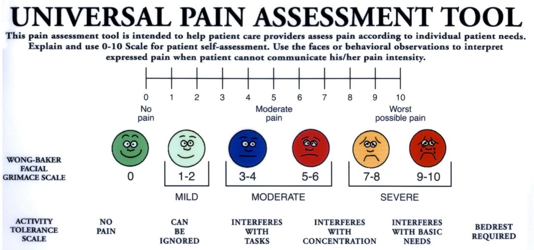
    2. Emotion: each test participant rates their emotion using the product using a standard measure of feeling like the Wong-Baker Facial Grimace Scale. If the total score of the seven participants exceeds 25 the product fails the test.

Wong-Baker Facial Grimace Scale

* How do we determine the maximum allowable time? I haven’t figured that out yet.

How To Get More Responsibility

Advice from Scott Berkun on the PM Clinic list:

…as a general rule:

1. Do good work
2. Show good work to people who have power to give you more responsibility
3. Ask for more responsibility
4. If told NO, ask what you need to do to get more responsibility
5. Repeat

Published
Categorized as Process

Social Media as a Product Testing Audience (e.g. for Motrin)

To catch you up, Motrin posted the below ad and people, particularly baby-carrying mothers, were so offended that the makers of Motrin pulled the ad.

Many of the offended people (“Motrin Moms” there were dubbed) were on Twitter, as well as blogs and YouTube. As a result, marketers are starting to get scared of social media, just as social media is taking off as a legitimate communications approach.

But another way of looking at it is, better the Motrin ad underwent a social media firestorm than a mass media firestorm.

New Article on Concept Design Tools

The nice folks at Digital Web Magazine published my new article on Concept Design Tools. It’s already received some nice reviews in the Twitterverse…

For those of you who haven’t seen Victor Lombardi’s new article on concept design tools, it’s a must read…

…it’s brilliant stuff and super accessible. It’s great to see solid thinking around the topic. There isn’t enough of it.

…great article on concept design!!!!

Here’s some reactions from bloggers I keep hearing over and over, confirming why I think this topic is important for digital designers. Steven Clark asks, Where is the breadth of our design?

where is our design process preceding the implementation phase? The moment we receive the brief we’re practically falling over ourselves to push forward, and implementation seems to go on at the same time that we’re figuring out what the product should do. This is as applicable to web solutions as to applications, we jump in boots and all with predetermined assumptions.

And Martin Belam writes

One strong theme that came out of it for me personally though was that, unlike industrial designers, when we make web applications and sites we tend to rush to wireframes and ‘colouring in’ before we have explored multiple potential solutions. Victor’s championing of questioning the brief looked like a good way to try and break out of that vice.

Since writing it I’ve already discovered similar work that’s been done over the past several decades. My approach is different in that the tools are simple and fast enough for any designer to use without having to learn a lot about method, but I will be spending some time with the masters to learn how I can climb onto their shoulders.

selective memory design concept tool

Small Project Management Things I Want to Remember to Do For Every Project

  1. Keep status meetings to .5 hour, but do them every week
  2. Establish a natural way for the team to share what everyone is doing — eating together, or tasks we all do together — while protecting personal time to think and work individually
  3. Set up a team mailing list and liberally copy everyone on everything; make it easy to filter
  4. Have one place for everyone to go to see what is the next action
  5. Folders to set up
  6. – 1. Discover
    – 2. Define
    – 3. Design
    – 4. Develop
    – 5. Deploy

    – archive
    – assets
    – financial
    – project management
    — agendas
    — status reports
    — proposals & SOWs

  7. For important meetings, supply each member of the team with
  8. – explicitly stated objectives
    – the agenda
    – a list of attendees and their roles
    – maps and necessary logistics
    – a list of tasks needed to prep for the meeting

Published
Categorized as Process

A Schedule for Planning a Presentation

I tend to think and think and think and think and, at the last minute, throw together slides that represent what I want to say. This time I resolved to be more prepared. Here’s my deadlines:

  1. Aug 29 – Make schedule; list all potential points I could make; filter points to ones I should make
  2. Sept 3 – Outline talk
  3. Sept 6 – Collect/make audio/visuals
  4. Sept 13 – Complete draft of presentation
  5. Sept 19 – Revise draft
  6. Sept 21 – Rehearse presentation
  7. Sept 22 – Leave for Amsterdam

In reality, the outline talk and collect/make audio/visuals steps are happening together, which is feeling like a nice way to craft my story for a conference. Establishing intermittent deadlines gets my ass motivated, and knowing I have time to iterate assures me I can get the quality to where I want it.

See also How To Tell A Story.

Using Real Options to Value Design Concepts

The common way that financial people will judge the potential value of a project, or a design concept representing a potential future concept, is by building a model, usually a discounted cash flow model like Net Present Value (NPV). The calculation essentially asks, if we do this project and gain the profit we think we’ll gain, how much is it worth to us right now? That way we can compare it against our other options.

The problem with these models is that they assume the world doesn’t change. The model tries to predict everything that will happen in the project from beginning to end in order to arrive at a single numerical value. But in the technology world, there’s lots of change.

So peeps at the forward edge of product and service development have started using real options to value projects. Real options essentially breaks the project down into a series of decisions. At each decision point a number of outcomes can occur, and for each outcome there’s a probability it will occur. There’s also a revenue associated with each outcome that we receive if it occurs. By multiplying the probability by the revenue we get the value of the option.

This is often illustrated using a decision tree, as with this analysis of a drug in clinical trials

What’s the big deal? It turns out this is a better way to value investments in Internet services for at least three reasons I can think of off-hand…

  1. Versioning: The Web 2.0 way of doing things is to release our work in stages, the public beta being a perfect example. If the beta is a big fail, we stop there and cut our losses, or we go down a different path of the decision tree.
  2. Uncertainty: There’s a great deal of uncertainty in our work. Twitter, for example, is a big success, but at the cost of a very tricky technical challenge. Instead of an NPV model that would judge the value of the project to be either simply negative or positive, we can model this reality of “large audience / technologically expensive.”
  3. Fast Risk Management: The ease of building betas makes it tempting to skip a big financial modeling activity, especially if it can’t accurately reflect (i.e. predict) how customers will react. Creating at least a simple real options analysis can save a lot of investment before building a beta that is hard to emotionally trash once it’s built. And while it’s tempting to say predictions are impossible so we should just run a trial, few managers with any P&L responsibility will invest in that.

Real options isn’t a perfect technique, however. Proponents claim it supports decisions with “mathematical certainty,” but the probabilities are derived from managers’ experience and judgment which is subjective and imperfect. Getting a group of people to agree on the probabilities may be difficult, and once a project is up and running a team may be unwilling to revise their estimates downward to reflect new information, much less kill their own project. Still, for the kind of work we do it’s better than the old ways.

References:

Two Things Design Experts Do That Novices Don’t

In my research on concept design processes, I’ve come across two ideas that jumped out as vital behavior that differentiates expert designers from novices.

The first comes from Nigel Cross of Open University, UK, who seems to have studied designers and their processes more than anyone I’ve come across. In his Expertise in Design (pdf) he says (emphasis mine)…

Novice behaviour is usually associated with a ‘depth-first’ approach to problem solving, i.e. sequentially identifying and exploring sub-solutions in depth, whereas the strategies of experts are usually regarded as being predominantly top-down and breadth-first approaches.

While the protocol studies he cites contradict this, when it comes to digital design I find this explains why I see so little concept design these days. Both product developers and designers have a tendency to jump on the first great idea they generate and head down one path, instead of patiently exploring the space of possible solutions. The pain is only felt far down the line when development makes it obvious what doesn’t work and what could have been.

The other big idea comes from How Designers Work, Henrik Gedenryd’s Ph.D dissertation. In the third section (pdf), he observes how designers go about defining the problem to be solved, the most difficult part of the project. How the problem is defined can determine the success of the succeeding design task…

…the two contrasting attitudes make the whole difference between frustration and progress: Quist literally makes his problem solvable, whereas Petra finds herself stuck. The bottom line is that Quist who is the “expert” is acting as a pragmatist, whereas Petra, the “novice”, acts as a realist. And as we have seen, this accounts for a great deal of his superior performance. The choice of either position is not merely a matter of ideology, but has important consequences.

In short, experts are pragmatists, they re-set or re-frame the problem to make it solvable. Novices are realists, they take the problem as a given and get stuck.

Woulda, shoulda, coulda. Didn’t. (The Failure to Beta Test)

Monitor110 was a business/site that tried to filter information for institutional investors. This post mortem from a founder probably won’t reveal any new lessons, but it’s always powerful to see theory — in this case the value of the beta release — played out in the form of failure…

…By mid-2005 the system worked, but spam was becoming more prevalent and caused the matching results to deteriorate, e.g., too much junk clogging the output. Around the same time we started to dig into natural language processing and the statistical processing of text, thinking that this might be a better way to address the spam issue and to get more targeted, relevant results. This prompted us to not push version 1.0, instead wanting to see if we could come up with a more powerful release using NLP to mark the kick-off. In retrospect, this was a big mistake. Mistake #5, to be precise. We should have gotten it out there, been kicked in the head by tough customers, and iterated like crazy to address their needs. Woulda, shoulda, coulda. Didn’t.

We talked about “release early/release often,” but were scared of looking like idiots in front of major Wall Street and hedge fund clients.

Published
Categorized as Evolve

Bruce Hannah on Prototyping

I’m back from Overlap 08 which is becoming my reliable annual inspiration for all things professional. It will surely fuel more thoughts here, but I wanted to capture one thing Deb Johnson said that Bruce Hannah taught her in design school:

Mock it up before you fuck it up.

The profanity I think is not just him being glib but actually justified in most cases.

Published
Categorized as Evolve