Concept Design: Name the Baby!

When you create a product or service concept, you should give it a name. Sounds like a no-duh idea, but in the heat of the moment we forget to do this. Sometimes…

  • we give them numbers or letters. “You see the change in materiality here in concept 2…” or “Clearly Concept C is a total paradigm shift…” But this kinda sucks. It’s hard to remember how the concepts map to numbers or letters, and that makes it hard for people to reference the concept. “Um, you know, I think it was the second one, the one with the thingie…” And if people can’t reference it, they can’t talk about it, much less buy it.
  • we only have one concept, so we name it after ourselves.Our idea is to…” or “The Bixby Canyon Software System, from Bixby Canyon Inc., gives your plants just the right amount of water…” This feels good at first because you can publicize your company and concept name at the same time, and it avoids those messy, expensive naming exercises. But it falls apart when concepts grow up into products. Say when…
    1. you want to change the product or the product name, but people keep referring to it by your company name. You’re stuck, or you change it and risk lose brand recognition.
    2. you introduce a second product which means you now need three names, two product names and a company name, that need different identities. For a long time Symantec was synonymous with anti-virus software, and they had to work hard to be a company known for more than that.

An exception is when you (intentionally or not) have a naming system. Let’s say your company and your first product name is Super Fantastic. When the next product arrives, you name it Super Amazing, then Super Stupendous, and so on.

Just as you wouldn’t have a baby (or a company) without naming it, don’t birth a concept without naming it either.

Two Things Design Experts Do That Novices Don’t

In my research on concept design processes, I’ve come across two ideas that jumped out as vital behavior that differentiates expert designers from novices.

The first comes from Nigel Cross of Open University, UK, who seems to have studied designers and their processes more than anyone I’ve come across. In his Expertise in Design (pdf) he says (emphasis mine)…

Novice behaviour is usually associated with a ‘depth-first’ approach to problem solving, i.e. sequentially identifying and exploring sub-solutions in depth, whereas the strategies of experts are usually regarded as being predominantly top-down and breadth-first approaches.

While the protocol studies he cites contradict this, when it comes to digital design I find this explains why I see so little concept design these days. Both product developers and designers have a tendency to jump on the first great idea they generate and head down one path, instead of patiently exploring the space of possible solutions. The pain is only felt far down the line when development makes it obvious what doesn’t work and what could have been.

The other big idea comes from How Designers Work, Henrik Gedenryd’s Ph.D dissertation. In the third section (pdf), he observes how designers go about defining the problem to be solved, the most difficult part of the project. How the problem is defined can determine the success of the succeeding design task…

…the two contrasting attitudes make the whole difference between frustration and progress: Quist literally makes his problem solvable, whereas Petra finds herself stuck. The bottom line is that Quist who is the “expert” is acting as a pragmatist, whereas Petra, the “novice”, acts as a realist. And as we have seen, this accounts for a great deal of his superior performance. The choice of either position is not merely a matter of ideology, but has important consequences.

In short, experts are pragmatists, they re-set or re-frame the problem to make it solvable. Novices are realists, they take the problem as a given and get stuck.

Maybe I’m Providing a Better Education than Ohio University

Someone just brought it to my attention that a student named Feng Xia who received a Master of Science degree in Electrical Engineering from Ohio University in 1998 did so with a thesis paper that steals from others’ works, including my master’s thesis. It’s so bad, that after cobbling together various works, Feng couldn’t be bothered to normalize the citation format, or even make the number of citations match the number of references listed.

Yet, this made it past the thesis committee.

Why bring it up? One, because if Ohio University doesn’t take the ethical path here I’d like the Internet archive to show what happened.

Two, I want to gloat a little that large established institutions with extensive accreditations don’t necessarily provide any better quality — and sometimes much, much worse — than my little Smart Experience.

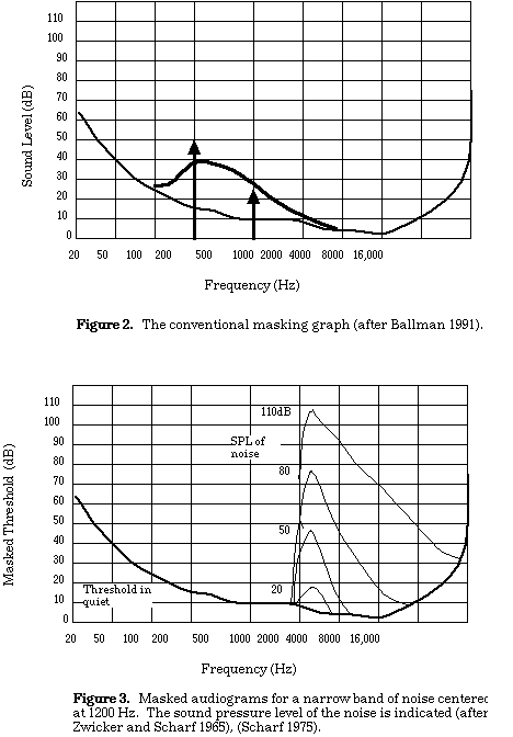
Just for decoration, here’s some graphs from my thesis I drew by hand circa 1994, probably in MacDraw, with proper references.

Published
Categorized as Teaching

Woulda, shoulda, coulda. Didn’t. (The Failure to Beta Test)

Monitor110 was a business/site that tried to filter information for institutional investors. This post mortem from a founder probably won’t reveal any new lessons, but it’s always powerful to see theory — in this case the value of the beta release — played out in the form of failure…

…By mid-2005 the system worked, but spam was becoming more prevalent and caused the matching results to deteriorate, e.g., too much junk clogging the output. Around the same time we started to dig into natural language processing and the statistical processing of text, thinking that this might be a better way to address the spam issue and to get more targeted, relevant results. This prompted us to not push version 1.0, instead wanting to see if we could come up with a more powerful release using NLP to mark the kick-off. In retrospect, this was a big mistake. Mistake #5, to be precise. We should have gotten it out there, been kicked in the head by tough customers, and iterated like crazy to address their needs. Woulda, shoulda, coulda. Didn’t.

We talked about “release early/release often,” but were scared of looking like idiots in front of major Wall Street and hedge fund clients.

Published
Categorized as Evolve

How To Tell A Story

I remember the first time someone impressed upon me the usefulness of storytelling. Back in 2000 a researcher came to Razorfish to study how we worked in order to improve our knowledge sharing. He told me how Secret Service agents studied storytelling so that, if they suddenly found themselves in the back of a car with the President for 5-minutes, they could quickly summarize all the pertinent facts about a situation in a format that was more likely to be absorbed.

And now, eight years later, I’m finally getting around to working on my storytelling skills. Barry McWilliams wrote a great set of guidelines for storytelling in his Effective Storytelling: A manual for beginners

Characteristics of a good story:

  • A single theme, clearly defined
  • A well developed plot
  • Style: vivid word pictures, pleasing sounds and rhythm
  • Characterization
  • Faithful to source
  • Dramatic appeal
  • Appropriateness to listeners

Adapting to our audiences:

  1. Take the story as close to them as you can.
  2. Keep it brief and simple
  3. Stimulate their senses so they feel, smell, touch and listen and see vivid pictures.
  4. Describe the characters and settings, and help them sympathize with the character’s feelings.
  5. Aim your story at the less experienced when telling to a mixed audience

Smart Experience Video Tutorials

In my time spent at consulting firms, client sites, teaching, etc. I see a need for more just-in-time design education. No formal program can keep up with the rate of change in digital design. People need on-demand materials they can use during their work day in-between tasks. The materials currently addressing this need leave a lot to be desired. They’re either canned presentations, unwieldy classroom-in-a-box applications, or simply too long and boring to fit into anyone’s busy schedule.

Here’s a short preview of a service I’ll be launching at Smart Experience to try and address this need. They’re short, inexpensive videos to teach design skills. This one is on the rather fundamental topic of direct manipulation, but I plan to cover design in the widest sense.

I’m happy with what I have as a first pass, but it clearly needs iteration. I’d love to hear what you think. If you wanted to build this sort of skill, would you pay for a 20 minute video on this topic that you could watch online or download any time you like?

Creative Commons: Good for Nature

At Overlap 08 this past weekend we talked a lot about sustainability in all its forms, including sustaining nature. This was on my mind this morning as I cycled over the Brooklyn Bridge and saw a small video crew capturing some footage of the bridge. Surely, I thought, there’s so much footage of this bridge already, you hardly need more. But of course they do need their own shots since most of the existing video is copyright protected. So crews all over the world today are traveling and otherwise consuming resources to recreate what was created yesterday.

Creative Commons is the legal infrastructure to change all that, helping us share all our media which gives us no competitive advantage, such as video footage of the Brooklyn Bridge. I’ve been sharing and using creative commons media for my work, and it occurred to me this morning that CC not only makes media available for everyone’s use, it encourages reuse which is one of the better ways to preserve our natural environment.

Put simply, reusing existing media is a more environmentally sound approach than creating media.

Lifehacker has a great list of 6 ways to find reusable media.

creative commons logo

Bruce Hannah on Prototyping

I’m back from Overlap 08 which is becoming my reliable annual inspiration for all things professional. It will surely fuel more thoughts here, but I wanted to capture one thing Deb Johnson said that Bruce Hannah taught her in design school:

Mock it up before you fuck it up.

The profanity I think is not just him being glib but actually justified in most cases.

Published
Categorized as Evolve

Google Labs Embedded in Gmail

I think a lot about how organizations and their products evolve quickly rather than remain static, and Google Labs are a prime example of that. By developing many alpha products, releasing several public betas, and getting live feedback they use the market to tell them what works. For many companies the notion of releasing your proprietary ideas is very scary, and yet the effect is the opposite: risk management.

A colleague just gave me a heads up to the Labs section of Gmail (accessible from Settings). It’s interesting for a few reasons:

  1. They’ve turned the labs upside down, embedding experimental ideas as preferences in an application rather than silo’d sites.
  2. Each feature is attributed to the employee(s) who invented it, acknowledging that great experiments often originate with one person, even if it takes a company to implement it.
  3. Some of the features — like “mouse gestures” which lets you navigate conversations by moving the mouse — innovate at the user interface level.

Gmail Labs

Design Thinking to Finance Skyscapers

In her comment to my post on the recent HBR article on design thinking, my friend HK writes, “What the article is missing is some concrete examples — what do designers do at strategic phases of projects, when the problems they’re solving aren’t explicit design problems?” She goes on to describe three of her own examples.

I suspect it’s both very hard and very easy to show examples. Very hard because applying creativity to what are normally analytical activities is a design problem in itself. I’ve found that inventing even rudimentary tools is hard. It’s reinventing how we’ve done business for hundreds of years, and it’s going to take years to build a more creative practice as reliable as our current methods.

But finding examples of design thinking applied to business problems is also easy, there are examples all around us. Financial deals can be quite complex and structuring one requires creativity. I was reminded of this last night while reading Adam Gopnik’s Through the Children’s Gate, stories about living in New York. In one scene he tours midtown Manhattan with a property tycoon…

It was a cold, crisp fall day, and as we looked at all the great glass skyscrapers of Park Avenue — the Seagram Building and Lever House and the Citicorp Center — he unraveled for me the complicated secrets of their financing and construction: how this one depended on a federal bond, and this one on a legendary thirteen-year lease with a balloon payment, and this one on the unreal (and unprofitable) munificence of a single liquor baron and his daughter…

We can imagine the sort of creativity needed to solve a problem like financing a building costing hundreds of millions of dollars involving several parties, credit instruments, commitments over time, tax structure, and so on. I’d like to know if anyone in finance is studying these deals as creative activities to help us understand how to design them better (and if traditional designers will be interested in this sort of design!).

Dan Hill on the Monocle Site Design

Monocle, as a business, a magazine, and a website, is an interesting story. I’m not sure how well the business fares, but it’s been around long enough and the content is growing in quantity and richness that it seems the affairs are in order.

Dan Hill recently posted about his work on the design of the site. The design reflects their strategy, which in a word could be summed up as bespoke. They’re differentiating on quality of a hand-crafted nature. While everyone else is installing white label social media packages, aggregating content from all over, and throwing features at the readers’ overwhelmed wall of attention, Monocle redoubled efforts to create a beautiful layout, professional writing and production, and a brand strong enough to extend into physical products.

Here’s a few of Dan’s notes that stood out for me:

  • Monocle was conceived as a multi-platform brand from the start.
  • We wanted to make Monocle a journalism brand that you had a weekly relationship with via the internet, as well as the monthly relationship via the magazine. Ultimately, this should be daily, if aspirations come to fruition.
  • I knew from the BBC that getting the broadcasts into iTunes would be the thing that really extended the viewership of the programmes… we waited until we had a critical mass of content before entering iTunes, with a podcast of all the programmes.
  • We’d seen many other broadcast news outlets appear to be getting ever more parochial, and produce editorial with lower quality (…the apparent step forward of journalists filing video reports via their mobile phone is often merely a cost-cutting exercise, and a step backwards in reporting quality). …we wanted to raise the bar in online video: to shoot things in high quality – we have our own Panasonic AG-HVX200 HD cameras and Mac Pro-based Final Cut Pro editing stations – and edit and encode professionally, embedding on the page in 16:9 ratio, to subtly give a sense of high quality broadcast.
  • I’ve conceived the video player… doubling up from it’s smallest size (470px to 960px) and then capable of going full-screen in the downloaded mp4 mode… We encode our programmes twice – once in Flash (using Sorensen Squeeze) for inclusion on the website, both in ‘lean-forward’ mode as embedded on the page, and in ‘lean-back’ mode when the user hits the double-size button; and then again in downloadable .mp4 files, which are encoded at the highest possible quality settings for iPod/iPhone.
  • Critically, we wanted to ensure that the sound is recorded correctly, so we used broadcast facilities in central London… before converting a space in the Marylebone Monocle HQ into a voiceover booth… Many other players have clearly not thought enough about sound…
  • Creating the right office/studio environment was also key… The centre-piece of the office is a large wall on which the issue emerges bit by bit, as useful for us commissioning video content alongside as for talking people through the brand.
  • Monocle's layout wall

HBR Finally Runs Their Design Thinking Article

Tim Brown Those of us following the dissemination of the design thinking meme were wondering if and when the Harvard Business Review would jump on board, and the waiting is over. In the June 2008 issue there’s an overview article courtesy of IDEO’s Tim Brown, a logical choice. He makes some key points while sidestepping unnecessary hype. Examples:

  • His cases include Coasting bicycles, Kaiser Permanente nursing shift changes, and the Aravind Eye Care System. But he wraps the piece with a comparison to Thomas Edison:
  • The lightbulb is most often thought of as his signature invention, but Edison understood that the bulb was little more than a parlor trick without a system of electric power generation and transmission to make it truly useful. So he created that, too. Thus Edison’s genius lay in his ability to conceive of a fully developed marketplace, not simply a discrete device… Edison wasn’t a narrowly specialized scientist but a broad generalist with a shrewd business sense… Innovation is hard work; Edison made it a profession that blended art, craft, science, business savvy, and an astute understanding of customers and markets.

  • Design applied downstream is tactical, design applied upstream is strategic.
  • The importance of a human-centered approach
  • Brainstorming and prototyping stand as examples for the array of possible techniques
  • Constraints as a springboard for creativity
  • Aesthetics are still important because they appeal to our emotions
  • As more of our needs our met, we crave better experiences

And so on. If you haven’t been introduced to design thinking, it’s a good place to start. If you have, it’s a good article to educate your clients.

Disruption From the Bottom Up: Flip

Flip Video I think it’s fair to say the $100 Flip video camera is a disruptive play. I’m not too surprised it didn’t come from Canon or Sony, but instead from a company who established their capabilities by building even cheaper cameras

Pure Digital started out, in 2002, making a digital version of the single-use “disposable” camera, sold through drugstores. The company’s research suggested that there might be a market for a similar product that took video images, and it created a one-time-use camcorder. But a number of consumers who liked the camcorder didn’t like the one-use limitation (and at least some of them figured out ways to skirt that limitation).

So when the first version of the Flip emerged in May 2007, its roots were in the point-and-shoot-camera world. That meant the company was far more conversant in how to make do with cheap components and keep prices down than in dreaming up the newest innovation that motivates the bleeding-edge camcorder freak.