Category: Interface Design


  • Wearable prototypes

    My wife is making a new dress for a party next month. Here’s a pic of her prototype. I love that her process resembles the basic design process: considering the desired experience, some research, investing in some materials/tools, building a prototype, testing it, marking it up, re-cutting it, testing it again, and is ready to produce the final version. All that in two evenings.

    Maybe next time I do a workshop, instead of staplers we can make clothing. Then wearing the work will be like trigger words, reminding the participants of the rapid prototyping process.


  • The unhidden value in Netflix

    Karl, in The hidden value in Netflix, points out that Netflix has… 345 Million movie ratings… Netflix gains a valuable resource that is hard to duplicate, that is almost the dictionary definition of a “strategic resource”, or a resource that can lead to a sustainable competitive advantage.

    Now Netflix is going beyond recommendations in using those ratings, combining them with its social network and other data already licensed…


  • If you like coffee you might also like…

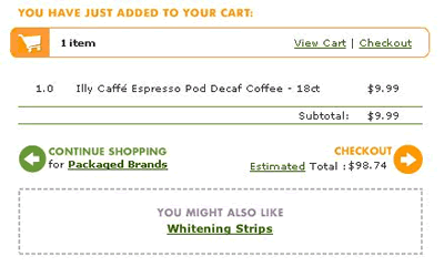
    I was talking to a manager at one of the big ecommerce websites recently and she predicted that collaborative filtering is reaching the apex of usefulness. The below recommendation from Fresh Direct had me laughing at their clever suggestion. Are customer behavior and needs just as much if not more important than purchasing patterns in making recommendations?


  • Information Esthetics lecture series in NYC

    A group calling themselves Information Esthetics have formed to examine “making data meaningful” with an expansive view on how that happens. They plan a promising lecture series including folks like Judith Donath and Bill Buxton which will be right around the corner from my office and cost a whopping $3. Bless them.


  • Flickr tag: cardreader


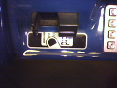
    NYC Subway metrocard slots

    Mike Lee sparked my interest in observing how many different ways designers tell us to insert a card into a machine. It’s interesting 1) because there are so many different ways, and 2) because many are confusing in that fascinating why-did-they-do-it-that-way? way.

    If you’d like to contribute, just add the tag “cardreader” to your pics.


  • Remember Quokka?

    I just discovered the work of Mark Allen Nakamura who designed some of the old Quokka Sports site, still one of the most daring and bold layouts to appear on a mainstream site.


  • Interaction design talk in NYC

    David Heller will be giving a free talk at the Parsons Design Lab this Thursday:

    What is Interaction Design (IxD)? Placing IxD in the context of Product Design and User Experience (UX) Design
    7pm
    Parsons Design Lab
    55 W. 13th St., 9th Floor
    NYC


  • Wider is better

    Someday in the not-too-distant future I will start pestering you all with urges to start leveraging auditory interfaces. But first I’ll pester you with the potential for horizontal scrolling. It seems quite useful on-screen, and those who are doing it now benefit from the novelty factor. One example is the current version of Ftrain.com, as if Paul’s writing wasn’t compelling enough, and another is Kottke’s portfolio, as if his work samples weren’t compelling enough. Seen others that rock? Lemme know at victor (at) victorlombardi.com.

    Update: Owen deflates the novelty element, with good reason, and Nick sends us Shutterbug’s tour of the Sydney International Airport, a wonderful way to tell a story in pictures. As I scroll it feels like turning contiguous pages. If this could snap into detents the way we want the backslider to it could do wonders for children’s “books”.


  • Widgetopia

    I knew Christina was moving Widgetopia to Drupal, but I didn’t realize the community had already jumped onboard and was contributing widgets. This is turning into the definitive gallery space.


  • Equifax Opt-Out Language

    Privacy Policy and Opt Out: By clicking below you may exercise your right to instruct us not to provide your non-public personal information to non-affiliated third parties, except as permitted by law.

    [checkbox checked by default] I choose to opt out.

    Huh? They must not have had my 7th grade teacher who warned us against using multiple negatives. Yup, I’m sure that’s the reason.

    Here’s my attempt to interpret: ‘non-public personal information’ is simply ‘private personal information.’ ‘Non-affiliated’ should be redundant when modifying ‘third parties’ if we’re referring to an institution with special privileges to collect my credit history. When it comes to the default check status it comes down to their philosophy of business and how they regard their customers, but I know which way I, as their customer, would have it. So re-written it’s simply:

    [checkbox checked by default] Do not provide your private personal information to third parties, except as permitted by law.

    But I probably don’t provide them as much income as the endless list of businesses who query my history, so I don’t expect them to modify that option anytime soon.


  • OSAF’s Vista

    Andy Hertzfeld, of the original Macintosh team, writes about the prototype of Vista: a prototype for OSAF’s Networked Personal Information Manager. As a view into a development process that must integrate many different modules into one flexible interface it’s a must read.

    I’m also glad to see he landed somewhere that has a good chance of releasing a useful product.


  • Hyperlinking the Action Words

    On an independent record label (forgot which)…

    On Gleanings


  • Lisa/Macintosh Evolution

    Here’s some wonderful sketches of the Macintosh interface evolution that span back to the Lisa prototypes. Those system 6 and 7 screen shots get me all misty-eyed…I used to live and breathe Macintosh in those days. Funny that the Lisa had multitasking and protected memory in 1984, I wonder how that was left out of the Mac? Really, back in 1984, it wasn’t needed in a personal computer. Grafting a user interface onto a free version of Unix probably wouldn’t struck them as pretty damn strange back then.

    Thanks to Ben for the link.


  • Moving the Back Button

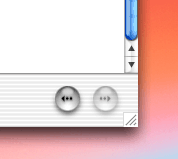
    Using the Help Viewer in Mac OS X I wondered in frustrated amazement that they didn’t include a back button to return to the search results list of documents. In fact, it is there, they just moved it from the top left to the bottom right…

    Which is the right place for it. The two most frequently used interface widgets are the scroll bar and the back button. Usually we browse a page and move the scroll bar to the botton right. If we don’t find what we’re looking for it’s the antithesis of efficiency to go to the opposite corner to use the back button. Moving such a commonly used button takes balls on Apple’s part, but it’s a small and important step to improving browser navigation.

    While we’re on the subject, the Help Viewer icon cracks me up…