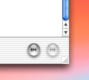
Using the Help Viewer in Mac OS X I wondered in frustrated amazement that they didn’t include a back button to return to the search results list of documents. In fact, it is there, they just moved it from the top left to the bottom right…

Which is the right place for it. The two most frequently used interface widgets are the scroll bar and the back button. Usually we browse a page and move the scroll bar to the botton right. If we don’t find what we’re looking for it’s the antithesis of efficiency to go to the opposite corner to use the back button. Moving such a commonly used button takes balls on Apple’s part, but it’s a small and important step to improving browser navigation.
While we’re on the subject, the Help Viewer icon cracks me up…