Category: Examples


  • Equifax Opt-Out Language

    Privacy Policy and Opt Out: By clicking below you may exercise your right to instruct us not to provide your non-public personal information to non-affiliated third parties, except as permitted by law.

    [checkbox checked by default] I choose to opt out.

    Huh? They must not have had my 7th grade teacher who warned us against using multiple negatives. Yup, I’m sure that’s the reason.

    Here’s my attempt to interpret: ‘non-public personal information’ is simply ‘private personal information.’ ‘Non-affiliated’ should be redundant when modifying ‘third parties’ if we’re referring to an institution with special privileges to collect my credit history. When it comes to the default check status it comes down to their philosophy of business and how they regard their customers, but I know which way I, as their customer, would have it. So re-written it’s simply:

    [checkbox checked by default] Do not provide your private personal information to third parties, except as permitted by law.

    But I probably don’t provide them as much income as the endless list of businesses who query my history, so I don’t expect them to modify that option anytime soon.


  • Hyperlinking the Action Words

    On an independent record label (forgot which)…

    On Gleanings


  • Lisa/Macintosh Evolution

    Here’s some wonderful sketches of the Macintosh interface evolution that span back to the Lisa prototypes. Those system 6 and 7 screen shots get me all misty-eyed…I used to live and breathe Macintosh in those days. Funny that the Lisa had multitasking and protected memory in 1984, I wonder how that was left out of the Mac? Really, back in 1984, it wasn’t needed in a personal computer. Grafting a user interface onto a free version of Unix probably wouldn’t struck them as pretty damn strange back then.

    Thanks to Ben for the link.


  • Moving the Back Button

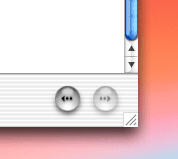
    Using the Help Viewer in Mac OS X I wondered in frustrated amazement that they didn’t include a back button to return to the search results list of documents. In fact, it is there, they just moved it from the top left to the bottom right…

    Which is the right place for it. The two most frequently used interface widgets are the scroll bar and the back button. Usually we browse a page and move the scroll bar to the botton right. If we don’t find what we’re looking for it’s the antithesis of efficiency to go to the opposite corner to use the back button. Moving such a commonly used button takes balls on Apple’s part, but it’s a small and important step to improving browser navigation.

    While we’re on the subject, the Help Viewer icon cracks me up…