Passwords Are Now Outdated

There’s a lot to be said about how to secure our online information while providing a good experience; hasn’t anyone written this book yet? In any case, I think a good, uncommon, guideline would be:

Do not use human memory

To remember and recall takes work, and I’d rather not expend my precious attention and cognition on computers. And, human memory is fallible. Most passwords break this guideline, but we now have biometrics and password managers to provide security without relying on memory and it’s time our security practices catch up to the technology.

Two-factor authentication, similarly, feels like a lazy, flawed approach which requires too much human work.

My Critique of the RGT Start Up Sound

In this video I listen to the sound as it’s used in real life, talk about what the sound is intended to accomplish, and then give it a sound score. And then I try to improve on it.

RGT is a great, freemium service that’s fun for cycling indoors. It connects to your bike and let’s you cycle through one of several virtual worlds along with other people. If you’ve heard of Zwift, it’s similar.

Why I Think Posture Makes the iPad Different

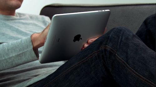
Of all the images to come out of the iPad announcement, the one struck me the most was less about the device and more about the experience of it:

iPad in Lounging Position

Lying back on the sofa — isn’t that a nice way to be?

And sitting or lying on the sofa with a 9.7 inch screen means we’ll typically hold this about 2 feet (.6 meter) away from our eyes, versus 1 foot with an iPhone, which means you can rest it on your lap. While some may buy the dock, putting the iPad on a surface means having to uncomfortably lean over it. I think lounging will be much more common. We can do this with a laptop, but the separation of output (display) and input (keyboard and trackpad) is disjointed in comparison. And the iPad will be a little awkward and heavy to hold aloft like a phone.

Consequently the mood while interacting with an iPad may be more relaxed. The interaction has the potential to be more passive, though not necessarily. We’ll make bigger gestures and pivot at the elbow and shoulder rather than the wrist. We’ll scroll/size less than on a phone, using more eye movement to scan the screen. And while Apple has had to succumb to menus to make more functions available, we have the potential for powerful new forms of direct manipulation.

As a designer I’m tempted to display more, denser visual content at one time that a person can sit back and absorb, and offer control with fewer, grander gestures.

Given the physical similarity, it’s tempting to look at the iPad and call it a big iPhone. But I think the posture we adopt and interaction with the device will make it an experience unlike a phone or a laptop.

Aside: how long until someone designs a lounge chair specifically for optimal iPad use?!

Play Literacy

…yes, that term sounds a little dumb, but it’s an idea I think will be important in the future. A deliberate spin on computer literacy, I think play will not only be important to designers to support creativity and innovation, it will be important simply to get along in an electronic world.

In the past I’ve argued that software tools will continue to be created much faster than we can possibly design quality interfaces for them. So consumers who can and are willing to play with a device to figure it out may be more successful.

I had this thought today while driving and navigating with the Google Maps iPhone app (I know, I know). The iPhone is slick, and the app is slick, but for so few functions it ain’t easy to use. But the slickness, the playfulness, of it all helps me overcome this. The desirability of the device and the experience make me want to overcome the usability. As designers, we can build playfulness in to help people, and, cynically, playfulness might be a sexier product development approach to sell than usability.

Update: Only tangentially related is how receive serious political ideas from comedians

In one “astounding half-hour” of television, Stewart viewers saw “more trenchant talk of the financial crisis and the responsibility of the networks than you’d find on any news channel, all the more surprising in that it aired on Comedy Central.”

Not surprising, really, in that comedians like Lenny Bruce did this long ago. It’s just another place where we like to coat our serious work with a bit a humor and fun to make it palatable.

When Engineering Defines the Limits of Design

I’ll get the plug part of this post out of the way right here: I worked on a preview of Bill Scott’s upcoming webinar on What Every Designer Should Know about Interface Engineering and I think it’s both very good and very important, and what’s more it’s a topic that I’ve never seen addressed outside project work.

I was reminded of this in a meeting the other day. We’re working through a Flex application that asynchronously queries the server with each criteria specified on a form, a little like what Kayak does, but with more data coming back from the server. Unfortunately the latency in that data transfer is simply too high, with too much customer time spent watching the spinning cursor. It’s unfortunate, because the design of the form itself (not mine) is clever, and I found myself thinking, “This is how Google would do it.” But the infrastructure in question is not as robust as Google’s infrastructure, and so the design needs to be modified to fit the latency of the system.

And this is the kind of situation that Bill refers to. When designers understand the limits and degree of difficulty in the technology needed to implement their designs, the designs are better.

No-Click is the New Click

I’m bummed I’ll miss Dan Saffer’s talk tonight on Tap is the New Click (though happy I’ll finally get to try Five Points as I take a client out to dinner).

But on that topic, I just came across some examples of interaction design that do away with the click altogether. It’s radical enough to require serious re-learning for most people, but a significant enough time-saver that some of these gestures will inevitably catch on.

http://www.dontclick.it/ is a fantastic experiment in click-less browser-based interaction

And there’s three similar concepts for swipe-based text entry out now:

Swype

Shapewriter

SlideIT

Smart Experience Video Tutorials

In my time spent at consulting firms, client sites, teaching, etc. I see a need for more just-in-time design education. No formal program can keep up with the rate of change in digital design. People need on-demand materials they can use during their work day in-between tasks. The materials currently addressing this need leave a lot to be desired. They’re either canned presentations, unwieldy classroom-in-a-box applications, or simply too long and boring to fit into anyone’s busy schedule.

Here’s a short preview of a service I’ll be launching at Smart Experience to try and address this need. They’re short, inexpensive videos to teach design skills. This one is on the rather fundamental topic of direct manipulation, but I plan to cover design in the widest sense.

I’m happy with what I have as a first pass, but it clearly needs iteration. I’d love to hear what you think. If you wanted to build this sort of skill, would you pay for a 20 minute video on this topic that you could watch online or download any time you like?

Pages and Direct Manipulation

Now that we have rich web interfaces and sufficient bandwidth there’s talk of the death of the web page. While that may happen someday, for now we’re on a gradual journey of using pages differently than we used to.

One difference is simply introducing more direct manipulation, such as clicking and/or dragging the pages themselves rather than a link representing the page. About four years ago I created a way to navigate web pages by moving them side-to-side

backslider

…one gesture the iPhone uses today.

iphone-slide.JPG

Some recent designs are using thumbnails to increase non-linear navigation performance, such as Issuu

issuu.GIF

…and AT&T’s Pogo browser.

No doubt these are some slick interfaces. But of course we’re relying on a visual thumbnail of a page to signal the meaning of what content is on that page. For relatively graphical web pages, that may be fine. For text pages, probably not. As they used to say at Apple, “a word is worth a thousand pictures.” Displaying a thumbnail and a word together could go a long way, at least until we kill the page.

Scrybe invite?

I’d love to check out Scrybe to try the innovative interaction design for myself. If you have a beta invite can you share?

Web 2.0 & Web 1.5

Have you ever upgraded software and then wish you hadn’t?

That’s the feeling I get sometimes when using the new generation of rich user interface websites. Many are great, though some seem to be going over-the-top in a play for attention. We made some great strides with Web 1.5, simplifying the UI and increasing text size and amount of white space. And these apps sometimes still perform better than their Web 2.0 contenders. I tried Yahoo’s beta mail for a while then switched back to the less finicky classic version. Renkoo seems to have so much potential as an Evite-killer, but the slick interface made it harder and more error-prone to create an invite, so I’m sticking with Goovite.

Until our design skills catch up with our technology, will we need to return to GOMS analysis?

Interaction Design as Language Design?

Marc Rettig, one of the most thoughtful practioners in the user experience world, will be in New York next month discussing Interaction Design is Language Design

…The notion of a “design language” has been with us for years, but if we take the idea seriously, perhaps ideas and frameworks from linguistics can help us design better interfaces. The goal of the topic is to create a grounded practice using the explored principles. The seminar is not meant to be a completed theory, but a work in progress that participants get to explore with Marc during the seminar and after on their own work.

Wearable prototypes

My wife is making a new dress for a party next month. Here’s a pic of her prototype. I love that her process resembles the basic design process: considering the desired experience, some research, investing in some materials/tools, building a prototype, testing it, marking it up, re-cutting it, testing it again, and is ready to produce the final version. All that in two evenings.

Maybe next time I do a workshop, instead of staplers we can make clothing. Then wearing the work will be like trigger words, reminding the participants of the rapid prototyping process.