I wish I could come up with product names like the Eureka 4885AT Whirlwind Omega Upright True Hepa Bagless Cyclonic Vacuum Cleaner.
-
Testing Second-Order Effects of Branding
Jared Spool offers some interesting advice when it comes to testing an institution’s branding:
Under the direction of Walt, Disney built the brand quality that they are ‘magical’. Adults interacting going to a Disney resort see the ‘magic’ in the design of their products, both in the direct interaction with the elements of the resort and with their children’s response to the elements.
Would a child ever tell you that Disney’s main quality is ‘magic’? Would an adult for that fact? Not without a lot of coaching or pressure.
To measure whether Disney’s site is ‘magical’, we’d need to measure the second-order effects of being magical. We’d need to talk about how a ‘magical’ site manifests itself — what happens when it is magical and when is it not magical?
For these types of qualities, first-order effects are often difficult to measure while second-order effects are easy. The only problem is: do you know what the second-order effects are?
-
Monday
Introducing Monday.
I can hear it now: ‘Monday we’ll meet with Monday…’
That PWC could pull a MarchFirst says to me either the management has as much taste in names as Accenture or that they’re really embracing new economy ways. Suddenly Razorfish doesn’t sound so ground-breaking anymore. We’ll have to push further out. Maybe Emmanuel, Shine, or Intestine.
-
girlwonder
girlwonder is looking fabulous with her new minimalist boxes-on-white design like, well, like me. Is white the new gray?
-
Audi Case Study
Jim Kalbach published his case study of the Audi.com and Audi.de sites. Highlights: GoLive for schematics, dynamic layout changing with browser width, and heavy usability testing of the non-conventional navigation.
-
Mozilla Help to the Rescue
Clicking a Link
Most web pages contain links you can click to move to other pages.
1. Move the pointer until it changes to a pointing finger. This happens whenever the pointer is over a link. Most links are underlined text, but buttons and pictures can also be links.
2. Click the link once. While the network locates the page that the link points to, status messages appear at the bottom of the window.
-
Attention Amazon Shoppers…
oh my, Amazon is trying their version of Blue Light Specials (communicating artificial exclusivity to generate demand). But just as with Kmart’s merchandise, it’s all crap. A George Foreman Rotisserie? Ugh.
-
Width
It’s a portrait design in a landscape world
-
Puerto Rican Day
It’s Puerto Rican Day in New York, complete with parade. I’m listening to West Side Story…
ROSALIA: When I will go back to San Juan.
ANITA: When you will shut up and get gone?
ROSALIA: Everyone there will give big cheer!
ANITA: Everyone there will have moved here!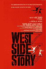
-
Library Science + Computer Science
The current social networks thinking is fascinating, and will only get better once more people dig into web services, and then the semantic web. It’s a little disconcerting, embarrasing even, that no IAs are at the forefront of these discussions. Isn’t that what we do, find interesting patterns in information and present them to people? It’s high time we start balancing our focus on library science with some attention to computer science. Or better yet combining the two to result in information architecture designs that haven’t been imagined yet.
When it comes to taxonomies/thesauri vs. ontologies as the organization scheme of the future, ontologies will win out because that’s what the computer science people are using. They control the implementation and therefore innovation on the Internet. IAs will just keep using what software is offered to us, unless we reduce our navel gazing and get into the programmer’s clubs. At least we can take encouragement in the fact that their interfaces still suck.
Kudos to Eric for outlining an implementation of social networks.
Update: Michael takes notice, and I hit on what Matt’s been thinking.
-
Web Design Books, Summer 2002
I just strolled through my local gigantic Barnes & Noble. I think I saw more computer books in one place than ever before. Some observations:
There are a surprising number of books on designing with usability in mind, which is reasuring.
There are plenty of general web design books, so many it must be hard for novices to choose among them.
The polar bear book was the only IA book on the shelves :( .
There are intermediate topics that aren’t addressed well. For example, Web Navigation was probably great when it came out, addressing a need of early web designers. But it’s out of print and, frankly (despite all the good things it has to say about my employer :), outdated. It sprung from a pre-Flash, pre-DHTML world and doesn’t do interaction design, much less all the innovations of Amazon, Google, and social networks. I’ve seen navigation done from a tech perspective, but I haven’t seen the ‘Interaction Design for the Web’ book, with a Shneiderman-like attention to human factors combined with a balanced look at navigation on the web.
I finally paged though Don’t Make Me Think. It’s awesome. Great thinking, great book design. I think I already know most of the lessons, but I might buy it anyway.
An aside: I keep expecting B&N to bridge their website and their stores by offering some sort of in-store kiosks. If I’m looking for a specific book, I’d like to do a quick search and find out if they have it and what section it’s in.
-
The Future of the Mobile Phone
Nils Rydbeck, former Ericsson phone designer and inventor of GSM outlines four different scenarios for the future of the mobile phone:
1. The phone contains everything that you have at home in your computer.
2. The phone becomes an entertainment and gaming device for youth, possibly with a display showing the person you’re talking to.
3. The phone carries everything that you have in your pocket.
4. The phone is just a phone.
He’s more inclined towards number 3.
-
1 + 1
Here’s a Philip Glass composition you can play yourself, as printed in Score: An Anthology of New Music (out of print I assume but probably findable in a university’s library):
Any table top is amplified by means of a contact mike, amplifier and speaker.
The player perfoms 1 + 1 by tapping the table top with his fingers or knuckles.
The following two rhythmic units are the building blocks of 1 + 1:
a) sixteenth note – sixteenth note – eighth note
b) eighth note
1+1 is realized by combining the above two units in continuous, regular arithmetic progressions.
The tempo is fast. The length is determined by the player.
-
Book Fair
Wow, so many great books being published. Peter stopped by the other night with an actual hardcopy prototype of his user-centered design book. Owen and other luminaries lay down the CSS goods. Wert and company cough up a tome on Usability. And Rebecca’s Blog book is out. Don’t go crying that you’re bored this summer.