The specific objective of the seminar is to assist participants to “see” the visual world more insightfully and to speak about it more articulately. By paving the way to design literacy, Design 101 prepares managers to lead energetically, articulately, and effectively in the dynamic dialogue now taking place at the intersection of management and design.
-
Design for Execs
-
JPG Magazine
From Heather and Derek: “JPG Magazine is for people who love imagemaking without attitude. It’s about the kind of photography you get when you love the moment more than the camera. It’s for photographers who, like us, have found themselves online, sharing their work, and would like to see that work in print.”
-
Parodies of office life
I tried watching The Office but not only didn’t find it funny, it was a little painful. I mean, office life, particularly in big companies, is actually like that, why go home and watch more of it?
On the other hand, I was happy to find Netflix carries The Newsroom, a parady that understands you need to go to lengths of realistic absurdity to be funny. This series, from the CBC, made an unfortunately short trip through public television a few years back, but is one of my personal favorites.
-
The State of IA in NYC
I’ll be on a NYC CHI panel this Thursday about The State of Information Architecture in NYC. Co-panelists are my friend Elliott Trice from Avenue A/Razorfish and Organic’s IA leader, Laurence Lipkin.
-
We like you, too
SFGate ran a great interview with David Neeleman, CEO of JetBlue. It’s an honest look at his failure in university, his Mormon upbringing, and his take on fundamental airline operations.
I recently noticed with delight their new ad campaign, We like you, too (contrast this with Google’s Do no evil. It’s a different stance that brings different results.). It’s a little cocky, but gets to the heart of what they want to do: make customers happy. And we hear this explicitly from Neeleman:
Let’s just treat people nice. Sometimes people don’t deserve to be treated nice. But let’s just do it anyway, because that’s just the way we want to do business. And so we talk a lot about that kind of stuff.
He extends this attitude toward employees too. He defends his anti-union stance by trying to treat employees better than a union would. Last year the profit sharing program resulted in 17% bonuses.
Link courtesy of Kottke.
-
Alexander and Eisenman
Katarxis reprints this wonderful 1982 debate between Christopher Alexander and Peter Eisenman, Contrasting Concepts of Harmony in Architecture. Here’s Alexander being snarky:
It’s very interesting to have this conversation. If this weren’t a public situation, I’d be tempted to get into this on a psychiatric level.
This whole issue of Katarxis feels like a Christopher Alexander issue, so if you’re a fan you’ll want to check out the rest.
Link courtesy of Design Observer.
-
Design is not art
…so says the Cooper-Hewitt, in their new exhibition “presenting virtually unknown designs from some of the most significant artists.” Why artists and not designers I’m not sure, but it looks like a good show. September 10 – February 27.
Link courtesy of MUG.
-
Build a CMS, go to heaven
Brian Alvey, speaking on a panel about CSS back at SXSW, asked, “Who’s building a CMS on these tools that spits out valid markup? Not many. A few. They’re going to heaven.”
Well, I don’t exactly believe in heaven, but to play it safe I wrote an article illustrating a few different ways you could integrate cascading style sheets with content management systems. The ideas came to me while I was working on a big Vignette-powered project, but the function is fairly easy to build in. The change is less about technology and more about organization and process: designers become empowered to improve the design through CSS as frequently and easily as authors change text.
It’s also just as useful on smaller systems, as demonstrated by Textpattern.
-
Hacking Congress
In this inaugural article of Paul Ford’s new column, Hacking Congress, he introduces his plan to create an RDF description of the U.S. federal government…
If you’ve been following Paul’s ideas for the semantic web, you can imagine the potential of this one.
-
Imagining the Aeron bed
Ulrike and I had a brief discussion about the thermal properties of our Tempur-Pedic mattress today (summary: great overall, but it seems somehow hotter in the summer than other mattresses) and I said for hot climates it’d be nice to have an Aeron bed. It would have a supporting mesh material that would let air circulate under your body. It would have to be stronger than a hammock and as soft as a mattress, perhaps by layering materials.
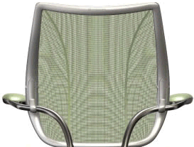
This didn’t seem unfeasible to me as I watch the progression of mesh support. First the Aeron…
Then adoption in other ways by other chairs, like my beloved Life…
And then Niels Diffrient upted the ante by joining separate pieces to provide support in a different way…”a limited stretch mesh pieced together like a shirt.” (See the Metropolis article)
But what really made me sit up and take notice was SaddleCo’s Flow Ti bike saddle. Mesh bike seats aren’t new — recumbants have had them for years — but in this case the saddle often has to support a person’s entire weight on two small areas that contact the cyclist’s sit bones, so it’s a higher-tech solution. In their words they use “tensioned elastomeric monofilament fabric mesh.” I think that means it’s really stong…

Given that all this evolved from the humble hammock, why not return to the hammock to make a tensioned elastomeric monofilament fabric mesh hammock, aka a warm climate mattress? Consumers are rabidly switching from springs to foam, so they may soon be ready for mesh.
-
IA Geek Weekend
I’m so looking forward to the Future of Information Architecture retreat. It’s two days of listening, talking, eating, drinking, walking through the woods and along the beach, with a little partying thrown in for good measure. I’ll be facilitating a session to create design patterns, a group exercise exploring how each of us approaches design management problems like sync’ing design change with business change and finding time to do research.
I think it’ll be a great time to flex the mind and the body, all without hurting the pocket (I found a roommate, so it’s only $221 for both days including three square meals a day). I’ve heard there’s still a few places left too, so all this can be yours.
-
Google! Don’t eat no babies
Paul Ford: The Banality of Google. I’d really like to excerpt the last paragraph here as he had me laughing so hard. But I don’t want to spoil it for you.
-
If you can find some craftsmen I’ll hire them
Just finished ready Tom Wolfe’s From Bauhaus to Our House, a wonderful, powerful critique of modern architecture. At one point he describes how the International Style was killing demand for craftmanship, replacing Beaux-Arts architecture with glass boxes.
…to those who complained that International Style buildings were cramped, had flimsy walls inside as well as out, and, in general, looked cheap, the knowing response was: “These days it’s too expensive to build in any other style.” But it was not too expensive, merely more expensive. The critical point was what people would or would not put up with aesthetically.
We can see parallels today in design. Once a product has been Wal-Mart’ed, people feel it should be had inexpensively. It requires reinventing the product (e.g. Oxo) to change people’s minds.
I have to wonder if the same will be true with relocated design and development (the term offshored doesn’t seem appropriate, since so much of it is enabled by place-less telecommunications). Will those that craft a visual design, that believe code is poetry, go the way of the bronzeurs, marble workers, and model makers once that work is made permanently inexpensive?
-
Coney Island integration
I live ten blocks from Madison Square Garden, site of the RNC. Starting a few days ago roads were blocked off, police are on every street corner, and helicopters hover overhead; it feels like martial rule. So on Sunday we escaped to Coney Island.
The beach wasn’t quite as crowded as in this 1940 photograph, but it wasn’t too far off. What struck me is the high level of integration: Russians and eastern europeans mix naturally with Latinos. They may not interact much, but they live together peacefully. This isn’t unusual in New York, but it’s a striking reminder when the multitude of nationalities in Manhattan is contrasted with just two, quite different, cultures sharing the same neighborhood.
I thought of this listening to news of yet more explosions in Israel, and the International Court of Justice ruling against the legality of the “separation wall.” How could such a giant lesson as the Berlin Wall be so boldly ignored? The myth that “good fences make good neighbors” makes for pithy politics but peaceful societies.