Month: October 2003

  • Shape of information, a summary

    Andrew Dillon’s work on digital genres, the web, and the shape of information is some of the most exciting research I’ve come across in the field of navigation. He has investigated how we can use our familiarity with genres to navigate, how navigation of information is different than navigation in physical space, and that creating navigation is essentially about creating meaning, not just road signs. And he manages to do this while retaining essentially a top-down perspective, not succumbing to a focus on merely organizing content. He doesn’t go as far as addressing larger user experience issues head on, but he positions his work in a way that acknowledges those issues.

    If you have access to JASIS past issues, a good starting point is Spatial-Semantics: How Users Derive Shape from Information Space (JASIS. 51(6):521­528, 2000). Otherwise download “It’s the journey and the destination” (PDF) where he questions the difference between navigation and content… ‘while physical navigation might be neatly divorced from the purpose of the journey, interactions with digital documents are not so easily divided. The purpose of moving though the information space is frequently the same purpose as the journey, to reach an end point of comprehension – and in this case the journey is the destination.’

    Here’s my short form raw notes, which aren’t necessarily helpful to anyone else until I do something with them…


    • Don’t misapply navigation from the physical domain to the semantic domain

    • User’s perceive “global” schemata (generally how sites work) and “instantiated” schemata (how this particular site works). This can be apply to ideas of design conventions.

    • The structure of a genre – the shape – is a global schemata. Users can predict ordering and grouping of elements. They know where a typical element belongs in the overall structure.

    • Examples of genres online might be articles, blog postings, email headers…

    • Need to leverage existing shape, and fit information into existing genres when possible.

    • Cites research (Snowberry et al) that menu navigation has (basically) bad scent. So these ideas are helpful when categories don’t work due to unfamiliarity with the domain.

    • Recognition of genre depends on experience and expertise of that genre. Integrate these attributes into user models.

    • Upon entering a new location, users will identify unique spatial configurations (Siegal and White, Mandles). Immediately after, semantic processing begins.

    • Shape is a property conveyed both by physical form and by information cotent

    • “Technology is more malleable that the user” – Amen!

    • Contrast expertise with differences in cognition (spatial ability or memory span). Also needs to be integrated into user models.

    • Disorientation occurs when short term memory (STM) is overloaded (by lack of good navigation)

    • Genre could be based on how a community uses information and varies by culture. Another attribute for user model.
  • New Books

    A new IA book, which isn’t so rare anymore, by Alan Gilchrist and crew: Information Architecture: Designing Information Environments for Purpose.

    Also, What is Web Design? by Nico McDonald. Never met him, but he seems like a smart guy. That title manages to stay short, on topic, and also target a audience with a certain expertise. It looks to be a treatise on process and organizations with several case studies.

  • Poor, defenseless little wireframes

    Liz pens a great piece on simplifying wireframes. Doing so definitely requires an understanding of your audience, knowing what your audience assumes and what has to be explicitly recorded. Physical architects had settled on conventions before leaving for CAD, and we will too.

    Riffing from there, Christina asks if we still need wireframes, and gets several interesting comments in response. I’ve felt the same way at times, getting frustrated with the disparity between wireframes and visual designs. But my opinion is yes, we do still need them. First because the entire span of Internet system design activities is difficult to do alone for a system of any significant size. Wireframes signal a useful point of division of labor among a team. While I’d love us to become auteurs – having a vision, drawing something beautiful, engineering the structure, designing the interior, creating the furniture – we can’t all be Frank Lloyd Wright, and even he had his draftsmen.

    Second, we as people need a simple way to model our ideas. We instinctively sketch on paper or on whiteboards to work out an idea, and wireframes serve this role well. While they sometimes strive to answer the question, ‘What is the design?’ they are only obligated to answer, ‘What is the structure?’

    Regarding what innies and outies are capable of, having made the move from consultant to in-house, I hope my experience of transferring structured design practices is not simply an isolated case but a trend of knowledge spreading through the industry.

  • Effective View Navigation

    If I were to edit a historical collection of essays on information architecture, it would have to include George FurnasEffective View Navigation (PDF). Published in 1997 and borrowing from earlier work that harks back to ’95, it is not to be read for new methods of navigation. It does however provide serious analysis of a fundamental information architecture challenge, ‘despite the vastness of an information structure, the views must be small, moving around must not take too many steps and the route to any target be must be discoverable.’ His focus is on what to do in that small view (i.e. a page, or a viewport of a page) including ideas that form the basis of information scent.

    For serious information architects, EVN is a must read. At eight ACM-style pages it’s not long but it is dense, requiring me to double-back often. His initial discussion of Efficient View Traversibility sets aside the user experience perspective in favor of graph theory and so can be a dense read to the practitioner, but it is necessary to his later arguments which are worth understanding.

    Here come the spoilers: after an interesting logical analysis of the problem he concedes that one navigation scheme – what we might call global navigation today – would be hard-pressed to provide access to a large information structure. Along the way he predicts the rise of a combination of global and local navigation.

    His ideas of efficient view traversibility provide (in my interpretation) a good mathematical explanation of creating short paths to target information and a helpful last resort after other methods fail, ‘always remember the strategy of putting a traversable infrastructure on an otherwise unruly information structure!‘ For example, as a last resort, stuff the information into a balanced tree. If we combine this with a user-centered design method, we might say, ‘If research of the users does not reveal a clear path to the information, and the users understand the domain enough to understand the meaning of a set of hierarchical categories, then stuff the information into a balanced tree.’ Other conclusions of his, combined with a design process, can yield a more systematic design method than what we have now (which is why I’m trudging through this stuff).

    His use of navigation requirements nicely frames his discussion, for example, ‘Every node must have good residue at every other node.‘ We rarely have such strict requirements in our designs, but the practice of using navigation requirements – falling somewhere between scenarios and screen designs – helps increase the likelihood of creating successful navigation.

    His setting aside of user experience considerations at times seems unworkable; the goal of efficiency can be at odds with what may be cognitively effective with users. But the thoughtful designer can factor that into the use of his ideas.

  • Move Upstream

    Bill Seitz reports on a talk by Tom PetersWhite Collar jobs are going to disappear over the next decade to the same degree that Blue Collar jobs did. It’s just a matter of who gets you: cheap labor from India, or a silicon wafer.

    I keep joking to friends that I’m going to work half-time from India so I can charge highly competitive rates and live like a king. It’s sounding less and less crazy.

  • Email + Website

    We usual IA suspects don’t write much about email and web integration (or streaming video, or some other neglected topics) but it’d be helpful. This is just a reminder to myself to see who has written about it.

    Some basic delivery options:

    • Text/RTF/HTML in email
    • Enclosure
    • Link to website

    Some basic criteria for deciding on the delivery option:

    • End user’s method of access to info
    • Immediacy of message desired
    • Resources required to produce
    • Integration with other (e.g. offline) aspects of user experience

    Incidentally, I just discovered Sippey and Arthur work for Quris, an email production company.

  • Introvolothanapolana

    Can I just say how much I like the name Plan B for the morning after pill? ‘Morning after‘ carries weird associations, and I respect the company for choosing a name that 1) reinforces that this is not a Plan A method of contraception, and 2) is not some abstract, invented, psuedo-Latin word. Nice work by the Women’s Capital Corporation.

  • IDEO’s Method Cards

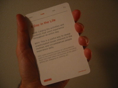
    I received my IDEO Method Cards, and they’re big, twice as big as your usual playing cards. The writing is good; short and sweet with funky photos on the reverse. The content isn’t earth shattering – each features a user research technique – but the format is quite handy and sure to stir up some new ideas at work.

    A coup for IDEO is how – as in this Fast Company article – they position what could be considered an advertisement as a confident revelation of their methodology. Clever.

  • Assembly Line Information

    One of those whoa things I find in search results and must go back and read later: Information on the Assembly Line: A Review of Information Design and Its Implications for Technical Communicators a master’s thesis by Jason Nichols. See, for example, chapter 8 where he compares info design schools of thought (Wurman vs. Redish).

    Incidentally, I’m so happy to see others publishing their master’s theses as websites.

  • Bush Refridgerator Poetry

    Make Your Own Bush Speech is a hilarious and well-executed piece of Flash.

  • Open House New York

    Open House New York is a city-wide celebration of New York City’s greatest architecture and design. New York City’s most intriguing buildings and sites will be open at scheduled times throughout our October 11-12 weekend event. Each site will offer different experiences, including self-guided and guided tours, informal talks and conversations with the designers…

  • Paris, New York

    The Parisian waitress at Le Gamin says, ‘I love Paris, and I love New York. If I had to choose, I think I would want Paris, but in America.

    Not likely. But isn’t that sweet?

  • Extra-Company Resource Management

    Walking down 87th St this morning I passed some construction workers hanging out on the sidewalk, as if they’re waiting for someone to pick them up for a job. This makes me think about new media workers…is there a reason we haven’t moved to a project-based model of employment like the movie industry uses, employing those who are just right for a particular product (does it suck?)? Would it be helpful to put a more flexible employment system in place?

    Imagine combining P2P or local RDF with resource management apps. Workers indicate their availability simply with a tag on their site or on a central site and then this info is aggregated and syndicated to anyone who wants to see it. Perhaps companies combine it with their internal systems to think more flexibly about how to staff a project.

    Lazy web, I summon thee!