Month: January 2001

  • Temptation


    With a Titanium G4 and a copy of Reason, I’d be unstoppable. But given the state of the Internet industry right now, I might be wise to save my pennies in case I end up jobless soon. Or do I spend money in order to make money? Yeah! That’s it…

  • Mutopia is free, legal sheet music. A longer description from the Scout Project:


    Modeling itself after Project Gutenberg, this volunteer project aims
    to make copyright-free musical scores available to everyone. Although
    copyright on a score expires 70 years after the composer’s death,
    music publishers retain copyright on their typeset editions. Thus,
    the only legal way to copy this music is to write it out or typeset
    it yourself and allow others to make copies. This is precisely what
    contributors to Mutopia have done. All music at the site has been
    typeset using GNU Lilypond and is available for download as .pdf,
    PostScript, or Lilypond .ly files. MIDI files and preview images of
    the scores are also provided. Visitors may browse the collection by a
    number of options, including composer, instrument, style, and last
    updated. Some sections are still somewhat thin, but interested users
    will certainly want to pay the site a visit and monitor its future
    development.

  • User interface designers of audio software seem to be doing the most interesting work around, even more adventerous than on the web. Take for example this emagic ES1 screen shot. It looks confusing at first because it’s unconventional, but (assuming you’re familiar with these functions from prior audio experience) you quickly understand how to operate everything – I can especially imagine grabbing these big blue arrows and adjusting them.


    Knobs still don’t map well to mouse movement though. Interestingly enough in this example they use an arc instead of what is usually adjusted via a knob, to good effect. And somewhat ironically they use knobs for a mutually-exclusive set of discrete options, which could just as easily appear as radio buttons (which they use elsewhere in the interface). I suspect they favored the esthetics and visual balance of the design just a tad too much, but show so many interesting ideas here.


    Steven Johnson’s Long Live Analog is an interesting look at the idea of modeling physical devices in on-screen interfaces for audio software.

  • The New York Times self-reflexively looks at its five years on the Web. Meanwhile, the home page has balloned to 60K of HTML plus at least 14 images, a slug even on my cable modem. They have officially crammed too much garbage on the home page.

  • There some innovative user interface ideas for reading on electronic devices at the lexiaProject Public GUI Initiative by Toby Braun.


  • Hi Owen!


    ;-)

  • sub rosa   \sub-ROH-zuh\   (adverb)
         : in confidence : secretly
    
    Example sentence:
         Several military leaders were meeting sub rosa, plotting to
    overthrow the king.
    

    Makes me think of last night’s West Wing episode (a great show, btw). I’m not usually a sap, but their appeal to patriotism and service gets me all choked up.

  • Woohoo, nice deliverables! (apologies to CarbonIQ, I pulled that page out of their frameset).

  • Once in a while I wonder back to WikiWikiWeb because the environment is so fascinating; so close to a true, unfettered combination of hypertext and community. But just now I became convinced WikiWikiWeb doesn’t have any actual content. It’s just an elaborately constructed collection of meta-content, always describing, teasing, instructing, guiding, but never yielding any actual stuff.


    Oh, there it is, like this gorgeous, Specialization Is For Insects
    post. Funny, the intro pages are one big silo, and the content pages are one big silo, and the RecentChanges page is a crosswalk between the two. If you get dropped (linked to) either silo you would think that’s the whole site.

  • Here’s a great summary of user interface book reviews. It makes so much sense that, with a list of books in one industry, all of which will have some interest to the reader, to put not only title, subject summary, and link in this list but to sum up the review. ‘Cause basically I’m in show-me-the-books-that-are-going-to-make-me-a-smarter-designer mode when I read this.

  • I just discovered a new interaction element in SoundJam for the Mac. I’m calling it the “column control”:

    Sound Jam Column Control.gif

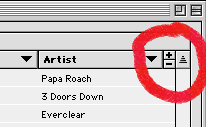
    Clicking the plus sign gives you one more column of information (like album, artist, time, date, size, etc.) and clicking the minus sign gives you one less. This is different than making the window bigger to expose more columns, which doesn’t happen; the window simply gets bigger. So you can have lots of columns in a compact space if you’re an information slut, or fewer columns for a minimalist approach. You can then change any column to display any category of information, and use the first column to sort by any of those categories.


    In other apps I’d think it was overkill, but in this case people may keep long lists of mp3s and may want a variety of ways to sort, view, and play them.


    The size of the controls, though small, is sufficient IMO since I don’t think people will be using this control often. It’s one of those things that could almost live in preferences, but some folks may want more frequent or immediate access to it. But it’s taken me months to even notice it, wonder if anyone else does?

  • What a great idea, Daisy Rock Girl Guitars.

  • Peter Morville’s take on the dot.com crash:


    Picture a long, dark tunnel with a light at the far end. Imagine a number of sheep in the tunnel. They are shuffling slowly forward through the tunnel. Suddenly, they begin moving from side to side, flying through the air and bouncing off the walls at almost the speed of light. Every few seconds, a sheep or two explodes into a brilliant ball of fire. It’s a fascinating spectacle but smells really bad. This is how I see the past year’s dot.com experience.

    OK, so I’m taking it out of context a bit so it’ll sound funnier. But it’s still a funky metaphor any way you spin it.

  • Challis Hodge, CEO of H A N N A H O D G E, has some wonderful thoughts on technology, such as this:


    My vision, or should I say hope, is that by 2003 we’ve created a
    people-centered world where the development and use of technology is based
    on human needs. We as designers and developers of technology based products
    and services need to stop thinking about how to make technology better fit
    into people’s lives and instead focus on real people’s needs and the
    solutions that would best fulfill them. I believe this also allows us to
    achieve parity between the goals of businesses and their customers and
    that’s just grand!

    …and I just discovered they have a blog with lots of juicy bits.