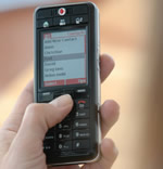
 Recently I met with some people visiting New York from one of the big electronics manufacturers in Japan. We were talking about market opportunities and I was lobbying for a super simple mobile phone, not realizing Vodafone’s new Simply mobile phone is that phone.
Designers, particularly the usability-focused variety, won’t have much trouble seeing the potential for this product, but that’s rarely how products get the green light. It’s helpful to see to how the Wall St. Journal describes it:
- Top-down market sizing was done. One data point is how the percentage of Europeans interested in non-voice mobile services decreases directly with age (can we give them a cheaper phone? can we make it easier to use these services?). Another shows saturation in under-40 Europeans (what do over-40’s want? why aren’t they buying?).
- A personal look, considering the case of Ann Ridley, 65, living in the UK who rarely gives out her mobile number and doesn’t even use it to store numbers because it’s too complicated. She spends less than $18 a year (would she spend more under different conditions?).
- How the CEO became convinced there was a market need and made it happen.
And the groupthink the CEO had to overcome to produce the phone was substantial. When requesting designs he received reactions from manufacturers “like I was from Mars” and younger Vodafone product managers kept trying to add features along the way. When it came time to develop the advertising, the CEO would show it to the product managers working on more advanced phones: “The more they hated it, the more we knew we were on the right track.”
It’s as if the CEO is a more thoughtful product manager than the product managers.
Customer research also played a role. Older customers were afraid to enter numbers in the phone and then lose it. They couldn’t adjust the volume. The designers made all the obvious design changes. But this design work was done after the company had already placed a bet on the opportunity.
Update: It’s the reverse of the RAZR story where the delivery teams had to get a working prototyping into the CEO’s hands before he saw the potential. But in both cases the CEO was key in deciding to get the product to market.
Comments
One response to “Vodafone’s Simply”
I’m convinced that most electronics could do well in a simplified format. Fax machines, microwave ovens, copy machines and other consumer things have just gotten too feature ridden and complicated. The problem I see is how to market a lack of features and simplicity as an asset…
I think the mobile phone example here may work, mainly because a land line phone is simple, and it provides a comparison point.