Good Design Can Make the Elevator Pitch Futile

I had a five-minute conversation with an angel investor last week and described the product I’m working on. His response: “Similar things are being done by bigger companies with giant marketing budgets, so you’ll need a very clever marketing idea to succeed. What is it?”

There was an uncomfortable pause. On one hand, I haven’t thought up any great marketing ideas yet and wondered if that was a hole in my plan. On the other hand, I was pretty sure this investor and I had very different perspectives on product development, but I didn’t have the language to succinctly express that gap.

I did understand what he meant. A few years ago I managed a large online dating service. We radically updated the design and added great features, but it was the online marketing that kept the revenue coming in. Why? I believe that while the design was good, the product wasn’t positioned to differentiate it from the competition. By contrast, if you design a product that’s different and more exciting than the competition, like the Anki DRIVE, there will be a lot more free media exposure and word of mouth to complement paid marketing.

My downfall, I think, is that I was trying to tell this investor about the product rather than show him. If my new and improved positioning is a result of product design, I need to show the product. For example, if I verbally described the Anki DRIVE as, “a racing game that combines an iOS app with physical race cars” that’s sounds mildly exciting. Watching the video is so much better…

What We Know About Failure So Far

I’m in the research phase of my book on customer experience product failures and I’m pleased to find several books on failure that will inform my work. I’m collecting them in a list on UX Zeitgeist: Oh Noes! Books About Failure. I’ll be adding reviews of each book I read. So far, Being Wrong is my favorite, Kathryn Schulz brings both philosophical rigor and great stories.

If you like the list, please Like it.

My Product as an Equation

One of the most important things I learned when becoming a product manager was being able to see my product as an equation. In the startup phase it’s easy, there’s just costs and they’re often tangible: people, hardware, software. Then you add marketing in various forms each with a different cost/revenue profile, then revenue streams and revenue sharing, then business overhead in myriad forms, and so on.

Developing a mental model of this equation (particularly the more volatile variables) and designing with that equation in mind is a fun part of managing a product. Maybe writing it down and posting it on the wall would be an educational tool for the team?

Another Readability Business Model

I’m a huge fan of the ‘old’ Readability — I hit a button which sucks out the content of a web page into a nicely formatted view, then I usually hit the Evernote button to save it for reading on my Macs or iPhone.

The Readability folks recently amp’d the feature into a business. They added the ‘read later’ function of Instapaper/Evernote, and most notably a subscription revenue model from which they pay 70% to the content creators or publishers to compensate them for the ads Readability sucked out.

There’s a lot I like here, from their reader-first philosophy to the fine folks they’ve chosen as advisors (a few are friends of mine). But I can’t help thinking it’s not going to work. My doubts:

  • They’re competing with ads. Large organizations that depend on ad revenue have huge investments in ad serving and tracking. Readability to asking publishers to give that up for what Readability gives them. 70% sounds generous, until you do the math and realize 70% of not much is not much (see They’re small below)
  • They’re competing with free in the form of their free Read Now offering, the open source version, and Evernote. And Evernote is very, very good.
  • They’re small, so besides the fact that what they pay publishers won’t be much, they haven’t revealed any way to scale to the size necessary to make a material difference in how the publishing industry works. They have an API for developers, but they need to focus on the publisher side of the equation.
  • They’re not giving publishers control. Sophisticated ad serving systems let publishers tweak ad buys based on calculations of page views, content costs, clicks, etc. Readability simply offers a set percentage. And Readability is hoping publishers will do the work of coming to the Readability site to sign up, just to get the deal Readability dictates.
  • The legality is questionable. If I’m an asshole publisher (you can be sure they exist) I only see someone who is stripping out my revenue stream as a threat to my livelihood, and I call my lawyers for their opinion. Chances are the big media houses have more lawyers than Readability.
  • 30% is expensive. Apple takes 30%, but has gorgeous devices and stores and the iTunes marketplace and credit card numbers galore. Publishers can bitch about Apple, but they offer a lot for their 30%. The value that Readability adds is small in comparison.

I could be wrong, there could be a huge infusion of this function into every reading tool. And once it gains a critical mass of readers the publishers get on board. But I don’t think the product is quite positioned for that yet. Here’s an alternate business model leading the same, and sometimes better customer experience:

Readability develops an ad network-facing API and partners with the biggest ad serving networks to integrate the API. When a publisher serves a page, the ad network checks the visitor’s machine for a cookie and if present serves a ‘clean’ page to Readability subscribers and a normal page to everyone else. The impression is recorded and Readability pays the ad network who in turn pays the publisher. In this model publishers don’t have to configure anything new and get paid automatically, the ad networks get paid and get a new revenue stream, Readability gets paid, and Readability subscribers get beautiful, clean pages often with zero clicks.

Why I Think Posture Makes the iPad Different

Of all the images to come out of the iPad announcement, the one struck me the most was less about the device and more about the experience of it:

iPad in Lounging Position

Lying back on the sofa — isn’t that a nice way to be?

And sitting or lying on the sofa with a 9.7 inch screen means we’ll typically hold this about 2 feet (.6 meter) away from our eyes, versus 1 foot with an iPhone, which means you can rest it on your lap. While some may buy the dock, putting the iPad on a surface means having to uncomfortably lean over it. I think lounging will be much more common. We can do this with a laptop, but the separation of output (display) and input (keyboard and trackpad) is disjointed in comparison. And the iPad will be a little awkward and heavy to hold aloft like a phone.

Consequently the mood while interacting with an iPad may be more relaxed. The interaction has the potential to be more passive, though not necessarily. We’ll make bigger gestures and pivot at the elbow and shoulder rather than the wrist. We’ll scroll/size less than on a phone, using more eye movement to scan the screen. And while Apple has had to succumb to menus to make more functions available, we have the potential for powerful new forms of direct manipulation.

As a designer I’m tempted to display more, denser visual content at one time that a person can sit back and absorb, and offer control with fewer, grander gestures.

Given the physical similarity, it’s tempting to look at the iPad and call it a big iPhone. But I think the posture we adopt and interaction with the device will make it an experience unlike a phone or a laptop.

Aside: how long until someone designs a lounge chair specifically for optimal iPad use?!

Democratized Design at BMW

At the end of the concept design phase you’ll need to select among the concepts you’ve developed, and there are various methods for doing so: customer feedback (e.g. desirability testing), a decision market, an executive decision, a vote, and so on. The last option, voting, becomes more interesting when you keep the designers anonymous to keep the focus of the decision on quality.

In the case of BMW and their new Z4 they arrived at this…

by anonymously choosing these designers…

Most people are surprised the male-dominated role of BMW auto design was awarded to two women. To me that’s a useful case study for using an anonymous competition for not only getting to the best design, but also breaking through cultural barriers to do so.

A Quantified Value of the iPod Design

This study — Who Captures Value in a Global Innovation System? The case of Apple’s iPod — is one of the best I’ve heard of in a long time. The researchers traced the parts and assembly of the iPod and attributed the value generated by each step by part and by country. A few key stats: of a $299 video iPod, Apple gets the largest piece of the pie: $80. The other portions are relatively small; China only gets $4 for assembly.

Hal Varian of the New York Times made this key observation about how Apple’s capabilities generate their benefits:

The real value of the iPod doesn’t lie in its parts or even in putting those parts together. The bulk of the iPod’s value is in the conception and design of the iPod. That is why Apple gets $80 for each of these video iPods it sells, which is by far the largest piece of value added in the entire supply chain.

Those clever folks at Apple figured out how to combine 451 mostly generic parts into a valuable product. They may not make the iPod, but they created it. In the end, that’s what really matters.

I’m encouraged by studies that highlight the value of concept design given my work in this area. Here’s a question for you: how would you most like to learn more about concept design: a book? videos? something else?

Dream Cars Meet Harsh Reality

That’s what Phil Patton at the New York Times thought about the concept cars at the Detroit Auto Show. In the article I found some insight as well as some assumptions we can toss out…

But this year, dark economic clouds seem to have cast a shadow even over the designers displaying their ideas at the Detroit auto show.

No question, the mood of the economy cannot be ignored in strategic design exercises. But then they go on to say…

Concept cars are expensive to build and budgets are tight.

Wrong. The way they are traditionally created are expensive design exercises: built to be actual working cars. But instead of an executive command to “only show sober, product development concepts” the executive command could have been “show cars that illustrate our strategic direction, continue to wow the audience, and spend 1/4 of what you usually spend.” Then the design staff has a meaty challenge. If the shape is the concept, they don’t need mechanical bits or even interiors, just dark windows. If the drive train is the concept, rip off the body. Concept cars are cool, but the practice of showing concept cars is now decades old and could use a little shaking up.

said Bryan Nesbitt, General Motors’ vice president for North American design. “You can no longer just throw a wild concept out there. You have to have a story.”

A concept that lacks a context is simply confusing. For instance, in 2004 Chrysler showed the ME Four-Twelve, a midengine supercar with a V-12 engine. Though it excited horsepower-hungry showgoers, it had no place in the company’s business plan and didn’t mesh with the image that the Chrysler brand was trying to project.

There’s an excellent insight, a concept that did not follow the constraint of strategic relevance or brand perception.

Mazda has drawn attention in recent years for some of the most provocative concept cars, but it did not display any concepts at all this year. Laurens van den Acker, general manager of Mazda’s design division, said that was because the company was now busy applying to production cars the themes it had developed in design studies.

That’s like saying, “We don’t have time to be strategic, our tactics are so good.” I bet that’s just rhetoric, and not showing concepts is just a money-saving action.

The article goes on to look at how the 1933 Auto Show helped companies discover how valuable concept cars could be, a good read.

Designing Better Proposal Price Tags

Not long I was talking to a project manager who was writing her first request for proposal, explaining the common wisdom on budget disclosure: “You’ll want to give them a ballpark idea of what your budget is without telling them your actual budget; agencies will sometimes configure the work to take all the money on the table.

But as I, with fresh eyes, watch her go through the proposal process, I do wonder if simply telling the agencies the budget wouldn’t be such a bad idea. Floating this idea on Twitter sparked these replies, mostly from peeps on the agency side:

“I always make them tell me the budget. If they can’t then I don’t send a proposal. That’s my tough love policy. Very few balk. I [tell them] we could propose $1M site, but its best that I know what the constraints are. 99% find it helpful.”

“It would certainly decrease wasted effort.”

“Absolutely! It would eliminate spinning our wheels too. Why waste the time proposing something they can’t afford?”

“I’ve worked at agencies where we lost jobs because we proposed too large a project. This could have solved it.”

“Agree…”

Money is a great constraint for spurring creativity. And if the same budget were disclosed to all agencies, the client can still compare the relative value of each proposal. The only drawback I can think of is if the budget is far out of alignment with the work requested, and if this is the case the client should be working with an expert outside resource to craft the RFP anyway.

(I’ll add this is specific to RFP situations. I still agree with the usual consultative selling advice to not talk about price until the very end of the sales process.)

Interview With Me Discussing Tangible Futures

Stuart Candy, researcher at the Hawaii Research Center for Futures Studies and research fellow of The Long Now Foundation, asked me a few questions about tangible futures and published the interview on his blog. While I’m more focused on near-term concept design these days, it was helpful for me to reflect on why and how I was originally drawn to the practice…

…So we started to consider this problem through the lens of our design experience, asking, “How can we help managers experience futures and strategy so that it can more substantially be understood, shared, and acted on?” The working definition became: Tangible Futures are the output of applying design-fueled disciplines like visualization, drama, and film to represent futures and strategies.

Finally, The Iraq War Ends

Iraq War Ends

…not really, unfortunately. But that was the headline on a “special edition” of the “New York Times” today. The credibility was in question from the start, as the paper was handed out free at the subway which is never the case with the Times. The production is quite accurate, but a quick glance at the date reveals July 4, 2009.

I love it as a clear example of a tangible future. But the editorial is so far to the left that we’re not really fooled. Only those that already hold these positions will think, “Yes! This is what we could create by July of next year!” So essentially, it’s propaganda. Personally I would have liked to see an editorial stance much closer to reality but with enough difference to be inspirational. (Just for the record, I’m fairly progressive socially, and excited about the results of the elections.)

Of course, we’re talking about the future, so I could be completely wrong about what happens.

Creative Commons: Good for Nature

At Overlap 08 this past weekend we talked a lot about sustainability in all its forms, including sustaining nature. This was on my mind this morning as I cycled over the Brooklyn Bridge and saw a small video crew capturing some footage of the bridge. Surely, I thought, there’s so much footage of this bridge already, you hardly need more. But of course they do need their own shots since most of the existing video is copyright protected. So crews all over the world today are traveling and otherwise consuming resources to recreate what was created yesterday.

Creative Commons is the legal infrastructure to change all that, helping us share all our media which gives us no competitive advantage, such as video footage of the Brooklyn Bridge. I’ve been sharing and using creative commons media for my work, and it occurred to me this morning that CC not only makes media available for everyone’s use, it encourages reuse which is one of the better ways to preserve our natural environment.

Put simply, reusing existing media is a more environmentally sound approach than creating media.

Lifehacker has a great list of 6 ways to find reusable media.

creative commons logo

Google Labs Embedded in Gmail

I think a lot about how organizations and their products evolve quickly rather than remain static, and Google Labs are a prime example of that. By developing many alpha products, releasing several public betas, and getting live feedback they use the market to tell them what works. For many companies the notion of releasing your proprietary ideas is very scary, and yet the effect is the opposite: risk management.

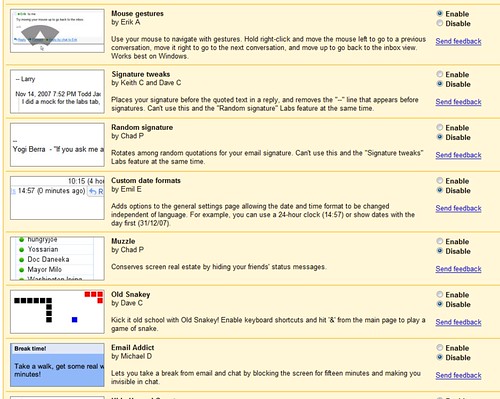
A colleague just gave me a heads up to the Labs section of Gmail (accessible from Settings). It’s interesting for a few reasons:

  1. They’ve turned the labs upside down, embedding experimental ideas as preferences in an application rather than silo’d sites.
  2. Each feature is attributed to the employee(s) who invented it, acknowledging that great experiments often originate with one person, even if it takes a company to implement it.
  3. Some of the features — like “mouse gestures” which lets you navigate conversations by moving the mouse — innovate at the user interface level.

Gmail Labs

Disruption From the Bottom Up: Flip

Flip Video I think it’s fair to say the $100 Flip video camera is a disruptive play. I’m not too surprised it didn’t come from Canon or Sony, but instead from a company who established their capabilities by building even cheaper cameras

Pure Digital started out, in 2002, making a digital version of the single-use “disposable” camera, sold through drugstores. The company’s research suggested that there might be a market for a similar product that took video images, and it created a one-time-use camcorder. But a number of consumers who liked the camcorder didn’t like the one-use limitation (and at least some of them figured out ways to skirt that limitation).

So when the first version of the Flip emerged in May 2007, its roots were in the point-and-shoot-camera world. That meant the company was far more conversant in how to make do with cheap components and keep prices down than in dreaming up the newest innovation that motivates the bleeding-edge camcorder freak.

The Familiar Product That’s Always Surprising

When one of my students started designing a product extension for Orbit gum, I didn’t get the appeal of Orbit (it’s huge among college students, but as I don’t own a TV I’m immune to the marketing). But lately my project manager at work keeps bringing it in, and each pack is a new flavor. “Chamomile?” “Mint mojito?” “Raspberry Mint?”

It’s a product with a comfortable familiarity that keeps surprising us. I don’t think anyone online has yet captured that combination of necessary consistency that establishes meaning and usability with surprising, fun variations in the experience (not just the content).

Orbit gum -- New Flavor!

Published
Categorized as Products