Example of weird info shape

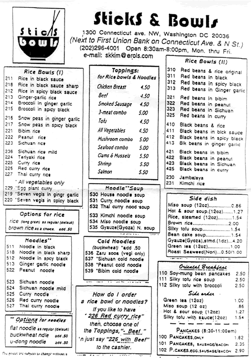
A few months ago I presented Incorporating Navigation Research into a Design Method (.pdf) at the IA Summit, which included an overview of using familiar information shapes. Afterwords Thom Haller approached me with this wonderful Chinese menu, a deviation from some Chinese menus I presented. He just said, ‘Look at this one. Try to figure out how much is a bowl of noodle soup costs.‘ You can see the logic in their modular approach, but when it takes 60 seconds to determine the price of noodle soup then something ain’t right.

Confusing Chinese menu

Published
Categorized as Layout

Information per Screen

I’d like to develop a finite, coherent set of attributes that determine how much information to put on a page (a virtual, scrolling page that is) and that size of that page. It seems like a small enough scope to get scientific about it.

The bookseller site analysis I did was informative (long pages seem to be OK in some contexts, density of text and links are something to look closer at). Some other relevant issues might be:

  1. Cooper, who says navigation isn’t fun, so make fewer pages with more to do (my personal take here is that interaction design is harder than your usual layout-content-and-links design, so only use interaction design if you can nail the interaction, otherwise keep it simple
  2. factor in page weight of course (which in turn factors in download speed)
  3. factor in the time it takes for elements to display (since stuff loading in over time is actually what people experience)

Published
Categorized as Layout