Noise Between Stations

Category: Web Navigation

Structuritis

Inflammation is the root cause of many “-itis” diseases. Similarly, we have places where structural design elements become inflamed and painful.

In a meeting yesterday I used to the term “landing page-itis” to describe the situation where a website landing page makes sense in one category so landing pages are added in all categories. What follows is an exercise of figuring out what kind of information will go on the new landing pages. To let the structure drive what is created is backwards; in user-centered design it’s the audience’s need that should drive the structure and the information created. If the structure becomes inconsistent or lopsided, then the whole structure should be revisited to see if it’s working.

The same thing happens with headers (headeritis). We may start a list without headers:

  • Telephone
  • Flower
  • Pencil

Then add items that require a sub-group, with a header for the sub-group:

  • Telephone
  • Flower
  • Pencil
  • Colors

  • Red
  • Blue
  • Green

Which then compels us to make up headers for everything:

    Other Stuff

  • Telephone
  • Flower
  • Pencil
  • Colors

  • Red
  • Blue
  • Green

The extra headers aren’t really useful, but we put them in for consistency, rather than admitting the structure might not work and fixing it.

Innovative Friends: Jim’s Navigation Book

My friends are doing brilliant things these days and I feel compelled to send out some props. I’ll start with Jim Kalbach, whose book Designing Web Navigation: Optimizing the User Experience will be out in August, but who apparently can’t stop writing and has started a blog.

We haven’t had a book on this topic in years, and Jim’s will be the first book dedicated to this topic to talk about how to design navigation, not merely describing how existing designs work. I’ve swam deep in those waters, and almost wrote a book as well, so I like to think I know the territory. So it won’t surprise when I say I think this is a significant topic, one that influences a large swath of society’s use of information these days. And I’m happy to say that Jim, with his dual academic background and years of hands-on experience, is perhaps the best qualified to write the book. I’ve only seen a couple chapters so far, but I’m anxiously awaiting the rest.

Dillon critical of navigation

Andrew Dillon, in his report on the fifth annual IA Summit, gives me props but is critical of the idea of navigation….

…I really enjoyed, again, a session on navigation by Victor Lombardi, which probably appealed to my academic sensibilities more than some of the other sessions. I have been a strong critic of the whole idea of navigation as a driving force for design, but there is no doubting the allure of the concept for IAs – it was standing room only at this session as Victor gave a detailed overview of the various strands of research that have emerged in this area and how best IAs might use the findings.

I’m not sure if he means navigation as in navigation bars (which Dillon has specifically questioned IA’s obsession with) or the larger practice of navigating through digital information, or something else. I’ll be sure to follow up.

Survey of Web Genres

Peterme points to Kevin Crowston‘s Reproduced and emergent genres of communication on the World-Wide Web which is — and I’m not exaggerating here — design gold. It really is. It relates to work by researchers such as Dillon and Toms on information shape and genre that I summarized in my navigation research paper (.pdf). The argument, put simply, is that if we format information using familiar genres, the familiar information structure of those genres can become more intuitable navigation (intuitive, of course, equals familiar).

What Crowston has done is survey and document all those genres. So the step I describe of “formatting information in familiar genres when possible” becomes easier when we have a list of common genres. Then you just need to figure out which genres your audience recognizes.

Litmus test for scent/meaning

I’ve plowed through the research on information scent, and while they seem to be learning something about how people think about links and navigation, it’s not clear if there’s anything actionable for designers to take away from it. So I continue to think about how to create scent, or really, how to make links meaningful to people. I think some of Spool’s research on link length is helpful.

Recently I’ve been playing with what I call the Litmus Test for Scent. It helps to quickly judge whether link text is effective in an appeal-to-common-sense way. Here’s the format:

OH! I really want to see what’s in [link name]!

So, for example, when I go to Amazon and see that little tab with my name on it, I say, “OH! I really want to see what’s on Victor’s page!

but not

OH! I really want to see what’s in Click here” or “OH! I really want to see what’s in [insider lingo]” etc.

Shifting information goals

Peterme nicely illustrates shifting goals in the information seeking process — complete with screen shots — revealing the complexity of navigation design: ‘My original “goal” was to learn about Ann Willoughby. On reading that page about Ann, my goal shifted…. Shifting and evolving goals are not only common — they are the norm.


Someone at work recently pointed out that the retail theory people, like the folks at Vanderbilt’s eLab, tried pinning navigation to the measurement of flow. It’s another example of a highly dynamic environment (psychology + HCI + lots of information) that makes simplistic approaches to navigation design look, well, simplistic.


I took the first step to addressing this with my navigation design research and method. It needs a lot of work, but I think it approaches something robust enough to acknowledge the complexity of navigation design yet accessible enough to use without interfering with the design work itself.

The beginning of the end of the page

Mark Hurst warns of a content-centric view in The Page Paradigm, making the point that ‘Web developers often waste time worrying about “where content should live”‘ which is so true. Designers often become hyper-focused on the content and navigation and forget about the user’s goals and the flow they go through to get there (can you say personas and scenarios?). That said, his three-step process of ‘Identify users’ goals on each page… remove any page elements that don’t help to accomplish the goal, and emphasize… elements that… take users closer to their goal… and you’re done‘ is just a wee bit easier said than done. I’m all like, Which tasks will help them accomplish their goals? In what order(s) do the tasks happen? What’s the best interface to accomplish each task? How do you present disparate interfaces in a coherent way? How do the tasks and interfaces differ according to the volume and type of content accessed? And so on. Navigation design can get fairly complicated when taken seriously. Whaddya trying to do, Mark, get my salary cut in half?!

Incidentally, in the long view, I think the page paradigm will go away. It’s an artifact of the earliest HTML spec, and once we have a platform where Flash-like capabilities are widespread we’ll all be doing interaction design (interactions designers will need to learn information architecture and vice versa). We might still think in terms of a current state, as with the currently displayed page, but the increased volatility and potential for richer interaction will be a whole new beast.

The Effects of Menu Graphic Design on Navigation Research

I was psyched to find The effects of menu design on information-seeking performance and user’s attitude on the World Wide Web by Byeong-Min Yu and Seak-Zoon Roh (JASIST, Volume 53, Issue 11, Pages 923-933). It’s only a couple years old and fairly rigorous, but I can’t recommend it. It looks as if in the process of trying to control for the graphic design, they ended up simply creating bad graphic design. Below is a shot of a cascading menu from the study, which is so unusual looking I can’t respect the study’s findings. Granted we’re looking at this out of context, but something as familiar as a cascading menu – especially when used for a navigation – should look rather familiar. I would think when controlling for this, it would make more sense to use the very familiar, such as menus that resembled Windows menus. Oh well.

Recognizing Digital Genre

Recognizing Digital Genre, a short 2001 paper by Elaine Toms at the University of Toronto continues (for me, at least) Dillon’s work on the shape of information, although it strangely doesn’t reference Dillon. It does include one super neato experiment. Highlights:

  • Creating Web documents is a cookie-cutter affair as documents of differing types are formatted with essentially the same structure, eliminating or disguising those visual cues that help people to make sense of the content and requiring additional effort to interpret the document.
  • An experiment asked people to recognize three versions of documents: an original, a ‘content version’ with all the formatting removed, and a ‘form version’ with formatting left intact but characters and numbers changed to X’s and 9’s respectively. Not surprisingly, the original and content versions were recognized more often, but the form version – when recognized – was recognized twice as fast as the other versions.
  • As a final test…we mixed and matched content and form within a single document…. People focused on the form or structure of the document first and were more likely to call a bibliography-formatted-like-a-dictionary, a dictionary rather than a bibliography.
  • For Dillon the precise definition of information shape is elusive; Toms defines it as ‘the regular and logical pattern of elements (the shape of information) expressed by a discourse community.

The references lists related work by her and others. Thanks Elaine.

Layer of Abstration

OK, you’ve got a taxonomy full of info you want a whole bunch of distributed, internal, business users to manage and a website that displays that taxonomy, but in a very particular way crafted to the needs of customers and controlled by a centralized web group because you don’t want to simply display the raw taxonomy cause that sucks for navigation much of the time, and somehow you must do the taxonomy dance to tweak how the taxonomy content flows into pages.

On back end, you store all metadata in faceted taxonomies – someone else’s smart decision that preceeded you – and on front end you combine some taxonomies to create a hierarchical view for browsing and within that display, content is displayed differently depending on info from other taxonomies, other values from other facets.

In order to do the taxonomy dance – massage taxonomy displays to be more navigable – you design a little two-screen interface to manage the display hierarchy (a technologist’s term for it, which I like), adding/deleting display categories (which are separate from the back end categories) and mapping children to parents.

A tricky part is that a lot of distributed people will be entering content, and only a few people will be doing the taxonomy dance. So those entering content won’t necessarily see the same categories that end up in the presentation, because dancing has altered it. How, you wonder, does one make this clear and comfortable for the content authors? This process of communicating with content authors using content management systems to manage a taxonomy catalog that is then displayed according to rules and an arbitrary user interface becomes a big, fat, juicy IA challenge.

IA as Conversation

In the past I’ve wondered about how taxonomies become navigation and did the taxonomy dance to match the bottom-up to the top-down, and now I wonder if this whole way of thinking about information architecture is flawed. Maybe the bottom-up of organizing information can never match the top-down of the user’s goals because we’re thinking about it wrong. Here’s my line of reasoning:

  • Design is about people. Design is done by people to benefit people.
  • Content is just the outward expression of the designer.
  • The reader is ultimately interacting with the designer. This interaction happens via the content. With all the technology and information before us, it’s easy to forget this interaction is about people talking to each other.
  • Information architecture could be thought of as facilitating conversation among people.
  • IA could benefit from techniques that help people interact well.
    • In a conversation, one can merely hear the other party, the two parties can each talk about themselves, or each can listen with empathy, ask questions, and build on each other’s comments.

How might this translate to designing information architecture? The design of social software comes immediately to mind. But I think this can have implications for good old navigation too.

Where Nav Meets Taxonomy

I had a great session at work recently massaging a general taxonomy to be navigable. Hunched over wireframes and a hierarchical view of the taxonomy with a programmer, business analyst, and manager we were all able to communicate and understand the issues.

This is an important area of IA that is getting to be more like science and less like art. Personally, I still think bottom-up design sucks when used for navigation. The idea that you can, say, create a taxonomy without knowing who will use it or how is just ridiculous, and the more different users and users you apply to it the more its usefulness is diluted; the effect is proportional.

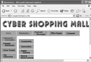
For example, a hierarchical taxonomy may not be balanced (an equal number of children for each parent), it may be deeper in some places than others. This may make it difficult to pull the data out and put it into a standard template (which is the advantage of having the info organized that way ahead of time), ending up with some pages that have too little content and others which have too much. With the philosophy that the UI is designed for the users’ needs, it’s the taxonomy that is the problem here.

Depending on the labels, leaf nodes may not be findable from the top of the tree (can someone look at the top-level category and ‘smell’ what’s a few levels down?). If we have this problem, we might start collapsing some levels. Then we look to see if this results in pages that are too long and balance the levels and the size of the pages: the taxonomy dance. But our information isn’t static, and we can’t always predict how the taxonomy and the information inside it will change.

That said, sometimes you have an underlying structure like a hierarchical taxonomy and need to stick a user interface on it. When this happens it’s best to have a layer of abstraction between the two so that the UI can serve the needs of the user. The layer of abstraction might just be very clever database queries. But this assumes the database is modeled to allow a flexible UI, for example, not hard coding hierarchical associations. I still haven’t arrived at the point of a method we can follow when doing this, it’ll take collaboration with a database programmer to do so.

Later…I had asked “can someone look at the top-level category and ‘smell’ what’s a few levels down?” That’s important for directed search, where you may be looking for grandchildren. It’s not as important for exploratory browsing: If you can smell the children categories under each parent, you can gradually work down the generations.