Zeldman beats up on drop down menus. You go brother. But why insult birdbath installers? That sounds like a nice job, working in gardens all day.
Category: Information Architecture
-
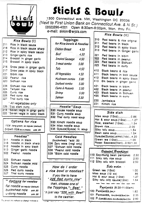
Example of weird info shape
A few months ago I presented Incorporating Navigation Research into a Design Method (.pdf) at the IA Summit, which included an overview of using familiar information shapes. Afterwords Thom Haller approached me with this wonderful Chinese menu, a deviation from some Chinese menus I presented. He just said, ‘Look at this one. Try to figure out how much is a bowl of noodle soup costs.‘ You can see the logic in their modular approach, but when it takes 60 seconds to determine the price of noodle soup then something ain’t right.
-
Worker-to-worker offshoring
Brett proposes the idea of worker-to-worker offshoring:
Just imagine: you get assigned to do two days of … competitive site audits for a pitch. Ugh. Why not sub-shore the work, W2W-style and take the day[s] off? It costs $15-20/hour…
I think PeterV has done this before, offshoring some personal programming work to a PHP programmer in India. I know it’d be nice to never have to do a content inventory again. Of course, we’d be training the offshore workers to do our jobs, but I think that’s inevitable. Move upstream.
(You know what I’d really like — and the socialist in me feels rather guilty about this — is a personal assistant. Boy, if I just had someone to take care of all the administrative crap in my life, I’d have time for, well, all the other crap (hopefully upstream crap). Could that possibly be offshored?)
-
Need an IA for 2 weeks…
A friend at Deloitte Consulting needs and IA for wireframe development for 1-2 weeks in NYC. The start date is next week (6/2) or as soon as possible. Send me an email (link in the nav) if you’re interested.
-
CMS Playground
I used to say CMS user interfaces were developing slowly because, like intranets, they were all behind the firewall. But I’m wrong, opensourceCMS has many CMS packages installed for you to try out and learn from. An excellent resource.
-
AIfIA, WSJ, and the PDB

In today’s Wall Street Journal the Asilomar Institute for Information Architecture achieved something we wished for from the beginning, notice in the mainstream press. The story, Redesiging the PDB, quotes Wodtke and Morville among others in discussing how IA could influence attention paid to the infamous Presidential Daily Brief on Bin Laden.
Unfortunately, the design community can’t agree on something as simple as Greg Storey’s one-page PDB redesign versus the undesigned original. One would think any attention paid to this document would be a good thing, but Edward Tufte disagrees, stating, ‘I think the design’s irrelevant.’ I hope that’s just the reporter screwing up his words.
Perhaps the most cogent statement came from Janice Fraser who pointed to the intentions of the document’s originators: ‘[Mr. Storey’s redesign] shifts responsibility — and, moreover, accountability — for interpretation to the analyst or advisor who prepares the brief.‘
-
Search method seeds
Over on the Asilomar email list I started exploring a method of adding search to a site that has grown to need it. The point is to get a pretty good idea of what should be done to arrive at good results in a logical way, rather than just install a search engine and improve through trial and error. With the help of Jonothan and Iwan here’s seeds of a method I’ve collected so far:
Let’s assume we’re working with conventional search engine technology, e.g. mostly relevancy-based.
We have to begin either at the point the content is going into an index or the user’s goals, and because I’m user-centered boy I’ll start with the users. We can learn about their goals, things like do they want precision or recall, what are their most popular search terms, how many queries do users submit in a session, do users repeat queries over multiple sessions, how do the queries change over time, and so on.
Using the user goals we can construct a strawman user interface.
Next we look at the content. We can ask what format is it in, how much is there, how will the volume change over time, for dynamic content will the search index rebuild anew or cumulatively grow, how clean is it (ROT), how often does it change, and so on.
With the strawman UI and a rough idea of what the index looks like we can simulate some search tasks and the result sets. We might then consider how metadata and tweaks to the ranking algorithm could help.
At some point we have to install the search engine, index the content, and try some queries. Then we might use a systematic approach to tweaking results:
Too many results? Try cleaning or otherwise reducing content, changing weighting, change the ranking algorithm, or use a more restrictive search form UI (e.g. more fields that must be selected)
Too few results? Try adding synonyms or a less restrictive search form UI. This might also be a sign that you don’t in fact need a search engine.
Is accuracy bad? Change the algorithm, change the weighting, add metadata, use best bets, improve the search form UI.
Users can’t fulfill goals even if results are good? Try improving the results UI.
I’m sure I’m missing stuff, but it’s a start.
-
Volunteering pays
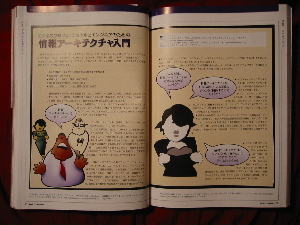
In one week the Intro to IA brochure (PDF) I created with Dan Willis has been translated into Spanish and Japanese. The latter was also printed in the Japanese journal ‘WebSite Design vol.10,’ who did a great job with the layout, not surprisingly considering its overall quality. And they paid me $65. Not a huge amount, but it’s nice to be compensated and watch the work take on new lives beyond what I imagined, all from a little piece Dan and I threw together for the hell of it.
-
CMS Seminar at IA Summit 2004
The Content Management for Information Architects seminar promises to be the best one day line up of CMS knowledge anywhere. Where else can you see Boiko, Rockley, Byrne, and Busch all on one stage, all laying it down with IA as their focus? CMS is the future, girls and boys, I really don’t believe we’ll be manually editing presentation code and content forever, let’s get together and conquer this bad boy.