Category: Design


  • Rotman on Design

    I’ve mentioned the Rotman Management (University of Toronto) design issue (.pdf) recently, but having finished it I’d like to point out what’s worth reading in this worthy mag:

    First, if you’re printing just do pgs. 5-30. The rest is fluff and alumni only.

    The dean’s column on page 7 contrasts the business focus on optimization throughout the 20th Century with the design focus on invention: ‘Value creation in the 20th century was largely defined by the conversion of heuristics to algorithms. It was about taking a fundamental understanding of a ‘mystery’ ­ a heuristic ­ and driving it to a formula, an algorithm ­ so that it could be driven to huge scale and scope… I would argue that in the 21st century, value creation will be defined more by the conversion of mysteries to heuristics ­ and that as a result, we are on the cusp of a design revolution in business.

    On page 12 Darden professor Jeanne Liedtka takes a more intellectual view, contrasting design and science: ‘The most fundamental difference between the two, they argue, is that design thinking deals primarily with what does not yet exist; while scientists deal with explaining what is. That scientists discover the laws that govern today’s reality, while designers invent a different future is a common theme. Thus, while both methods of thinking are hypothesis-driven, the design hypothesis differs from the scientific hypothesis.

    Demand Innovation on page 26 is a quick case study by Adrian Slywotzky of Mercer Management Consulting on a product company that looks at the higher-order needs of its customers and creates services that help customers use its products. ‘These companies are focused on creating new growth and new value by addressing the hassles and issues that surround their products rather than by improving the products themselves. They have shifted their approach from product innovation to demand innovation.


  • Dreyfuss Mobile Phone

    You know what would be great? If someone created a mobile phone in the shape of Henry Dreyfuss’s classic 500 Series handset (not the whole phone, just the handset)…

    Yes, it’s rather large, but this could be used to our advantage. The space between the receiver and transmitter could hold a PDA…

    Riffing with Liz at work, we thought perhaps it’s part of a woman’s handbag. The phone clicks into the bag to become the handle. Click out to use the phone, and carry the bag with a shoulder strap. Might look great on a black Prada…

    I’m rather fond of this design, having had a 554 on the kitchen wall growing up.

    Postscript: Owen also cites the ability to hold this between ear and shoulder as well as not appearing crazy while walking down the street handsfree and in monolog. Even better, he points to a brilliant hack, simply wiring the handset to plug into the mobile’s headphone jack. That led me to more examples. And even if you think this is all rather silly, they offer a designer-friendly view of the future: ‘The phone accessory will very soon take over from the phone itself as the wearable part of the device. …people [will] leave their tiny phones out of sight whilst their low cost / highly expressive handsets will worn as any other fashion devices. It will also allow designers to produce handsets without the need for heavy technological insight or investment.


  • Doblin’s Short, Grandiose Theory

    Empire State lit up white, at night

    Thanks to Zap — who invited me to a panel on design methods (.ppt) at the IA Summit — I finally got my hands on a copy of Jay Doblin’s A Short, Grandiose Theory of Design, an article from the 1987 STA Design Journal. In its seven pages Doblin presents a straightforward and persuasive argument for design as a systematic process. Quick notes:

    • For large, complex projects, it ‘would be irresponsible to attempt them without analytical methods.‘ He cites the existence of a too-common ‘adolescent reliance on overly intuitive practices.
    • He contrasts direct design in which a craftsperson works on the artifact to indirect design in which a design first creates a representation of the artifact, separating design from production in more complex situations.
    • He outlines a generic process of design: STATE 1 -> ANALYSIS -> GENESIS -> SYNTHESIS -> STATE 2
    • Analysis is deciding what is relevant, then detailing and structuring it
    • Genesis is expressing the concept, what Terry Swack used to call expressing the intended user experience. In some ways it is model building.
    • He demonstrates using a 2×3 matrix of performance/appearance vs. products/unisystems/multisystems (increasingly complex artifacts or combinations of artifacts).
    • In the end, he brings it back to a focus on business, reminding us the core issue is to compete effectively

  • Marsupial Mouse

    Imagine this scene: a 40-something art director talks through a design review session in a conference room in front of her colleagues. At one point she reaches over to the Dell laptop which serves as the conference room computer to bring up a website. The laptop has not one but two pointing devices built in, a trackpad and a TrackPoint…

    cartoon

    Both pointing devices rely on fine motor control, and she fumbles with the trackpad until the situation becomes embarrassing and the person next to her assists. The situation could be avoided with a mouse.

    I’ve noticed many people who will trim their portable computing setup to the minimum but still pack a mouse, usually a full size mouse borrowed from the office. This can be eased a little with smaller mice like the Atek Minioptical…

    cartoon

    The Dell approach amuses me a bit, inserting two different input devices that rely on such similar motor control, it seems like a desperate attempt to satisfy users who don’t like one or the other. An alternative is to acknowledge the mouse is the king of the pointing device world and include one with, or in, the laptop. Imagine doing away with the trackpad or the TrackPoint, moving the internals (e.g. CD/DVD drive) over a bit, and using the newly found space to insert a wireless, optical mouse the size of the Atek inside the body of the laptop. A button on top (providing a perceivable affordance for newer users) gently pops the mouse most of the way out the side of the case, where a thumb and forefinger can pull it out.

    I call it a Joey — the name for a baby kangaroo — for its marsupial behavior.


  • Headline! Radio buttons originally controlled radios

    If you’ve read About Face, you know about how to use radio buttons. But if you haven’t read Tog on Interface, you don’t know how they were invented, or why they’re called that. You really don’t need to, but it’s damn interesting, and while the book is outdated, Tog is funny as hell. Actually, it may be useful too; a friend just wrote to ask, ‘Is it radial or radio?‘ The reason it’s radio is because it mimics the behavior of those old analog car radios. They had a row of buttons to select a station, and pushing one in moved the analog needle to the preset frequency. Of course you can only select one station at a time, hence they’re a good metaphor for when you need a mutually-exclusive UI select widget. Also, you can plainly see which choice is selected and all the choices at a glance.

    Hmmmm, I feel old.


  • Cost and Style

    My post on eBay-as-Flea Market received a bit of attention, including — judging by the referers — some folks from eBay. Later discussions with Tanya and Owen refined these ideas a bit, namely:

    • I was a bit sloppy in my use of the word design. eBay’s design works, though the style of the site — by reflecting the home-spun vernacular of sellers — can be low style
    • Low style is not the same as clean style or bad style. Low is the vernacular, clean can be a default look, and bad actually works against the design. Someone somewhere probably has expressed this better with different terms, but lacking that knowledge I’m running with it.
    • Low style and low cost — giving the perception of a Flea Market — can be good. These are not value judgments, but judgments of value.
    • Organization and classification is often secondary to other factors that communicate value, such as style and cost.

    • And so on. The interplay of style and cost most interested me, so I created a little matrix with pretty pictures:

      It’s a bit rough, but could turn into a fun little tool to clarify product design and marketing (‘Which quadrant are you in? They’ll all good, but different.‘). Might be nice to create a book of them, including ye ol’ value-complexity matrix.


  • Theory: EBay as Flea Market

    Let’s assume EBay looks the way it does (not great) because not a lot of attention was paid to the design. Now let’s say they had contracted the design to a professional services firm that practices user-centered design. What would the result look like? Most likely something pretty slick.

    Conventional wisdom – at least with the folks I hang out with – says that auctions, plus EBay’s first-mover advantage – is such a compelling experience that people will tolerate the bad design. But what if EBay is succeeding because of its bad design? What if, like a flea market’s rough, seller-created environment, the amateur design communicates the idea of bargain?

    A designer might have come to this conclusion – balancing some good global elements like navigation with lots of seller-created pages, letting the vernacular bubble up, however painful to look at – but maybe not. And even if the designer was to hit upon this idea, how hard it would be to sell, or even to think about selling, a poor looking design to the client.

    The experiment to switch the quality of the design could certainly be run, and will be if EBay ever grabs the reigns in a big way and puts a pretty design in action. If popularity declined as a result, that would be quite a big insight into experience design.

    Update: Sparked thoughts from Tanya, Gene, and Jason.


  • Teaching in Sound Bites

    Some time ago I helped create a classification scheme for a very large company’s website. Several months into the project, when most of the coding to power this scheme was finished, some executives objected to it. Some of the objections made sense, and with some tweaks we were able to incorporate additional concerns like marketing issues without harming usability. But some requests flew in the very face of the reasoning behind how the classification worked (in usability testing, not just theoretically). And a lot of the classification wasn’t even innovative; it leveraged what had been working for sites like Yahoo for years.

    Somehow this reminded me of After the Dot-Bomb: Getting Web Information Retrieval Right This Time. In it Marcia Bates argues that the rest of us were reinventing information seeking when the library and information science field had already solved many of these problems. In the light of my work’s executive manhandling, I saw Bates’ insistence that we were ‘ignoring‘ this discipline as inadvertently admitting, "We in the LIS field failed to communicate what we know and make it accessible to those who need it."

    I’m not laying blame; I don’t think anyone was prepared for the Internet explosion of the 90’s in which millions of people suddenly had access to a plethora of information used in new ways. But it would be nice if the absolute basics were universally understood. In my example of the painful case above an absolute basic would be ‘Classification is complicated and particular skills are needed to do it effectively.‘ And only as much argumentation as is necessary should accompany that point to make the point.

    In the pursuit of perfect information science, our basic taxonomies still suffer from arbitrary decisions. I hope the information architecture field will communicate these essential points – recognizing that the best is the enemy of the good. It’s a matter of summarizing in executive-sized bits ideas similar to what the first principles do for us.

    An example of a teaching sound bite might be Enabler vs. Driver Technology: Breakthrough technology can be a driver of new products and services. Less innovative technology is an enabler of some other strategic advantage – such as design or marketing. The way you structure your projects should reflect whether technology is an enabler or a driver.

    Maybe these are written as patterns? Not for the sake of compiling into a language and used, but just for reading and learning.

    This idea cropped up listening to Brenda Laurel in Texas. Teenagers use SMS more than email or the phone. Lots of carefully constructed, tiny, messages. How will this generation cope with the skills needed to find a good job in the market of the 2010’s? What sort of IA education do they need?


  • Y! Personals & Galleries

    Yahoo! has this clever campaign for their personals that I couldn’t help but follow and explore (Not that I’m in the market ­ sorry to disappoint you :). What I saw was pretty amazing, a gallery-like view of many singles…

    Very cool, because it’s just so browse-friendly. Visually scan for an attractive face, then click for a bit more info, and if he/she still holds potential then click ahead for all the juicy details. I might be shallow wanting to see what people look like first, but I would bet this is the ‘primary facet’ for many folks, especially in the privacy of their web browsers.

    Unfortunately, this isn’t how Y! Personals actually works. The above is just a promotion screen. The actual search results are pretty conventional…

    The problem also must balance the volume of results; while the gallery layout can squeeze in 50 results you need to consider the amount of results within the chosen geographical area. I’d probably try delivering the first 50 results closest in geography by default and let the user alter it further. I know in a dense area like New York there’s 92 results of women my age within 5 miles, which ends up being 10 results pages, pages you actually want to view, as opposed to your usually search results. I’d rather have 2 pages. Too many images per page over a modem? Nah, these are worth waiting for.


  • Your email has been sent.

    …and then what? What do you give them after they click Send? None of the usual approaches satisfy me. I want to give that person who just took the time to send us email a big smooch, or some sort of instant gratification, a coupon for free ice cream, a free report, something of beauty or humor.

    Brett Lider and Craig Scull write in:

    The confirmation page after a feedback form submit should list some recent changes made to the website in response to user feedback or usability. This helps them feel like the message doesn’t get flushed into the corporate vortex and makes the company look responsive to customers. It will take some periodic updating of the confirmation page to follow-through on this idea. And if you allow for users to sign-up to be part of a user research pool, include that link here.


  • Life Chair

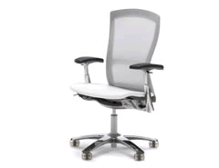
    I saved my pennies while sitting in one of these* so I could give myself a gift of back relief, a Life Chair. It costs as much as the Aeron and is at least as comfortable, if not more so. Rather than mounting a dark, mechanistic rig, the Life is visually lighter and seems to yield more comfort for being so. Knoll’s extensive line of fabrics can make customization a daunting task, not made easier by their lack of a thorough website. Luckily there’s a showroom nearby, as you pretty much have to go through a Knoll dealer to order it, with a process like ordering office furniture. In my case it was worth; I’ve got one happy bum.

    * Note that the Internet includes a metalfoldingchairs.com


  • Dieter Rams: Ten Points

    Dieter Rams: ‘I have distilled the essentials of my design philosophy into ten points.


    • Good design is innovative.


    • Good design makes a product useful.


    • Good design is aesthetic.


    • Good design makes a product understandable.


    • Good design is honest.


    • Good design is unobtrusive.


    • Good design is long-lasting.


    • Good design is thorough down to the last detail.


    • Good design is environmentally friendly.


    • Good design is as little design as possible.


  • Marketing Personas

    I spotted this two page spread in Forbes magazine. It’s IBM using a persona (“Lois”) to get companies to think about ‘customer centricity.’ It’s text heavy and superficial, but if it increases customer centricity than I’m all for it.

    Similarly, Brett Lider points to Microsoft’s MSN personas. They’d be denounced by Cooperites based on the sheer number of them (one persona for every age group?). More sins abound: ‘Age 14-17, Amanda is at the pivotal point in her life where she is beginning to define her brand affinities.’

    She’s age 14-17? Very realistic. She’s developing her brand affinities? Is that what her and her friends do after school? By putting a face on demographics they end up with a face on demographics, not a realistic depiction of a person that we can use our imagination to design for. But this is just a marketing tool, MSN trying to help advertisers advertise. Will it degrade the idea of personas for design? I hope not. Hopefully it’ll turn marketing on to the grooviness of customer centricity.


  • New Methods for UX Design

    Nathan Shedroff’s New Methods for Designing Effective Experiences looks relatively new (October 2003?) and is a current overview of methods that is strongly resonating with me. In particular, he nails some shortcomings of traditional personas. IAs take note, he’s using the term taxonomy in the widest sense, not only in the LIS sense.