Why I’d Love to See Graded Interaction Design Problems

One reason I love bouldering is that it’s game-like. No matter how much experience a climber has, we’re all at a certain level with certain climbs (they’re actually called “problems”) that currently challenge us. It’s like playing a well-crafted video game: the levels you’ve finished are easy, the levels ahead of you are frustratingly hard, but the level you’re currently on is a good match of difficulty for your skill level; and you can feel the flow.

8wng7

I recently started learning a new programming language and I find it similarly game-like. Every new technique is a new challenge. Every new algorithm is a new challenge. The easy stuff is boring, the crazy theoretically stuff is frustrating, but the next chapter in my book is just right.

And like video games, in bouldering these problems are codified. So I can say, “I can do all the V0’s in this gym, and I’m working on the V1’s” and other climbers know something about my abilities.* Codified problems exist elsewhere too. Here’s some to help people improve their skills playing Go.

I’d love to see graded problems for interaction design. They would make it fun to solve problems, alone or socially, and communicate to each other our level of ability. “But Victor,” you might say, “interaction design problems don’t have a defined solution like a boulder.” Actually the boulders don’t either. People can solve the same problem different ways, but there are rules everyone must follow that give the game useful constraints. As long as you follow the rules and get to the top you’ve solved the problem. Some climbers are more elegant than others, and the same would be true in interaction design.

* The Moonboard is like graded problem-meets-Github, a single wall with over 800 bouldering problems contributed by various route setters.

Published
Categorized as Teaching

Webinar with Bill Scott of Netflix, Yahoo + 20% Off

Bill Scott of Netflix, formerly of Yahoo, will be hosting the Future Practice webinar tomorrow, helping web designers learn how to create designs that are easier to implement by illustrating the UI engineer’s point of view. And you, my dear readers, get 20% if you enter the code VTWBNR when signing up.

I recorded a bit of our rehearsal with Bill. He’s killer smart — an O’Reilly author and frequent presenter — but has a great laid back style that’s such a pleasure to learn from. Here’s a ~7 minute edit:

A New Service: Future Practice Webinars

We’re pleased as punch to partner with our good friend Lou Rosenfeld at Rosenfeld Media to offer you Future Practice Webinars. Our first two events are Modern Web Form Design with Luke Wroblewski and Using Mental Models for Tactics and Strategy with Indi Young.
When we created them we wanted to accomplish two things:

  1. Provide a forum for advanced practitioners in the field of user experience design to share with us their best thinking on topics that have immediate practical value and to show us where the practice is going in the long-term to help us prepare. Hence the series title, Future Practice
  2. Enable practitioners like yourself to benefit from this education at a lower price than in-person seminars and conferences, without having to travel and emit all that nasty carbon.

For more information and registration, go to the Rosenfeld Media webinar page. For 20% off, use discount code NBSWBNR

Maybe I’m Providing a Better Education than Ohio University

Someone just brought it to my attention that a student named Feng Xia who received a Master of Science degree in Electrical Engineering from Ohio University in 1998 did so with a thesis paper that steals from others’ works, including my master’s thesis. It’s so bad, that after cobbling together various works, Feng couldn’t be bothered to normalize the citation format, or even make the number of citations match the number of references listed.

Yet, this made it past the thesis committee.

Why bring it up? One, because if Ohio University doesn’t take the ethical path here I’d like the Internet archive to show what happened.

Two, I want to gloat a little that large established institutions with extensive accreditations don’t necessarily provide any better quality — and sometimes much, much worse — than my little Smart Experience.

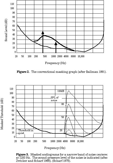
Just for decoration, here’s some graphs from my thesis I drew by hand circa 1994, probably in MacDraw, with proper references.

Published
Categorized as Teaching

Smart Experience Video Tutorials

In my time spent at consulting firms, client sites, teaching, etc. I see a need for more just-in-time design education. No formal program can keep up with the rate of change in digital design. People need on-demand materials they can use during their work day in-between tasks. The materials currently addressing this need leave a lot to be desired. They’re either canned presentations, unwieldy classroom-in-a-box applications, or simply too long and boring to fit into anyone’s busy schedule.

Here’s a short preview of a service I’ll be launching at Smart Experience to try and address this need. They’re short, inexpensive videos to teach design skills. This one is on the rather fundamental topic of direct manipulation, but I plan to cover design in the widest sense.

I’m happy with what I have as a first pass, but it clearly needs iteration. I’d love to hear what you think. If you wanted to build this sort of skill, would you pay for a 20 minute video on this topic that you could watch online or download any time you like?

Tool: Business Design Concept Poster

Each semester I tweak my Business & Design class as I learn more about how to teach undergrad design students about business, and help them to blend business and design ideas rather than see them as two separate spheres (while relating cautionary tales, as with Ford bean counters who show up at the end and revise the design!).

This semester culminated with a poster that could encapsulate the artifact, consumer experience, and business model on one sheet of paper. Once we had all this information in one place, we could see that, for example, it wasn’t going to make enough money, and then use our research and idea generation techniques to tweak some aspect, such as the price, and watch how it changed other aspects, like the target audience.

For a one semester course, it was a lot for them to absorb, and the results will still look elementary to professionals, but they rose to the challenge and I think this format has potential to help designers and businesspeople see the connection between form, function, audience, costs, revenue, and business model.

Here’s three examples. Click through the link to see the high-res versions.

Entrepreneurs: Beware of Big Liabilities

The Zollverein School in Essen, Germany was a great hope for the business design field, starting the first MBA of its kind in Europe. But this newspaper story lays out a tale of caution for anyone starting a venture like this. In short, it seems the gorgeous new building they constructed to house the school has become a real estate liability. Even with taxpayer funding, the operating costs are a burden.

The dot com downturn of 2001 sank some firms like Scient but not others like Razorfish. The difference wasn’t client base or capabilities (or even the fact that I was working at Razorfish :), it was real estate liabilities. Scient invested in a lot of expensive offices whereas Razorfish put their spare cash in the bank for a rainy day.

Let’s hope the Berlin C-School — through partnership with Steinbeis University — avoids this issue.

Don’t own nothin’ if you can help it. If you can, rent your shoes.” — Tom Peters Forrest Gump

Storyboarding Instead of Writing

head first storyboard

I’ve been doing a lot of “writing” lately, but in an attempt to emulate great, bestselling computer books that are highly visual and concise, I’ve been thinking about layout first and writing second, because we want to learn and not necessarily read. I’ve started mocking up the piece on index cards to get a feel for the flow of content. As it turns out I’m not the first to go this route

…pretty much every page of every Head First book first exists as a scribbly drawing on paper before it ever makes its way into page layout software. Same deal with my book. In fact, my entire book was written on paper in pencil before I ever laid out a single page electronically. That version of a Head First book is known as storyboards, or boards for short. The idea is that you sketch up the core visual elements of each page in the boards. And by steering clear of software layout tools with fancy visual effects, you’re forced to stick within the realm of concepts. No characters, no cute graphics, just core visual concepts and whatever your artistic ability can muster. It’s all about focus.

Here’s some of the principles behind the Head First Formula:

  • Instead of repetition, use novelty to tell the brain something is important
  • Use pictures, because your brain is tuned for visuals, not text.
  • Place words within the pictures they describe (as opposed to somewhere else in the page, like a caption or in the body text)
  • Use redundancy, saying the same thing in different ways and with different media types, and multiple senses, to increase the chance that the content gets coded into more than one area of your brain.
  • Use concepts and pictures with at least some emotional content
  • Use a personalized, conversational style, because your brain is tuned to pay more attention when it believes you’re in a conversation than if it thinks you’re passively listening to a presentation.
  • Include many activities, because your brain is tuned to learn and remember more when you do things than when you read about things.
  • Use multiple learning styles, because you might prefer step-by-step procedures, while someone else wants to understand the big picture first, and someone else just wants to see an example.
  • Include content for both sides of your brain
  • Include stories and exercises that present more than one point of view
  • Include challenges, with exercises, and by asking questions that don’t always have a straight answer, because your brain is tuned to learn and remember when it has to work at something.
  • Use people. In stories, examples, pictures, etc., because, well, because you’re a person. And your brain pays more attention to people than it does to things.

It’s about making books fun. In some ways, it’s about making adult’s books more like children’s books.

Kathy Sierra expands on these ideas in the below interview. Some key points:

  • Make readers feel like “I Rule” — identify where people feel guilt and fear and alleviate it.
  • They used the Save The Cat screenwriting book
  • Don’t start at the beginning, chop off the first chapter (introductory stuff) and put that at the end. Then spend a lot of time on the new first chapter to suck people into the action right away.
  • Amazon reader reviews of Head First book are more about their experience with the book than the book itself. Also, they referred to authors by the first name instead of the last.

The State of Video Education

Having started a school of sorts, I’m interested in anyone pushing the envelope of what can be done to teach people, and lately I’ve turned my attention to reaching more people with sessions online rather than only in the classroom. The first generation of “distance education” from universities mostly sucked; schools were sold software that forced them to shoehorn pedagogy into a particular medium (discussion boards, online text, chat rooms) and it really only worked when you had a perfect storm of content that fit the medium, students and teachers comfortable and patient enough to use the medium, and classroom instruction that filled in the gaps. I taught an information architecture class at the New School/Parsons School of Design years ago and it was a royal pain in the ass, but for those few people in Asia that had no other option, it was probably fairly useful.

Fast forward several years where Web 2.0 meets the classroom. Specifically, with broadband our palette of media opens up to include audio and video, and our business models open up to include architectures of participation. YouTube is now the richest playground of education experimentation online. Here’s two examples:

You Suck at Photoshop
Boring, technical techniques are thwarted with dark humor. Perfect for graphic designers.

Team Ukemi Parkour Tutorial
Instructional techniques lifted from technical illustration, mixed with attitude, and applied to video (“just take the marker and draw right on my back”)

Awesome, but this just scratches the surface. How can we use this approach to teach business, design, and business design? I’d love to hear your thoughts.

The Berlin C-School

The Berlin School of Creative Leadership sounds fascinating…

By bringing together top creative executives and international leadership experts, the Berlin School will pave the way for new standards in communication and leadership, fostering global discourse on creative leadership in entertainment, journalism, media, advertising and marketing.

At its heart is the Executive MBA in Creative Leadership, an 80-day part-time program comfortably spread over 18 months, taking place in Berlin with study trips to Chicago, New York and Tokyo.

Grant’s analysis is honest and insightful (as usual)…

The danger is that this will be another jolly club, where pals appoint pals, and the odor of self congratulation extinguishes the possibility of fresh thinking. Creatives may have the Canadian problem I was talking about this week: people who are brilliant as individuals and small groups working in agency circumstances find themselves diminished by still larger groups and the scale, to say nothing of the pretensions, of university life.

I guess the real challenge is how you get the academics and the creatives to play together This is not a famously productive relationship and it will take some tremendously good mediation to make these two parties mutually useful, let alone mutually inspirational.

Two Tips for Keynoters

A friend about to give her first keynote speech asked my advice on how to approach it, then suggested I post the advice for others to see. So here it is:

  1. Keynote content has a large burden. Ideally it provides context — or at least controversy — for the rest of the event. It should have big ideas of where we’ve been or where we’re going, but also be grounded in the practical in a way that makes it relevant to attendees. It isn’t very difficult to strike this balance, but probably different topically from what we do day-to-day, so give yourself extra time for research and imagining.
  2. The keynote speaker also becomes an implicit ambassador of the event. While some may board their private jet immediately following the talk, I found that I felt I should continue the keynoter persona throughout the event, answering questions and socializing with everyone, including the organizers.
Published
Categorized as Teaching

Discount on the IDEA conference and SmartEx Classes in NYC

I’m psyched that IDEA — a conference on designing complex information spaces of all kinds — is happening in New York this year, with a great lineup of presenters like Jake Barton, Alex Wright, and Chenda Fruchter.

And from now until September 15th October 3rd you can get 10% off the price of the IDEA 2007 conference when you sign up for a class at Smart Experience.

And, if you register for IDEA by September 15th, you receive 20% off any Smart Experience class. Here’s the details.

Five New SmartEx Classes in NYC + A Discount

After successfully launching Smart Experience this Summer with a prototype course, I’m very happy to have a stellar line up of teachers sharing their expertise this September and October. Here’s the class listing, and if you follow these links you’ll get a 10% Noise Between Stations reader discount…

Information Architecture 3.0
Oct 16 with Peter Morville

Interaction Design for Web Applications
Six sessions starting Sept 5 with David Malouf

Managing the Online-Offline Partnership
Oct 9 with David Wertheimer

Moving User Experience into a Position of Greater Corporate Influence
Sept 8 with Richard Anderson

Foundations of Interaction Design
Sept 12 with Karen McGrane