
my online notepad
Pop-up windows are relatively sucessful, especially when you can control their size with JavaScript. I'm surprised more sites don't use them.
I've been looking at portal interfaces lately as I'm working on building a vertical portal for a major "finanancial and news group." The best click-this-symbol-and-have-this-box-open-in-a-new-window icon, but far, isn't even on a portal. It's on http://www.peterme.com, a fav weblog of mine:
It works because it shows what the result will look like and shows that an action will occur, using the little motion lines. Here's the equivilent from Yahoo:
And one from mom, the Razorfish intranet:
Interesting that some, like Excite, choose to provide a Windows-like minimize function instead that acts like the Mac windowshade. I guess a pop-up is better used for frequently viewed info that you might want even when you're performing other tasks, like a calendar. Whereas less important information, or less frequently viewed information, can be hidden and revealed as needed.
The other buttons, edit and close, are usually well represented with "edit" and "x", the latter usually a stolen Windows close box.
Don't really know what the Epicentric icons mean! Maybe "edit, pop-up, and close" respectively.
8-12-1999
Whew, it's been a while since I updated this space. Now that I have a job that actually keeps me busy (and happy), my personal expression doesn't get recorded. I have a bunch of ideas planned for this space...
Updated the Churches of Montclair photo essay again, this time with the first color photos.
My friend Walter gave a sermon last Sunday at the Unitarian Universalist Church in Plainfield, NJ. Though he's professed belief in something of a higher power, he takes a rather rationalist view towards other religions, especially ones which hold beliefs contrary to science. In his sermon he ragged on particular examples of faith and afterwords, in a discussion session he initiated, he received a bit of cajoling (maybe too strong a word given Unitarian's PCness) about his intolerance. Some said you should respect other's beliefs, some said that others can believe whatever they want just as long as they don't force it upon us. Here's my take on it:
I think everyone, especially Unitarians who make it a point to explore the world's wisdom, filter out what doesn't work for us and remember the rest, integrating the best of what's left into our world view. The bad stuff also makes an emotional impression on us and we remember it because we want to keep it out of our world view. If it's really bad, we want to spare others from it as well. That can be seen as helping others or unwanted proselytizing, based on your frame of reference (Unitarian, Jehovah's Witness, Atheist, etc).The situation is really more complicated than we might think, not just a matter of "believe what you believe, and let others do the same" since we all want the world to be a certain way and are generally pissed off when others don't realize we're right!
More thoughts on "The Inmates are Running the Asylum" expanding on my thoughts in an earlier entry:
- People will relate to different customers differently depending on their position at the company (e.g. varying levels of tech support will deal with end users with various experience). There is danger in generalizing from this point of view.
- The term user can be too elastic, stretching to fit your needs. That's why you should develop and design for personas rather than for "users".
- Fallacy of focus groups: being the victim of a problem doesn't necessarily give you the power to solve that problem.
- Designing for many audiences is futile, make one audience ecstatic. To do this, you can design for a persona.
- Personas help avoid idiosyncracies in individuals.
- Programing is defined by cases at the edge of the paradigm, whereas is defined at the center.
- Generalizations like "power user" and "computer literate" do not apply to most people.
- You can develop an "anti-persona" (Cooper calls it a "negative persona") to specify who you're not designing for.
Sarah, my better half, had several words of criticism on this weblog, mainly:
- I didn't give her credit, and
- I didn't give others credit
"Contextualize" and "Socialize," two hot words in the mouth of any management consultant who's anyone (sarcasm intended):
- "Contextualize" means simply to put in context, but can take on sophisticated implications depending on the kind of context you're referring to.
- "Socialize" (heard from Anderson Consulting) refers to the sharing of ideas, to talk about and spread a concept. It's the initial process that can lead to cultural memory, or memes.
Does anyone else occasionally dial the fax number on a business card by mistake, or is it just me? Putting the fax number right next to the phone number on biz cards with equally weighted fonts has probably resulted in billions of wrong numbers and who knows how many days of wasted time.
Can we do usability testing in a real-world environment? Having just finished my first round of honest-to-goodness official sit-behind-the-two-way-glass usability tests, I see the faults in this environment (people eager to please, asked to do an artificial task under artificial conditions...) Could we actually test people in a real-world environment? Imagine getting the buy in from a boss to assign the task, then use a hidden video camera (unethical?) to tape the session "Joe, we need to order a new copier and I hear Sharp has some cool stuff at this URL. We need features A, B, and C. Can you evaluate them and get back to me with a recommendation?"
Just read a fascinating article about Danny Hillis from an old Wired magazine. Hillis is famous for giving supercomputing a great big push by making parallel processing practical. Now he works for Disney and is working on a clock that will tell time for the next 10,000 years. The design itself is fascinating, but the philisophical point he's trying to make is even more mind blowing. His purpose is to get us thinking about the longer term future. Longer than New Year's resolutions, longer than this job or that degree, longer than our lives or even our children's lives. Only by considering this future can we make significant improvements to society and the environment.
7-22-1999
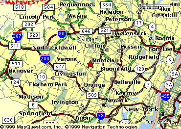
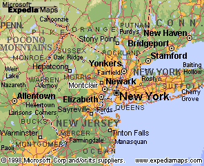
I beat up on Microsoft's Expedia maps site in the past, but I must admit that some of the actual maps are gorgeous due to simple real-map-like coloring, much better than the primary-colored Mapquest look. The difference is also due to use of fonts of varying size and weight for different size cities. The overall look gives a much better impression of distance and terrain. Here's an example of default maps from both systems:
Mapquest:
Expedia:
I'm now reading "The Inmates are Running the Asylum" by Alan Cooper, and love it. It takes a business look at how software products should be designed (they should be designed by designers and then engineered by engineers, in that order).
Some key points and terms I liked:
- User's number one desire is to not feel stupid
- "Dancing bear functionality" describes the amazement people feel when watching formerly unknown functionality, even if the functions appear clumsy or barely usable
- Software experts pride themselves on their ability to handle high "cognitive friction" (the result of
- A "wet dog" is something that is very unpleasant yet you still carry it around only out of irrational love
- "Domain knowledge" is in-depth experience in a particular field
- The frequency of use of a feature is inversely proportional to the amount of information needed to control it. The easier it is, the more people will use it.
- Software apartheid - otherwise normal people are forbidden from entering the job market and participating in society because they cannot use computers affectively. This is the fault of difficult to use software.
- The knowlefge gained from building a prototype is more valuable than the code it's made up of. Trying to use this half-baked code in the real product is building on a shaky foundation - don't be afraid to throw it away.
- Larry Keeley's "Product tripod" - viability (business goal) balanced with capability (technology goal). Desirability (design goal) must come first and dictate the other two. Desirability can result in loyalty, which in the long term can be stronger than need. Example of high loyalty: Apple Computer. Example of low loyalty: Novell networking. MBAs don't learn this importance of design.
- Computers used to be more expensive than labor, so it was smart economic practice to hire people to cope with obscure technology. Now the equation is reversed: talented labor is expensive and computers are cheap, so difficult software ends up costing companies a lot of money.
For some reason I'm feeling a stronger emotional reaction to Apple's iBook than the similar iMac. Apple has almost always made great portables, and adding a wireless network option this time around amplifies the appeal of computing independence.
A friend is considering rolling these out at an ad agency figuring the higher initial cost of an Airport over conventional Ethernet wiring will pay for itself by saving the need for extra cable pulls and redoing installations due to construction (more common in Manhattan than in office parks).
But I wonder if you'd shoot yourself in the foot. What's the range, 150 ft? Is that enough to roam from the top northwest corner of your office to the bottom southeast corner? Will people keep computing as they're walking down the halls? Will the connection weird out when they get in the elevator? What if you're saving a document as you walk out of range, does it corrupt the sucker? If you walk out of range and back in does it re-establish the connection in a seamless way? Will the RF cause cancer?
I don't care, I want one - in creamsicle orange.
7-16-1999
I know this is completely immature, simplistic toilet humor, but it's still one of the funniest sites I've seen on the Internet.

7-11-1999
Someone has finally provided subway directions for New York City - New York Times's New York Today (in conjunction with Altavista's Zip2) - too bad the interface is shite. I became too frustrated using it to get what I was looking for.
7-10-1999
Updated the Churches of Montclair photo essay.
7-6-1999
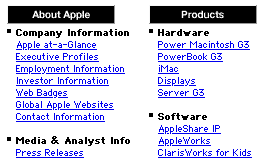
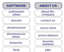
Down with site maps! Maps are fine for navigating geography, but virtual geography such as a web site is more like a book/card catalog/library I would think. Only a very general map pointing towards major sections makes sense. After that there's too much visual scanning involved. Even good maps rely on listings of street names and such, tapping into organization methods like the alphabet and indexing.
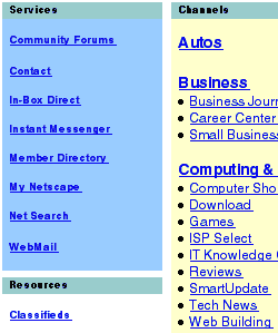
The below are called "maps" but only so people know what they will get when they click on the "site map" link. They resemble outlines more than maps. Each is a good representative of the company from which it was birthed: Apple's is clear and informative; Macromedia's is clear with a more current design sense; Netscape's is a poor imitation only tolerable on a black and white monitor.
6-27-1999
I'm wondering where our advances in auditory interfaces will take us. Not unlike my entry for 6-21 below, I wonder if we'll end up in our own sound-proof environments, whether by way of headphones or barriers around our workstation? It'd be nice if the headphones didn't simply pipe in an alternate sound source and block others, but instead intelligently blended the environmental sound with the computer-generated sound, adjusting volumes where required. Perhaps this would also alleviate the increased environmental sound caused by everyone using speech recognition as an interface to their computers.
6-24-1999
Auction Yourself! Sociology won't be able to keep up with advances in new and astounding Internet business ventures. Here's the newest one from Monster.com:
This first-of-its-kind auction-style product empowers independent professionals, contractors, consultants, freelancers and micro-business owners to market their skills and experience directly to employers for short and long-term assignments.Here's how it works. You describe your skills, your experience, and your target opportunity - where you're willing to work, what kind of company you'd like to work for, what kinds of projects you're interested in and your desired rate. Then you launch your auction. As the bids start rolling in from employers, you select only those companies and opportunities you're interested in. The freedom to choose is in your hands.
I hope we'd go in the other direction: new networking opportunities emerging from online communities at vertical portals; tight knit groups of people in a common field offering personal referrals to each other, all made easier with technology (that's how I found my job, on a listserv!). For example, the computer book publishing community is getting there in the form of Studio B.
6-21-1999
I'm wondering where our advances in speech recognition will take us. Say, for example, I am dictating this, and any other thoughts I have during the day, to the computer. Instead of typing it all in I am now speaking it. This is surely easier in the short run, but how soon will I fatigue from all that talking? Will I associate talking with work and be more apt to drink alone on weekends instead of in a social environment? Will we all end up in sound-insulated cubicles at work isolated from one another?
Think Different: I think the Mac will always be in the minority; the masses are too lazy to think differently and experiment with a possibly exciting computer because of the bit of a hassle it carries with it. Apple's "Think Different" campaign only speaks to those who are already inclined to appreciate being apart from the crowd and so reinforces this idea of appealling to the minority.
Regarding the ungrammatically slogan, the "Think Grammatic" folks overlook the fact that
the grammitically incorrect slogan is one way of being
different, of not conforming to rules and instead going with
what "feels right."
Press releases suck. They are written for another time in which other media ruled. Putting these ridiculous documents on a web site is insane. They were never meant to be read by the reader, they were meant to be incorporated into newscasts and other formats. They're not internet friendly - too long and not written with hypertext in mind.
And now that people have greater access to them there must be
a growing aura of cynicism around them, given the fluffy, hype-ridden nature of press
releases these days.
6-11-1999
NPR's Quest for Sound is a wonderful project, collecting "... home recordings of the last one hundred years to be shaped into stories that capture the rituals and sounds of everyday life."
I've been looking at lots of high design sites lately, of which http://www.k10K.net is one of the best. Some of the art on these sites, using state of the art Flash and DHTML, is inextricably tied up with mathematics - requiring the designer to also be a programmer.
Olla podrida, a beautiful word, curtesy of Merriam-Webster:
olla podrida   \AH-luh-puh-DREE-duh  or  OY-uh-puh-DREE-duh\   (noun)
  1 : a rich highly seasoned stew of meat and vegetables usually
  including sausage and chickpeas that is slowly simmered and is a
  traditional Spanish and Latin-American dish
 *2 : hodgepodge
Designing Auditory Displays for Global Usability is a great article by Robert Tannen of the U of Cincinnati Dept of Psychology. Although he covers some basic ground already covered by others, what he adds is insightful. What I found interesting:
- Good interfaces provide an effective buffer between the user and the machine, enhancing performance, but we're not yet at the point where the systems are so good that we don't need to monitor their progress. This buffer can insulate us from feedback we need to keep the system working.
- Although web browsers are arguably trying to imitate TV, surfing the Internet involves lots of background processes (e.g. FTPing files) and a lack of screen space makes it difficult to monitor those processes.
- Sound could provide the necessary feedback to improve web browsing, and is well-suited to this task since it is good at signaling changes over time and is less directional than a visual display (the "modem-handshaking song" is one good example).
- Tannen points to sonification (using sounds not natuarally derivative to represent events or objects, such as the ping on a sonar screen) as a way to provide needed feedback in a universal manner, because the abstract sounds don't belong to any particular culture.
I propose a hypothetical auditory display based that follows this vertical metaphor. The form of this auditory display is a cascade: the direction and rate of information between the web and the desktop is aurally presented as rising and falling "streams" of information. Clearly, trying to simulate a waterfall-like sound would go against the principles discussed earlier, so short mid-frequency (~500Hz) pulses can be generated. These pulses are spatialized using 3D sound processing technology, so that when information is being download to the user�s desktop, the pulses appear to originate from a point above the desktop display (and vice-versa for uploading). The position of consecutive pulses fall sequentially closer to the computer, to give the impression that data is falling from above and landing in the user�s information space. This is consistent with the visual desktop metaphor of pages loading from top to bottom. Direction (uploading or downloading) is displayed by the perception of sound sources moving away from or towards the desktop along a vertical axis. Rate of information flow is a time-based function: the rate of change in the position of sound pulses. Communication lags can be differentiated by spatial location. For example, if the pulse rate decreases as the signals approach the desktop level, this is an indication that there is a local problem (busy CPU). If the pulses are relatively slow all the way down one can assume that the lag is caused by high network traffic.
6-4-1999
Motion Graphics as practiced by hillmancurtis.com was the topic of the lecture I attended today, given by Mr. Curtis himself. In a nutshell, "motion graphics" consists of graphics set in motion in order to highten the emotional effect. In Curtis's case that usually means fast motion and lacking any interaction. Take away points:
- The process of composing these little Flash animations is much like video production, and as technology for the web increases in sophistication it will be video production. I guess us web/interactive folks will have to learn how to play with the audio/video production folks.
- Sync'ing audio with animation in Flash is tough, and depends on the processor speed (the sound can be preloaded so it's ready even over a modem connection). Using less percussive sounds make small imperfections in the sync less noticeable.
- The main selling point here is emotional effect. I'm afraid these will become novel and lose that effect soon.
6-1-1999
My better half, a change management consultant, introduced me to the field of Organizational Development (OD). OD, as far as I can tell, is how psychologists do business consulting. An "OD" consultation seems not unlike how MBA's do re-engineering, or process engineering. Firms that focus on OD work on issues such as human resources, recruiting, interpersonal factors affecting business, compensation, etc. and may be a better, more specialized choice for these cases than the big, cookie cutter consulting firms.
OD folks acknowledge the role of technology in an organization, they are primarily concerned with the "social subsystem."
In a good, short introduction to the topic, Organizational Development - A process of learning and changing, W. Warner Burke makes these points:
Organizational Development is a process of fundamental change in an organization's culture
where culture is defined by Edgar Schlien as:
basic assumptions and beliefs that are shared by members of an organization, that operate unconsciously...They come to be taken for granted because they solve problems repeatedly and reliably.
and development is defined by Ackoff as:
an increase in capacity and potential, not an increase in attainment...It has less to do with how much one has than with how much one can do with whatever one has.
So an organization practices its old ways and may even keep growing but cannot develop without change in its culture. How does an organization know when they need developing?