Just when you thought you knew how radio buttons should work, Expedia introduces the Link Button:
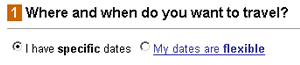
I stared for a few seconds, then guessed upon clicking the link it would give me an explanation of the term. Nope. It selects that option, same as if you clicked the radio button. Did Expedia do usability testing and found no one knew how to use radio buttons?
More interesting is what lies just above the radio buttons, another form of mutually exclusive navigation:
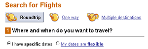
In this case the selected state is represented by a button which is not clickable. My personal preference is for links to load a new screen of information, not new form options, but that’s not a big deal. What’s odd is that they use two different and somewhat unconventional UI widgets right next to each other to do the same thing. Other options include putting some questions on the previous screen, inserting wizard questions, using all radio buttons, and even Amazon-style tabs might be more clear and exhibit more consistent behavior. Heck, why not use them all?