Month: March 2004

  • A complex stream containing numerous clusters of value satisfactions

    The Whole Whole Product is essentially about customer experience: ‘The core focus has shifted from ³how good can we make our product?² to ³how happy can we make our customers?² Two very different questions, looking at the marketplace from two very different perspectives.’ But it’s from a marketing perspective, so you get different terminology: ‘A product is, to the potential buyer, a complex stream containing numerous clusters of value satisfactions.‘ The design and marketing fields may be on orthogonal paths, speaking about the same thing but rarely interacting. Some bridge material would be helpful.

    Also, it’s interesting that Gerry McGovern is writing for the same publication.
  • Volunteering pays

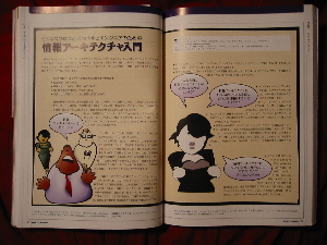
    In one week the Intro to IA brochure (PDF) I created with Dan Willis has been translated into Spanish and Japanese. The latter was also printed in the Japanese journal ‘WebSite Design vol.10,’ who did a great job with the layout, not surprisingly considering its overall quality. And they paid me $65. Not a huge amount, but it’s nice to be compensated and watch the work take on new lives beyond what I imagined, all from a little piece Dan and I threw together for the hell of it.

  • Tools for Women

    I saw the Barbara K tools for women in Bed, Bath & Beyond this weekend and they’re very nice, the handles are all curvy and feel great. After owning hammers whose head would slide off the handle I now own a solid, heavy hammer I love, but my wife thinks it’s too heavy. In a world of big, burly tools these are so smart.

  • The IA goods, en español

    The AIfIA Translation Initiative translated several new pieces from me and several others into Spanish.

  • Tyco Jury Sent Home to Calm Down

    “This is not a hung jury based upon a lack of unanimity,” the note continued. “This is a jury that has ceased to be able to conduct respectful, open-minded, good-faith deliberations.”

    I was on a criminal court jury last summer, deliberating a case that could have put someone in jail for a long time. I spent a week and a half sitting silently next to a randomly selected group of eleven other New Yorkers, and then moved into a room with them to discuss the defendent’s fate. I was singularly impressed with the seriousness and intelligence every person brought to the situation. Now, I ride the subway looking at strangers knowing what they are capable of, but also that I might have been lucky.

  • Shut Up ‘N Draw Yer Wireframe

    We’re posting our wireframe templates over on the Asilomar site.

  • Top Ten Things They Never Taught Me in Design School

    From Michael McDonough, I’m still learning these lessons.

  • Headline! Radio buttons originally controlled radios

    If you’ve read About Face, you know about how to use radio buttons. But if you haven’t read Tog on Interface, you don’t know how they were invented, or why they’re called that. You really don’t need to, but it’s damn interesting, and while the book is outdated, Tog is funny as hell. Actually, it may be useful too; a friend just wrote to ask, ‘Is it radial or radio?‘ The reason it’s radio is because it mimics the behavior of those old analog car radios. They had a row of buttons to select a station, and pushing one in moved the analog needle to the preset frequency. Of course you can only select one station at a time, hence they’re a good metaphor for when you need a mutually-exclusive UI select widget. Also, you can plainly see which choice is selected and all the choices at a glance.

    Hmmmm, I feel old.

  • Cost and Style

    My post on eBay-as-Flea Market received a bit of attention, including — judging by the referers — some folks from eBay. Later discussions with Tanya and Owen refined these ideas a bit, namely:

    • I was a bit sloppy in my use of the word design. eBay’s design works, though the style of the site — by reflecting the home-spun vernacular of sellers — can be low style
    • Low style is not the same as clean style or bad style. Low is the vernacular, clean can be a default look, and bad actually works against the design. Someone somewhere probably has expressed this better with different terms, but lacking that knowledge I’m running with it.
    • Low style and low cost — giving the perception of a Flea Market — can be good. These are not value judgments, but judgments of value.
    • Organization and classification is often secondary to other factors that communicate value, such as style and cost.

    • And so on. The interplay of style and cost most interested me, so I created a little matrix with pretty pictures:

      It’s a bit rough, but could turn into a fun little tool to clarify product design and marketing (‘Which quadrant are you in? They’ll all good, but different.‘). Might be nice to create a book of them, including ye ol’ value-complexity matrix.

  • Handling error messages

    Julie Stanford and Todd R.Warfel offer a good guidelines for handling error messages.

  • Litmus test for scent/meaning

    I’ve plowed through the research on information scent, and while they seem to be learning something about how people think about links and navigation, it’s not clear if there’s anything actionable for designers to take away from it. So I continue to think about how to create scent, or really, how to make links meaningful to people. I think some of Spool’s research on link length is helpful.

    Recently I’ve been playing with what I call the Litmus Test for Scent. It helps to quickly judge whether link text is effective in an appeal-to-common-sense way. Here’s the format:

    OH! I really want to see what’s in [link name]!

    So, for example, when I go to Amazon and see that little tab with my name on it, I say, “OH! I really want to see what’s on Victor’s page!

    but not

    OH! I really want to see what’s in Click here” or “OH! I really want to see what’s in [insider lingo]” etc.

  • Shifting information goals

    Peterme nicely illustrates shifting goals in the information seeking process — complete with screen shots — revealing the complexity of navigation design: ‘My original “goal” was to learn about Ann Willoughby. On reading that page about Ann, my goal shifted…. Shifting and evolving goals are not only common — they are the norm.


    Someone at work recently pointed out that the retail theory people, like the folks at Vanderbilt’s eLab, tried pinning navigation to the measurement of flow. It’s another example of a highly dynamic environment (psychology + HCI + lots of information) that makes simplistic approaches to navigation design look, well, simplistic.


    I took the first step to addressing this with my navigation design research and method. It needs a lot of work, but I think it approaches something robust enough to acknowledge the complexity of navigation design yet accessible enough to use without interfering with the design work itself.

  • Interface Politics

    I’m not sure if Christina coined the term, Interface Politics, but it so nicely sums up what it describes I need to steal it.