If you’re in Austin for the IA Summit don’t dine alone! Some of us are having dinner at Zax, 312 Barton Springs Rd at 7:30.
Month: February 2004
-
Recently featured at NBS…
Good explainations for something we already knew: Big companies breed small minds.
Even if Mark Hurst is over-simplifying, those pages aren’t long for this world.
Shop for a date at Yahoo! Personals.
And Nathan Shedroff sums up what’s wrong with personas. -
Big companies breed small minds
Two views on the same idea:
Daniel Dennett in How The Mind Works, courtesy of Alex Wright:
A flow chart is typically the organizational chart of a committee of homunculi (investigators, librarians, accountants, executives); each box specifies a homunculus by precribing a function without saying how it is accomplished (one says, in effect: put a little man in there to do the job). If we then look closer at the individual boxes we see that the function of each is accomplished by subdividing it via another flow chart into still smaller, more stupid homunculi. Eventually this nesting of boxes within boxes lands you with homunculi so stupid (all they have to do is remember whether to say yes or no when asked) that they can be, as one says, “replaced by a machine.” One discharges fancy homunculi from one’s scheme by organizing armies of idiots to do the work.
Jim McGee, courtesy of Bill Seitz:
Years ago I worked for one of the big systems consulting firms. In a conversation on a flight from New York to Chicago, one of the partners told me, “Jim, we can’t have everybody thinking for themselves, 90% of the people here are just pulling on the oars. If everybody decides to steer we won’t get anywhere.” There’s a huge amount of industrial logic in this. You want to control risk. You want predictable results. You want control and replicability. What makes the transition to a knowledge economy so scary is that it disrupts this equation. What if one of those guys pulling on the oars figures out how to make a sail? Contemplation of these questions makes innovation and new knowledge creation feel like potential chaos. Easier to push the problem into the categories that promise continued control.
-
Marketing/Usability Litmus Test
Refining my thinking about how to integrate brand and marketing into IA. My current litmus test is, ‘Do both the company and the customer benefit from the design?‘ That sounds like a statement I think my marketing people will agree with, and is more realistic than only arguing for usability (in most companies). I find that most of the decisions occur at fine levels of design, like when and how to ask for an email address. And that’s when the litmus test is invoked.
-
Grey Tuesday
The positioning of Grey Tuesday is interesting, but somewhat flawed. First, this ain’t a censorship issue, it’s a copyright issue. Second, censorship doesn’t work, but copyright does.
Granted, not everyone wants copyright. For those who wish something more flexible, there’s Creative Commons. For those who don’t want to respect copyright, there’s, well, stealing. Stealing is bad. I like Creative Commons, and I dislike narrow minded lawyers, but that doesn’t turn this into something other than a legal issue, so it’s a matter for the courts to rule on this grey area (pun intended) of fair-use. I’m not sure a lot of coordinated stealing is going to influence the judges.
-
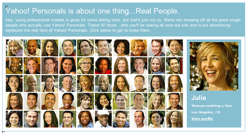
Y! Personals & Galleries
Yahoo! has this clever campaign for their personals that I couldn’t help but follow and explore (Not that I’m in the market sorry to disappoint you :). What I saw was pretty amazing, a gallery-like view of many singles…

Very cool, because it’s just so browse-friendly. Visually scan for an attractive face, then click for a bit more info, and if he/she still holds potential then click ahead for all the juicy details. I might be shallow wanting to see what people look like first, but I would bet this is the ‘primary facet’ for many folks, especially in the privacy of their web browsers.
Unfortunately, this isn’t how Y! Personals actually works. The above is just a promotion screen. The actual search results are pretty conventional…

The problem also must balance the volume of results; while the gallery layout can squeeze in 50 results you need to consider the amount of results within the chosen geographical area. I’d probably try delivering the first 50 results closest in geography by default and let the user alter it further. I know in a dense area like New York there’s 92 results of women my age within 5 miles, which ends up being 10 results pages, pages you actually want to view, as opposed to your usually search results. I’d rather have 2 pages. Too many images per page over a modem? Nah, these are worth waiting for.
-
Your email has been sent.
…and then what? What do you give them after they click Send? None of the usual approaches satisfy me. I want to give that person who just took the time to send us email a big smooch, or some sort of instant gratification, a coupon for free ice cream, a free report, something of beauty or humor.
Brett Lider and Craig Scull write in:
The confirmation page after a feedback form submit should list some recent changes made to the website in response to user feedback or usability. This helps them feel like the message doesn’t get flushed into the corporate vortex and makes the company look responsive to customers. It will take some periodic updating of the confirmation page to follow-through on this idea. And if you allow for users to sign-up to be part of a user research pool, include that link here.
-
AP Voltron
This ok/cancel had me in stiches. We need some more East Coast power. Maybe like in Lord of the Rings we can light fires along the Appalachians and summon Krug, Druin, & Quesenbery?
-
A Short, Grandiose Theory of Design?
I’m desperately searching for “A Short, Grandiose Theory of Design”, by Jay Doblin from a 1987 issue of the STA Design Journal on Analysis and Intuition. If you have a copy to share you can email me from my bio page.
-
Stop Reading This RSS Feed
Come visit, I never see you anymore!
-
Designing the TiVo Remote
Now Preening on the Coffee Table is a story in the NY Times (free registration required). ‘Central to the process, Mr. Newby said, was producing prototypes “early, ugly and often.” Ugly? “There tends to be this conservatism in the design process,” he said. “I encourage young designers to go off and scare me.” -
Booty
Someone is selling old Razorfish paraphernalia on Craigslist. I actually owned much of this stuff at some point, still have a couple of the shirts. The sleave of my MOM3000 (the name of the intranet) shirt says, ‘never in beta‘ which pretty much sums up the exuberance of the time.
-
Tracking user’s nav use
Michael describes his work tracking where on the screen users click on navigation.