Category: Information Architecture


  • The Effects of Menu Graphic Design on Navigation Research

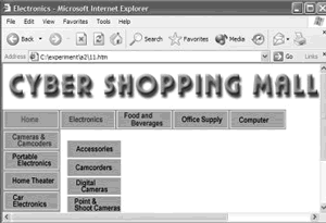
    I was psyched to find The effects of menu design on information-seeking performance and user’s attitude on the World Wide Web by Byeong-Min Yu and Seak-Zoon Roh (JASIST, Volume 53, Issue 11, Pages 923-933). It’s only a couple years old and fairly rigorous, but I can’t recommend it. It looks as if in the process of trying to control for the graphic design, they ended up simply creating bad graphic design. Below is a shot of a cascading menu from the study, which is so unusual looking I can’t respect the study’s findings. Granted we’re looking at this out of context, but something as familiar as a cascading menu – especially when used for a navigation – should look rather familiar. I would think when controlling for this, it would make more sense to use the very familiar, such as menus that resembled Windows menus. Oh well.


  • Recognizing Digital Genre

    Recognizing Digital Genre, a short 2001 paper by Elaine Toms at the University of Toronto continues (for me, at least) Dillon’s work on the shape of information, although it strangely doesn’t reference Dillon. It does include one super neato experiment. Highlights:

    • Creating Web documents is a cookie-cutter affair as documents of differing types are formatted with essentially the same structure, eliminating or disguising those visual cues that help people to make sense of the content and requiring additional effort to interpret the document.
    • An experiment asked people to recognize three versions of documents: an original, a ‘content version’ with all the formatting removed, and a ‘form version’ with formatting left intact but characters and numbers changed to X’s and 9’s respectively. Not surprisingly, the original and content versions were recognized more often, but the form version – when recognized – was recognized twice as fast as the other versions.
    • As a final test…we mixed and matched content and form within a single document…. People focused on the form or structure of the document first and were more likely to call a bibliography-formatted-like-a-dictionary, a dictionary rather than a bibliography.
    • For Dillon the precise definition of information shape is elusive; Toms defines it as ‘the regular and logical pattern of elements (the shape of information) expressed by a discourse community.

    The references lists related work by her and others. Thanks Elaine.


  • Layer of Abstration

    OK, you’ve got a taxonomy full of info you want a whole bunch of distributed, internal, business users to manage and a website that displays that taxonomy, but in a very particular way crafted to the needs of customers and controlled by a centralized web group because you don’t want to simply display the raw taxonomy cause that sucks for navigation much of the time, and somehow you must do the taxonomy dance to tweak how the taxonomy content flows into pages.

    On back end, you store all metadata in faceted taxonomies – someone else’s smart decision that preceeded you – and on front end you combine some taxonomies to create a hierarchical view for browsing and within that display, content is displayed differently depending on info from other taxonomies, other values from other facets.

    In order to do the taxonomy dance – massage taxonomy displays to be more navigable – you design a little two-screen interface to manage the display hierarchy (a technologist’s term for it, which I like), adding/deleting display categories (which are separate from the back end categories) and mapping children to parents.

    A tricky part is that a lot of distributed people will be entering content, and only a few people will be doing the taxonomy dance. So those entering content won’t necessarily see the same categories that end up in the presentation, because dancing has altered it. How, you wonder, does one make this clear and comfortable for the content authors? This process of communicating with content authors using content management systems to manage a taxonomy catalog that is then displayed according to rules and an arbitrary user interface becomes a big, fat, juicy IA challenge.


  • Bella at St. Johns

    If you live in the New York City area and are looking to learn more about IA and classification schemes, you might like Bella Hass Weinberg’s class at St. Johns University. This Spring it’s offered on Thursdays, 7-9pm. Bella is a world-class expert on indexing and thesaurus design. She can tell tales of the oddest indexes found in the most ancient texts. She works and writes constantly. She also wears, without peer, the most stunning hats.


  • IA as Conversation

    In the past I’ve wondered about how taxonomies become navigation and did the taxonomy dance to match the bottom-up to the top-down, and now I wonder if this whole way of thinking about information architecture is flawed. Maybe the bottom-up of organizing information can never match the top-down of the user’s goals because we’re thinking about it wrong. Here’s my line of reasoning:

    • Design is about people. Design is done by people to benefit people.
    • Content is just the outward expression of the designer.
    • The reader is ultimately interacting with the designer. This interaction happens via the content. With all the technology and information before us, it’s easy to forget this interaction is about people talking to each other.
    • Information architecture could be thought of as facilitating conversation among people.
    • IA could benefit from techniques that help people interact well.
      • In a conversation, one can merely hear the other party, the two parties can each talk about themselves, or each can listen with empathy, ask questions, and build on each other’s comments.

    How might this translate to designing information architecture? The design of social software comes immediately to mind. But I think this can have implications for good old navigation too.


  • Semantic Web: Paul Ford responds to Clay Shirky

    Usually a fan of Clay Shirky, I heaved a heavy sigh at yet more strawman arguments directed against the Semantic Web efforts. I was pleased to see Paul Ford took the time to respond at length, giving concrete examples as well as demonstrating the techniques on his own site.

    The critics of the Semantic Web, methinks, simply lacking patience. If everyone only thought one, three, or five years into the future we’d never solve the very hard problems. The Semantic Web as a practical reality might be 10 or 20 years off, but that’s not really so long. And if the W3C wasn’t doing this work, we’d all be sitting around complaining, “Someone has to think about the future of the web, coming up with the strategic plan for web technology and use. Why isn’t the W3C doing this?!”


  • Where Nav Meets Taxonomy

    I had a great session at work recently massaging a general taxonomy to be navigable. Hunched over wireframes and a hierarchical view of the taxonomy with a programmer, business analyst, and manager we were all able to communicate and understand the issues.

    This is an important area of IA that is getting to be more like science and less like art. Personally, I still think bottom-up design sucks when used for navigation. The idea that you can, say, create a taxonomy without knowing who will use it or how is just ridiculous, and the more different users and users you apply to it the more its usefulness is diluted; the effect is proportional.

    For example, a hierarchical taxonomy may not be balanced (an equal number of children for each parent), it may be deeper in some places than others. This may make it difficult to pull the data out and put it into a standard template (which is the advantage of having the info organized that way ahead of time), ending up with some pages that have too little content and others which have too much. With the philosophy that the UI is designed for the users’ needs, it’s the taxonomy that is the problem here.

    Depending on the labels, leaf nodes may not be findable from the top of the tree (can someone look at the top-level category and ‘smell’ what’s a few levels down?). If we have this problem, we might start collapsing some levels. Then we look to see if this results in pages that are too long and balance the levels and the size of the pages: the taxonomy dance. But our information isn’t static, and we can’t always predict how the taxonomy and the information inside it will change.

    That said, sometimes you have an underlying structure like a hierarchical taxonomy and need to stick a user interface on it. When this happens it’s best to have a layer of abstraction between the two so that the UI can serve the needs of the user. The layer of abstraction might just be very clever database queries. But this assumes the database is modeled to allow a flexible UI, for example, not hard coding hierarchical associations. I still haven’t arrived at the point of a method we can follow when doing this, it’ll take collaboration with a database programmer to do so.

    Later…I had asked “can someone look at the top-level category and ‘smell’ what’s a few levels down?” That’s important for directed search, where you may be looking for grandchildren. It’s not as important for exploratory browsing: If you can smell the children categories under each parent, you can gradually work down the generations.


  • Transitional Volatility

    Notes on Transitional Volatility (PDF) by David Danielson (2003), also the topic of his master’s thesis. It’s a rare, rigorous look at the common guideline to ‘make navigation consistent’ in a world that has big websites where the navigation must change from time to time. His finding showed that complete consistency is not always the best route.

    Essentially he studied how users reacted to changes in the navigation appearance from page to page. He tested use of three versions of one site, each with a different navigation scheme. The ‘full overview’ had a full site map-like outline in the left nav, the ‘partial overview’ only listed the second and third level categories for the currently selected top level category, and the ‘local context’ listed the second level choices for the currently selected top level category plus the third level categories for the current second level category (see screen shots in the paper). Users were given directed-search tasks, or low complexity fact-finding missions.

    His sample site used a ‘well-formed’ and limited hierarchy, such that each of the two upper levels’ items always had subordinates, and no item at the third level had any subordinates.


    From the abstract: The results suggest an interesting pattern of interaction effects: When users are provided with partial overview navigation support, navigational volatility predicts increased disorientation, decreased perceived global coherence and decreased ease of navigation. In contrast, when provided with a more locally focused navigation scheme, navigational volatility predicts increased perceived site size and increased perceived global coherence. The results generally supported a model with a direct causal link from navigational volatility to disorientation.

    Transitional Volatility: the extent to which users encounter changes in the Web interface as they move within or between sites.

    On user expectations: The user becomes habituated within the recent navigation patch. The user predicts content and navigation option changes in page -to-page transitions. The user reorients at the destination page of a transition. The destination page becomes part of the recent navigation patch, continuing the cycle. So it’s just not the page right before the change that sets expectations, the user has a subtle and complex memory of pages they’ve experienced.

    His incorporation of user expectations integrates the volatility question with a main challenge of navigation, the ‘behind-the-door’ problem of user’s ability to understand what a link will lead to.

    On causes of disorientation:moving among unrelated information topics in the Web space appears not to have been related to disorientation. More importantly for the purposes of this discussion, top-level switches do not, in and of themselves, cause disorientation… disoriented users consciously recognize the hyperlinks that will lead to navigational changes (navigational predictability), and then decide that such change is desirable… it was the home page link in the top-left corner of the page, just as one might have expected, that was "inviting" disoriented users, not the top-level hyperlinks.) [Spool would love this] A reasonable conclusion seems to be that the all-or-nothing nature of users’ navigational volatility distributions in the Partial Overview condition were more noticeable, and more disorienting, than the more subtle and graded changes typically encountered with a Local Context navigation scheme… The extent to which a user is habituated in a navigation patch may make the changes seem even more dramatic when they do occur

    The take-away is (to oversimplify) keep navigational changes subtle. The subtlety should be in proportion to how much the user becomes habituated to the navigation. Later we see that subtle changes may themselves be helpful, assisting users in perception of connections among links.

    On perceptions of site size and complexity: The study results suggest that navigational volatility leads to increased site size perception… A significant effect was not found linking perceived global coherence to perceived site size.

    On perceived global coherence: navigational differences (navigational volatility) allowed users with Local Context support to see connections between distal pages they otherwise would not have seen – and so led them to view such pages as more related. Fascinating, a change in navigation actually helped the users perceive connections.

    On context: The broader goal may be to precisely determine the set of factors affecting a navigator’s ability to map hyperlink attributes at a source page to characteristics of the hyperlink’s destination page. As this investigation shows, the factors will not be limited to hyperlink attributes (such as what the link’s text snippet itself says), but, rather, will extend to broader contextual factors, such as the sorts of volatile transitions the user has already been exposed to. So just looking at scent, or just shape, ain’t enough. It’s a complex interaction of several components.

    Variables: he nicely controls for navigation structure and page layout. I wonder if it’s additionally possible to control for info scent and shape?

    Thank you David.

    Later, a comment from JJG offers a fun name for this: ‘One new wrinkle is this notion that the more navigation changes from page to page, the larger and more complex the site will be perceived to be. Call it the Seven Veils Effect: by alternately showing and hiding what’s available, you create the impression that there’s more to see than there really is.’ I’d argue that you’re just cleverly showing what’s actually there, but I love the name.

  • Usable Browse Hierarchies

    Notes on Toward Usable Browse Hierarchies for the Web (.doc) by Kirsten Risden of Microsoft Research (1999). Looking at Yahoo-style category and sampling of sub-category navigation, she seems to suggest that using polyhierarchies are a way of compensating for ambiguous categories and labels. Well yes, one might say, but if it helped people find what they’re looking for, isn’t this just an academic argument? But the point is well taken: if you’re turning to polyhierarchies to solve a findability issue than perhaps your categories (or any categories) aren’t the solution.

    Thanks Kirsten.


  • The Sheer Mass

    Kathryn says, ‘I carry the weight of old boyfriends, self-possessed jerks and sweet immature nerds. The weight of making the relationship work, I can feel it in my chest and my throat. And if I open my mouth I inhale the sheer mass hanging in the air between us. My fear and ignorance are cinder blocks around my waist, one day anchoring me to the bed of the East River.


  • Educating and Marketing

    What’s the essential difference between informational content and marketing content? I decided it was an objective tone vs. a subjective tone, respectively. I had to get that clear for myself as it can become very subtle when adjusting language and people can be rather passionate about wanting one or the other without actually knowing what they’re asking for.


  • Design Principles for Content Management Applications

    I’m working on a content management application – the part of the content management system the authors and administrators use – and jotted down a few principles to follow. They may not be applicable in every case, but expanding along these lines might lead to some design patterns.


    • Manage content, not pages. This makes content reuse easier.

    • Reuse existing content when possible. The interface should make it easy to


      do so.


    • Content should improve the user experience. When deciding whether to reuse


      content or create new content that will facilitate a significantly better user experience, create new content.


    • Store content once: Do not create (or allow the user to create) copies.

    • Facilitate quick updating: Reduce need to update the site through less


      convinient processes, such as uploading templates outside of the CMA.


    • Content is valuable: Content takes a long time to create and update. Do


      not delete or expire content unless absolutely necessary. In general, more content is better.


    • Separate content from presentation: wherever possible, separate display


      text from HTML and other formatting information.


    • Design CMA display to resemble CDA: when possible, this helps to present


      authors with a familiar visual design


  • Shape of information, a summary

    Andrew Dillon’s work on digital genres, the web, and the shape of information is some of the most exciting research I’ve come across in the field of navigation. He has investigated how we can use our familiarity with genres to navigate, how navigation of information is different than navigation in physical space, and that creating navigation is essentially about creating meaning, not just road signs. And he manages to do this while retaining essentially a top-down perspective, not succumbing to a focus on merely organizing content. He doesn’t go as far as addressing larger user experience issues head on, but he positions his work in a way that acknowledges those issues.

    If you have access to JASIS past issues, a good starting point is Spatial-Semantics: How Users Derive Shape from Information Space (JASIS. 51(6):521­528, 2000). Otherwise download “It’s the journey and the destination” (PDF) where he questions the difference between navigation and content… ‘while physical navigation might be neatly divorced from the purpose of the journey, interactions with digital documents are not so easily divided. The purpose of moving though the information space is frequently the same purpose as the journey, to reach an end point of comprehension – and in this case the journey is the destination.’

    Here’s my short form raw notes, which aren’t necessarily helpful to anyone else until I do something with them…


    • Don’t misapply navigation from the physical domain to the semantic domain

    • User’s perceive “global” schemata (generally how sites work) and “instantiated” schemata (how this particular site works). This can be apply to ideas of design conventions.

    • The structure of a genre – the shape – is a global schemata. Users can predict ordering and grouping of elements. They know where a typical element belongs in the overall structure.

    • Examples of genres online might be articles, blog postings, email headers…

    • Need to leverage existing shape, and fit information into existing genres when possible.

    • Cites research (Snowberry et al) that menu navigation has (basically) bad scent. So these ideas are helpful when categories don’t work due to unfamiliarity with the domain.

    • Recognition of genre depends on experience and expertise of that genre. Integrate these attributes into user models.

    • Upon entering a new location, users will identify unique spatial configurations (Siegal and White, Mandles). Immediately after, semantic processing begins.

    • Shape is a property conveyed both by physical form and by information cotent

    • “Technology is more malleable that the user” – Amen!

    • Contrast expertise with differences in cognition (spatial ability or memory span). Also needs to be integrated into user models.

    • Disorientation occurs when short term memory (STM) is overloaded (by lack of good navigation)

    • Genre could be based on how a community uses information and varies by culture. Another attribute for user model.