From Michael McDonough, I’m still learning these lessons.
Author: Victor
-
How topic maps and ontologies compare to taxonomies and thesauri
Metadata? Thesauri? Taxonomies? Topic Maps! Making sense of it all from Lars Marius Garshol, on my to-read list.
-
Headline! Radio buttons originally controlled radios
If you’ve read About Face, you know about how to use radio buttons. But if you haven’t read Tog on Interface, you don’t know how they were invented, or why they’re called that. You really don’t need to, but it’s damn interesting, and while the book is outdated, Tog is funny as hell. Actually, it may be useful too; a friend just wrote to ask, ‘Is it radial or radio?‘ The reason it’s radio is because it mimics the behavior of those old analog car radios. They had a row of buttons to select a station, and pushing one in moved the analog needle to the preset frequency. Of course you can only select one station at a time, hence they’re a good metaphor for when you need a mutually-exclusive UI select widget. Also, you can plainly see which choice is selected and all the choices at a glance.
Hmmmm, I feel old.
-
Cost and Style
My post on eBay-as-Flea Market received a bit of attention, including — judging by the referers — some folks from eBay. Later discussions with Tanya and Owen refined these ideas a bit, namely:
- I was a bit sloppy in my use of the word design. eBay’s design works, though the style of the site — by reflecting the home-spun vernacular of sellers — can be low style
- Low style is not the same as clean style or bad style. Low is the vernacular, clean can be a default look, and bad actually works against the design. Someone somewhere probably has expressed this better with different terms, but lacking that knowledge I’m running with it.
- Low style and low cost — giving the perception of a Flea Market — can be good. These are not value judgments, but judgments of value.
- Organization and classification is often secondary to other factors that communicate value, such as style and cost.
And so on. The interplay of style and cost most interested me, so I created a little matrix with pretty pictures:
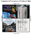
It’s a bit rough, but could turn into a fun little tool to clarify product design and marketing (‘Which quadrant are you in? They’ll all good, but different.‘). Might be nice to create a book of them, including ye ol’ value-complexity matrix.
-
Handling error messages
Julie Stanford and Todd R.Warfel offer a good guidelines for handling error messages.
-
Interface Politics
I’m not sure if Christina coined the term, Interface Politics, but it so nicely sums up what it describes I need to steal it.
-
Otwell on Berlin’s Tacheles
‘…entire neighborhoods were made up of the retail equivalent of personal websites…‘
-
BCG Publications
BCG Publications (Ivory tower consulting firm), free.
-
Theory: EBay as Flea Market
Let’s assume EBay looks the way it does (not great) because not a lot of attention was paid to the design. Now let’s say they had contracted the design to a professional services firm that practices user-centered design. What would the result look like? Most likely something pretty slick.
Conventional wisdom – at least with the folks I hang out with – says that auctions, plus EBay’s first-mover advantage – is such a compelling experience that people will tolerate the bad design. But what if EBay is succeeding because of its bad design? What if, like a flea market’s rough, seller-created environment, the amateur design communicates the idea of bargain?
A designer might have come to this conclusion – balancing some good global elements like navigation with lots of seller-created pages, letting the vernacular bubble up, however painful to look at – but maybe not. And even if the designer was to hit upon this idea, how hard it would be to sell, or even to think about selling, a poor looking design to the client.
The experiment to switch the quality of the design could certainly be run, and will be if EBay ever grabs the reigns in a big way and puts a pretty design in action. If popularity declined as a result, that would be quite a big insight into experience design.
-
Compare Products
A quick comparison of ‘compare products’ functions, I’m particularly interested in the use of screen space and comparing several products. Yahoo shopping will let you compare a seemingly unlimited number of products in its columnar layout, so the visual scanning is done by horizontally scrolling. Same deal at NexTag and EspressoPeople. Dealtime also lets you select many items but paginates the results, five per page. Bizrate uses a pop-up alert when you try to select more than three items. MySimon compares prices, not features, and uses rows instead of columns. Canon UK offers three pull-down menus displayed horizontally and each column is populated dynamically (neat, if limited). Turbo Tourney just displays their three products, no interaction needed.
Holy crap, check out the Yahoo Shopping SmartSort. The interaction design – especially the most/least important radio buttons – is a little confusing, but it’s fast and useful. Neatest of all is the copy for each of the items, which changes dynamically, so it can say things a person would say, like
Toshiba Portege 2010 is a subcompact notebook. It is ranked first because it has the best Screen Size compared to the others in your top 10 results. This Notebook Computer is cheaper than Toshiba Portege R100 which is displayed next.
Algorithmically, that’s
Toshiba Portege 2010 is a [productType]. It is ranked [rank] because it has the best [strongestFeatureByUserWeight] compared to the others in your top [resultSetAmount] results. This Notebook Computer is cheaper than [nameOfNextItem] which is displayed next.
Click one of those radio buttons and the results resort and the copy changes accordingly. I’d love to see the look on the programmer’s face when the designer proposed this.
