
Internationalization Gallery
Surveying the variety of ways we provide access to country and
language sites...
Yet another gallery.
This time I'm confronted with a host of issues, which I'll summarize as
a crib sheet for the future:
- A page has a default language (usually) and some way to signify
what country and/or language options are available. This could be done
with maps, flags, labels, etc.
- Each situation will have different cases for countries and
language, e.g. only needing to address countries in which your products
are sold.
- The good old graphic text vs. html text is a factor
- Sometimes an issue will be to signify changing a country to see a
different language, changing it to see different content, changing it
to see contact info, or some combination of these. The interaction
design follows the use case which follows the business strategy.
- Whether to choose a default country - irrespective of language -
can be a touchy issue for global companies. A related issue is whether
or not to remember a user's country selection, and how to do this.
Enough blather, on to the nit picking...
From Pipermail, your typical pull-down menu:
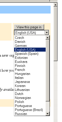
Like a lot of the interface in the otherwise loved Pipermail, the
"View this page in" button is kinda weird. A label that wants to be a
button. Can we all chip in and pay for the operation?
The pull-down at 3M:
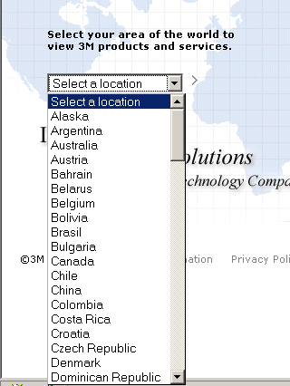
Mixing American states with countries. I would be castrated if I did
this.
On inside pages 3M presents this:
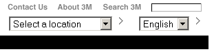
Here we have the old interaction design problem of needing two lists
sometimes but not all the time; we'll always present Spanish to the
Spaniards, but the Swiss get their choice. This design makes you want
to open the second menu all the time, just to make sure there's not a
better choice ("what, no American
English??"). And then there's the arrows to click to enter the choice.
Does the first arrow update the second menu, or change screens? Later
we'll see simpler, better solutions...
GE offers a list of regions or a map:

...and when a region is clicked (either the text link or the map) the
available countries are presented:

I'm not sure how the 'Overview' helps
a user reach their goal more so than the website. But ignoring this
complication this is an interesting solution. One might argue there's
one or two clicks too many, but the map helps avoid any labeling
issues. I'd be curious how this design compares to the label-only
designs in usability testing.
On 3Com we get a list of countries on the home page:
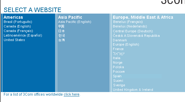
(disclaimer: I consulted on this site years ago, and still swoon
over Joe Pemberton's attractive visual design.) I like the sorting of
countries into regions - it seems easy to scan horizontally then
vertically - and the display of languages in their native language.
Back when this was built we didn't know how to do it without images
(ugh), but the W3C shows us how, below.
On later 3Com pages:

The list has to forego the images, and uses a nice, simple solution of
languages in parens next to countries:.
GM also divides the list into regions:

Incidentally, if you're storing this information in a database, it's
hard to do this display programmatically unless your data model knows
what a region is. Otherwise, you might be stuck with a strictly
alphabetical display.
Later, on the English language Canada GM page, a classy way to switch
to French:

Is this the GM site again? No, it's Ford!
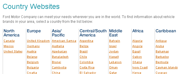
My usability spidey sense tells me
seven regions might be too many. I'd bet ten of whatever your currency
is that someone in Bermuda would scan North America or Central/South
America to find their home before seeing the last column, Caribbean.
Macromedia also gives you the option to remember your choice for your
next visit:

Another way you could design this is
to automatically remember the country, i.e. set a cookie. "It depends."
On the IBM home page there's a pull-down:
Interestingly, it's not a full list
of countries, with one of the choices leading to a full list. It's fun
to reverse-engineer this one. I'm betting they shortened the full list
into order to make the home page load faster.
IBM inner pages:

A simple link to a full list of countries, this loads even faster
than the abbreviated pull-down list above.
The upper right corner of Wal-Mart's home page:

I cringed when I saw it. "No," I thought, "by 'International' they
don't really mean everyone who's not American, do they?" They do. Not
all of us in America are like this. Really.
BBC World's Choose your language page:
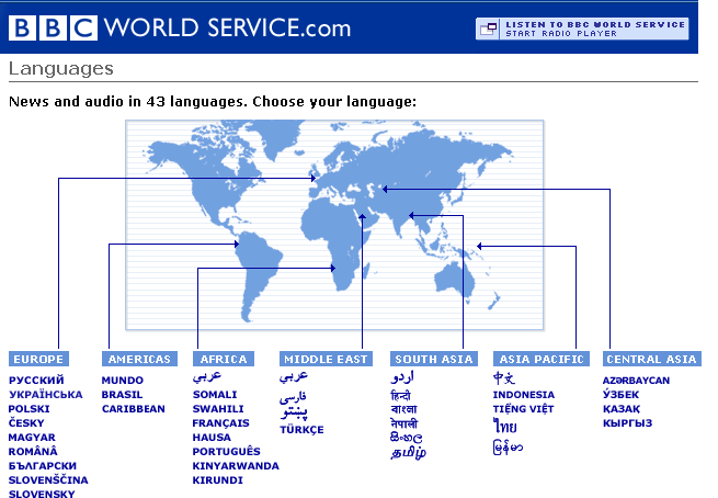
The combination of map visual associated with labels is interesting.
Sadly, one cannot click on the map. Apparently the labels are there for
people who may not know just where Central Asia is. Barring the sudden
rise of geographic knowledge in the world, I'd say this is actually a
categorization/labeling problem disguised as a you-dumb-user problem.
Finally, the venerable W3C list of translated content:

Labels in the native tongue, and it's text, not images. Those guys
are good.
That was fun, I really need to do that more often. You should too.