Blurb Gallery
Surveying the variety of ways we display introductions to longer articles...
I keep finding myself working on sites that have news or portal-like layouts, and each time I start from scratch thinking about how to display the headlines and summaries. No more, I started this gallery to capture the many ways it's done, and perhaps I'll eventually map these to the audience and business goals.
Incidentally, for a good introduction to writing blurbs, check out Dennis G. Jerz's Blurbs: How to write them for web pages.
From Tolerance.org, a head, blurb, and simple Go link at the end:

I like the 'Go' link at the end, as it naturally follows the blurb text. But I tend to think there's a strong convention of linking the title, which could improve this approach [ disclaimer: I worked on this site ].
FT.com uses a linked headline and a READ link after the blurb:

With the 'Read' link and the linked title, I like this approach more. But why the big distracting time code near the end?
Salon sometimes includes a thumbnail image:

The bold, underlined link is clearly the headline and the link to the story, and like xblog below, it doesn't take much space and leads the eye nicely. The thumbnail also has a link-colored border, possibly helpful to those of us who were on the web in 1995. Also notice the tasteful use of typography, setting the author's name with a different family than the blurb.
The New York Times will sometimes link the head to the main article, then also include links to related articles after the blurb:

A good way to draw attention to associated articles, but I wonder if people think any of the links at the bottom are the same as the headline link or not? Also, at that font size they're really pushing it with the serif font.
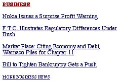
Also from the NY Times, a linked category label, linked article heads, and another link to the category page using a 'More...' label:

Clean and simple, but it can be clumsy reading all that underlined text.
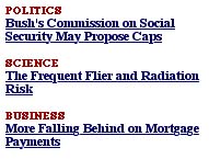
Again from the Times, alternating category links and heads:

Similar to above, but with more use of bolded text. Perhaps the context explains why it's bold in one case and not in another.
From Textism, in-text links:

A blog style in-line link. The headline in this case is supplimentary, a quirky statement more than a summary. The IA hordes continue to debate whether in-line links are effective or not; in the case of a blog with this audience I'd say they are the convention.
From Quokka, there are two phrases with an implied semicolon in between, each of which could act as the link text. Only the second phrase is linked.

Looks nice, but to my eye the colored, underlined links stand out so much I tend to skip over the text in-between.
From xblog, the headline is in-line with the blurb.

Even though the headline is not on its own line and large, as is the norm, it still stands out and is scannable because of the red link color and the white space between entries. The color also adds interest. Being in-line, the eye naturally leads from headline to blurb. Very nice.
From nublog, the headline, blurb, and 'continue' text are all links, with underlining displayed on rollover.

I can't help but think more linking is better, though this is unproven. It reminds me of my approach to kids sites, where I try to make everything clickable because kids are such wonderful explorers.
From iaslash, includes meta data in between the head and the blurb.

Since the meta data is treated the same as the blurb text, the eye has trouble passing over it. Maybe this is intentional. IMHO, I think the meta data is handy to reference, but shouldn't get in the way of the content.
From WebWord, John explains, 'I call out the article title and I
bold it. Then, if appropriate, I call out the source in parathesis. I
follow that with two dashes, quotes, the actual pull quote, and closing
quotes. If appropriate, I add comments at the end. You can see all of this
on WebWord.com Feedback on this method has been quite positive.'

[ Victor says ] I often find myself mousing over a link and looking down at the address bar to see where it will bring me. So I like the inclusion of a source attribution right after the link; it mirrors my mental process.
From the International Herald Tribune, the headlines are in the center column and the blurbs are in the right column.

Having a column with only headlines and all that space makes it so easy to scan the headlines, probably a frequent task on this newspaper site.
From Useit.com, Jakob says to, 'make the headline into a hypertext link. No need for additional links such as Read or Go if it's obvious that one can click the headline. This is most easily achieved if using standard blue-and-underlined links...My example happens to be a list of bi-weekly columns, which is the reason for the date annotation. That's also the reason for the mini-archive of old headlines (below the current column) which are also date-stamped. Time-stamps might be appropriate for lists of financial news or other events that change frequently during the day.'

[ Victor says ] The inclusion of a month and day stamp is interesting. There's probably a fair amount of regular useit.com readers, so it's helpful to know which column is which so they don't miss anything. In another context, a year stamp would also be helpful, as this advice is long-lasting but perhaps not timeless; as devices, platforms, and software change over the years the information design recommendations may change. Sure 'nough, the Alertbox archive includes the year in the date stamp. That guy is pretty smart.
Are there approaches I haven't covered here? Email me.
Thanks to Eric Scheid, John S. Rhodes, Dennis G. Jerz, and Jakob Nielsen for the suggestions and ideas.


