Map Zoom-By-Icon Design
Task: Instead of using an arbitrary number to represent map detail, reveal the level of detail in the interface.
Background
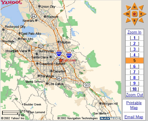
Traveling to a new place, I needed to get a sense of how far apart it and other destinations are. Doing this required a lot of zooming in and out to find the right level of detail and coverage area. The arbitrary numbers associated with each level of detail didn't afford me any information about that amount of detail until I had already loaded the page. Also, some levels of detail didn't seem significantly different from their neighbors, increasing the time needed to find the right level (Hick's Law).
Designs
Here's the original design:

Here's the redesign. I replaced the numbers with details of each map level and reduced the number of levels in half. The beveled buttons are a little campy, but you get the idea.
Observations
- These levels of detail seem practical for a metropolitan area like San Jose, CA, but are they as effective with a rural area?
- It's probably impractical to generate all these map-specific icons on-the-fly, but not necessarily impractical to pre-generate and cache them. Hey, hard drives are cheap these days.
- If caching is impractical, perhaps generic versions of these views could be used instead.
- Also see the Eameses' Powers of Ten.
